
Real Life Dashboards - Actuals vs Projections
In 2022, my intention is to share a bunch of "real life" dashboards that I created for and use at work. These dashboards were built for my specific business and for very specific use cases, but my intention will be to mock up data that is more easily understood by the general public.
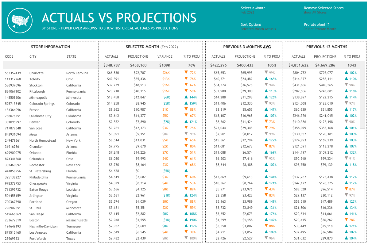
The first real life dashboard is simply looking at actual sales versus projections for all of our stores. (In my use case, these are actually agencies and it's not tracking sales.). It shows each store, the values for the selected month (which defaults to the current month using a dynamic parameter), the previous 3 month average and the totals for the prior 12 months. If you hover over any of the colored marks, you will see the monthly figures for the past 3 years. The filters and controls at the top allow users to select a month, sort in a variety of different ways (alphabetically, by store code, or by any of the sales figures), allows you to remove agencies based on certain factors, and allows you to prorate the month to see if each store is on track to meet their target.
Based on feedback, I've created two different versions of this dashboard. The first simply utilizes three colors and the second helps show the magnitude of how far from projection a store is. Both are shown below. I personally like the "look" of the first one, but believe the second is much more insightful. Internally, we are using the second one. Click on the images to be directed to the actual dashboards on Tableau Public.


I hope you like the Actuals vs Projections dashboard and find it beneficial. Thanks for checking it out.


There is a lot to learn inside them, Thank you!!!!!
ReplyDelete