
Our Top Ten Favorite Tableau Vizzes of 2022

In late 2021, Ken and I chose our favorite Tableau Public vizzes ever. Then in 2022, we started an annual tradition of choosing our favorite vizzes of the year, this time was for 2021. In continuing that tradition, Ken and I each chose our personal favorites from 2022, then jointly trimmed that to our top 25, and finally agreed upon a top ten. In this blog post, we will show our top ten starting at number ten and moving down to our favorite viz of the year. For each, we will provide a small screenshot, but we encourage you to click on the links to see them in their full glory. Please note that although I am composing this blog post, all of the selections and commentary were developed as a team between Ken and me.
But before we press on, we do have some ground rules. Some of these rules have been slightly modified from previous years.
1) Data Visualizations Only: Throughout the year, people create some absolutely amazing and incredibly useful instructional workbooks on Tableau Public. We love these so much, but for this list, we will be focusing on “pure” data visualizations only.
2) No Flerlages: We can't pick any of our own vizzes or each other’s.
3) Adam McCann Rule: We will pick no more than one viz from any single author (previously we would allow for up to 2 for a given author).
4) Attribution: we chose these vizzes because we love them. We will do our very best to provide attribution and inspiration if applicable, but we did not create these vizzes so we simply don’t know where the author was inspired.
Okay, now onto the top ten!
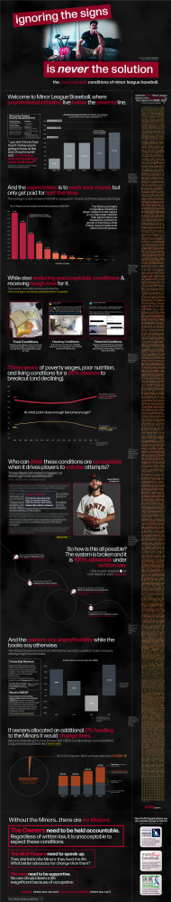
10) The Conditions of Minor League Baseball by Tina Covelli
If you look through our favorited vizzes on Tableau Public, you'll see that Tina is certainly one of our favorite authors. In fact, she had two vizzes in our 2022 top 25. She has such a great sense for design and the layouts of her visualizations are near perfection. This viz is no different. This viz nails all of the Iron Viz criteria of analysis, design, and storytelling (dang the storytelling is good in this viz). And in our opinion, had this been entered into an Iron Viz competition, it could have won. Incredible work, Tina!
9) 2021 F1 Season by Rafael Centeno Pérez
Truthfully, neither of us knew anything about F1...until this viz! It is super informative and has a nice, clean layout using a variety of really well-designed charts. Rafael did a heck of a job with this visualization.
.png)
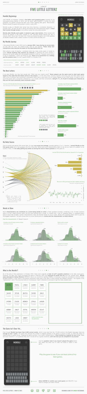
8) A Story of Five Little Letterz (#IronViz2023) by Lindsay Betzendahl
Over the past couple of years, we've seen a good number of vizzes about Wordle and this one is most certainly among the best. This was Lindsay's entry into the 2023 Iron Viz competition, and it was one of our absolute favorites - and it could have easily won it. In our opinion, it nailed every category. This viz not only tells the story of Lindsay's Wordle journey, but it could be used as a guide to improve your skills in the game and you can even practice because she built the actual game within the viz. Love it!
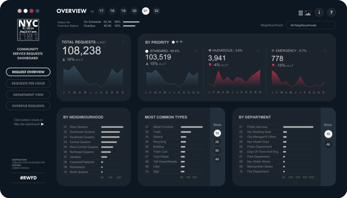
7) #RWFD - NYC Community Service Requests by Chimdi Nwosu
Chimdi...oh Chimdi. He is soooo good! Everything he creates deserved Viz of the Day and like Tina, he also had two vizzes in our top 25. Here he shows off his incredible business dashboard style. Everything is perfectly designed using simple charts, with great color, all of which are easy to understand. Bravo!
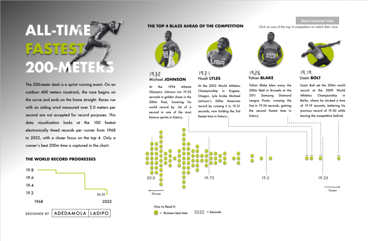
6) All-Time Fastest 200-Meters by Adedamola (Damola) Ladipo
We can group Damola with Chimdi for the fact that we probably nominate every single one of his vizzes for Viz of the Day. He has such a distinct style that actually reminds us both of Tableau Visionary, Judit Bekker. His vizzes are typically one page with only a couple charts, but they are perfectly designed. Damola is another one that had numerous vizzes in our top 25. We are jealous.
5) HR Attrition Dashboard | VOTD | #IIBAwards'22 by Pradeep Kumar G
Pradeep Kumar is one of the absolute best and he has been doing it for a very long time. As of the time this blog post was written (mid-January), he had just passed one of us (Ken) as the third most favorited author on Tableau Public. And our guess is that by the time this blog post has been released, he will have passed the other one of us (Kevin) as the second most favorited author on Tableau Public. And he deserves it! Pradeep also had two vizzes in our top 25, but this was our favorite. This viz was Viz of the Day and placed third in the Business Analytics category of the Information is Beautiful Awards (not to take anything from first and second, but this was definitely our favorite in that category). Again, we are jealous!
We will note that this was using data from the Real World Fake Data project. This means Pradeep just used fake data. In a normal business environment, he would have taken the time to meet with stakeholders to determine their business needs, targets, etc. The end result could potentially look a lot different. We also want to comment that every dashboard could be better. There are certainly things that we would change about this dashboard, but for this particular blog post, we are here to provide praise.
.png)
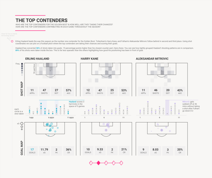
4) The Race for the Golden Boot by Fuad Ahmed
Wow! This viz is awesome...and another Iron Viz entry that absolutely could have won. The design and storytelling are spot on and we both loved the business dashboard feel where you can consume the viz in chunks versus long-form. Fuad is so skilled at using white space; there is a ton of it on this dashboard and it works soooo well. Like so many on this list, Fuad also had two vizzes in our top 25.
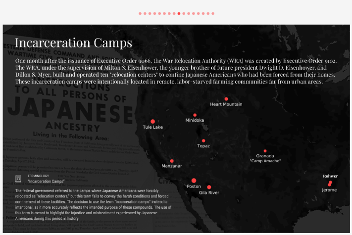
3) Executive Order 9066: The Incarceration of Japanese Americans by Alex Dixon
We both know Alex from Twitter, but neither of us followed him on Tableau Public. Why?...well, this was his first (and to date, his only) Tableau Public viz. And wow, what a viz it is! This viz uses story points (the best we've ever seen it used) to tell the story of Japanese Americans that were incarcerated by the US during World War II. Alex does an incredible job of telling the story and using charts only when they need to be used. And the design is just...well...perfect! A work of art! Well done, Alex.
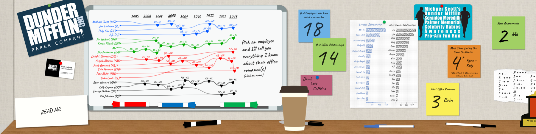
2) Office Relationships by Brian Moore
Well, we talked about renaming the Adam McCann rule to the Brian Moore rule, because when he creates a viz, he goes big and we are two of his biggest fans. Brian could have easily had multiple vizzes in the top ten had we allowed it. That said, his Office Relationships was simply insane and our favorite of his this year. In this viz, he created numerous charts that look like they were hand-drawn on whiteboards and scratch paper...and he did it all in Tableau. Like we said, INSANE! Michael Scott would be proud.
Okay, drumroll please....
Our favorite viz of the year is...
1) Diet✝ by Kasia Gasiewska-Holc
Kasia is an absolute rockstar (and a regular contributor on our website 😃). She is so gifted technically, but equally gifted in design. In this viz, she explores her own weight loss journey. Similarly to Brian, she creates charts that look hand-drawn and dang, how the heck did she do it? The addition of design elements, such as animated gifs, adds so much fun to this already incredible visualization. We both want to be Kasia when we grow up. Be sure to check out the interactive version of this viz, because a static image doesn't do it justice. Congratulations on creating our favorite viz of 2022!

Although that's a wrap on our ten favorite vizzes of 2022, there were several other vizzes that could have easily made the top ten. Since it was so close, we just wanted to mention those folks. The list includes Kimly Scott, Gandes Goldestan, Jared Flores, Priya Padham, Kavin Kumar G, Muhammad Azhar, Brittany Rosenau, and Tedy Iskandar.
Thanks to all the incredible Tableau Public authors for another great year. We can wait to see what everyone does in 2023!
Thanks!
Kevin Flerlage & Ken Flerlage, January 23, 2023


Thanks Kevin. I would never have found these works had you not published your blog. Better still, I found Pradeep Kumar G's dashboard truly inspiring to the point that I will be updating some of my own visuals to reflect his approach.
ReplyDelete