
Custom Date Drill Down Trend Chart (Guest Post from Kasia Gąsiewska-Holc)

This is a guest blog post is from our regular contributor, Kasia Gąsiewska-Holc. Based in Poland, Kasia works remotely as a Senior BI Analyst at Ecovadis, a data analytics company based in Warsaw. She is also a Tableau Public Ambassador and she loves using Tableau as a creative outlet for data viz experimentations.
About the Tutorial
A note from Kevin: Before event reading a word, check out this incredible teaser video that Kasia shared on Twitter & Linkedin last week. It does a fantastic job of showing you what this tutorial is all about. Okay, now back to Kasia.
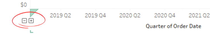
In this tutorial we’re going to explore a way to customize settings of + and – buttons within custom date hierarchy trend charts. You probably recognize these from some of your own work:
As useful as these buttons are, they are fairly limited. In order to introduce some customization, we could use a slider, which will allow us to click through different levels of granularity in the chart.
In the video, I talk about sliders in more detail, but for this particular tutorial a slider is implemented as a set of two shapes: + and -, in order to mimic these built-in buttons. To see it in action, check out the Tableau Public example.
What are the advantages of using custom +/- buttons (a slider) instead of the default, built-in option?
Default +/- buttons cannot be customized and adjusted to only display certain levels of granularity. If the trend period field is of the date type, granularity will automatically range from years through to days. If the period field is a timestamp then the granularity will range from years through to seconds. Sometimes this is not desired, especially if the data already comes pre-aggregated to e.g. months.
Default buttons are only visible upon hovering over the X axis. UX-wise, this is not the best solution, as users are frequently not aware that they can change the level of granularity of the chart themselves.
A slider is based on a backend parameter and that opens up more avenues for further chart customization. We can use parameter values to customize the chart title, headers, annotations, labels etc.
Implementation of custom buttons is very quick and simple. Once set up, adding or removing additional levels of granularity takes just a few seconds.
To find out more on how to use a custom slider in your own workbook, follow the video tutorial below.

Slider Template
In order to implement the custom +/- slider, discussed in the tutorial, you will need to download the following slider template.
How to use the slider template?
Go to the Tableau Public example and click the download button at the bottom (or simply go to this link and download it).
Download the workbook
Copy the ‘Slider’ sheet
Paste the ‘Slider’ sheet into your workbook
For more detailed instructions, follow the video tutorial.
Feel free to reach out to me with comments or questions. Also, if you want to connect with me, you can follow me on Twitter or Linkedin.
Lastly, massive thanks to Flerlage Twins for hosting my content on their fabulous website yet again!
Happy vizzing! 😊
Kasia


No comments: