
23 Simple Tips to Polish Your Dashboards

Sloppy dashboards drive me crazy. The truth is, you can clean them up with some relatively simple steps. I call these steps "adding polish". When I talk about polish, I am talking about those extra steps you take to ensure your dashboard is clean and neat, your dashboard is easy to use, and that your dashboard is easy for other developers to understand and modify.
The following are 23 simple steps to add polish to your dashboards (in no particular order). Note: I will dig into some and let others stand for themselves. I've also created a printable, one-page checklist to go along with this blog post (click the hyperlink to download it). It includes a QR code to link back to this blog post in case you need additional information. (Please email me at flerlagek@gmail.com if you have issues accessing the checklist).
1) Name your sheets and dashboards with easy-to-understand names.
2) Name your calculations with easy-to-understand names.
3) If you create multiple, similar calculations that will likely be used together, use similar nomenclature. For example, let's assume you create two Fixed LODs, one to calculate the SUM(Sales) at the Category level and another to calculate it at the Sub-Category level. I recommend you name the calculations clearly (as notated in #2) as well as in the same format so they show up in the pane together. So rather than name them [Category Sales Fixed] and [Sub-Category Sales Fixed], you should name them [Fixed Sales by Category] and [Fixed Sales by Sub-Category].
4) Name your dashboard and worksheet actions. Without naming them, people will have to edit every one just to find the one they are looking for. I suggest the following format: [Type of Action] - [What it Does]. For example, "Parameter - Feed in Month" or "Filter - State Map by Bar".
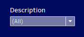
5) When filter names are hard to understand, words run together, words are separated with underscores, or too long, you should edit the title to be something cleaner and easier to understand. For example, if a filter is titled "CustomerName", change it to "Customer Name". If a filter is titled "United States of America State Abbreviation", change it to "State".
6) Something that always bugs me is the fact that filter titles start before the actual filter itself. Below is an example of what I am talking about.
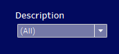
See how the D starts well before the filter? This drives me nutty! So for every filter, I edit the title and add a space before it. The result is better aligned and much cleaner.
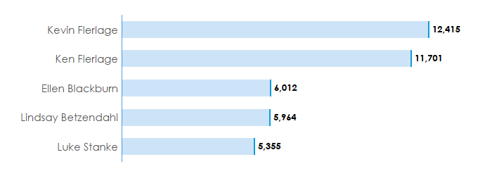
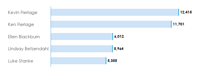
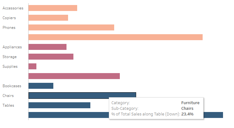
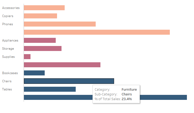
7) In most cases, left align the headers on bar charts (versus right align). Here is an example from a little viz that Ken did. He left-aligned the headers (yay, Ken), but I show it with right-aligned headers as well. In my opinion, the right alignment just looks jagged and is hard to read. The left alignment is so much cleaner. It also provides nice, neat straight edges that are easy to align other elements with.
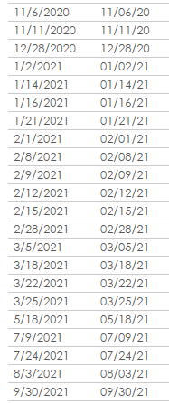
8) When using dates, use a consistent format. If you just let it use any date format, dates in lists can be very difficult to read. In the US, I use the MM/DD/YYYY (or YY) format (this would be YYYY-MM-DD in most countries). You will need to set a custom format in order to accomplish this. Setting it in this format allows all the dates to line up neatly versus being offset (much easier to read). Below is an example. See the huge difference?
9) Put groups of related fields into folders. To do this, select the fields, right-click, choose Folders, then Create Folder.
10) Always set your date and number formatting defaults at the field level. If you were not aware, you can set your date and number formatting defaults on the field itself so that you don't have to do it every time you add it to your view. Just right-click on the field in the left-hand pane, choose Default Properties, then choose either Number Format or Date Format.
11) If you choose not to use default formatting at the field level, in most cases, you want to format your fields when adding them to the view. For example, with all the data, your figure shows 120, but when you filter, it shows 1.00. Setting your formatting to whole number, in this case, would be best.
12) Use transparent shapes on BANs (Big A-- Numbers). I explain this in detail in my transparent shapes blog post. See #5 BANs without Weird Selection.
13) Hide your sheets. Once you've built your dashboard(s), hide all the sheets on that dashboard. If there are sheets that are not on a dashboard, but you want to keep them, I recommend placing them on the dashboard, then using your cursor to move them to the right, outside of the dashboard pane. If you don't need the sheet, just delete it. Clean that workbook up so it's easier for you (and others) to know what is being used, what is not, and so that they don't have to scroll left and right through 40 sheets to find the one they want.
14) When bringing in button icons from PowerPoint, sometimes Tableau cuts them off around the edges. To resolve this, just add a larger transparent shape around the image you created, then select everything and save it as a new image. If Tableau cuts it off in this case, it won't matter because it will just be cutting off the transparent section.
15) When adding a bank of filters, be sure to add padding between them and between the margins. It doesn't take a lot to make it look much cleaner. I typically just add 10px of padding to the right of each. A before and after is shown below. (Bonus filter tip: tile your filters in containers - one horizontal with numerous verticals. Don't float them, because when you need to add or remove one, you'll have to move every single one of them).
Before
After

16) Don't put your filters and parameters in a collapsible container unless you need to. If you have just a handful of them, why make your user open that container and close it every time they need to modify filters?
17) For tooltips, don't just leave the default. You should clean them up just like you did the rest of the dashboard. I made reference to a standard tooltip design of mine in #6 of my A Little Design blog post. Just scroll down to the image showing the pink and gray stacked bar with tooltip.
18) If you have long field or calculation names, don't use them in tooltips. If you do include fields with long names, simply edit them in the tooltip to add some polish. A good example of this is with table calculations. Just edit the header to make it more clear. Below is a before and after example. (Note: I would not leave my tooltip as the "after example" either, I would clean it up to have a nice overall design).
Before
After
19) When filters contain three or more values, add an apply button. Not doing so causes major problems for users as every time they click, the view refreshes. Also, make sure the filters are consistent. If one has an apply button, they all should (if possible).
20) Change the color of your worksheets for the purpose of applying filters. Sometimes you apply filters to the entire data source - that's easy. But when you have to apply some filters to some worksheets and others filters to other worksheets, it can be confusing and error-prone. A great way to do this is to color-code your worksheets based on filter application, i.e. worksheets that will share the same applied filters.
21) Rename your data sources. When you bring in data sources, they often aren't very descriptive causing potential issues. One perfect example is when you use Custom SQL, it may name your data source "Custom SQL Query (TableauData)". If you add a second data source using Custom SQL from the same database, it would name it "Custom SQL Query (TableauData) (2)". I've seen lots of workbooks like this. Save yourself (and others) a lot of work by renaming your data sources to help developers understand what they actually are.
22) Ensure your fonts are the same colors. It's easy to end up with multiple shades of gray.
23) Hide unused fields in your extracts. For more information on this one, check out #3 in this PhData blog post.
There you have it, 23 simple tips to polish your dashboards. I hope that this is helpful to you and ends up being helpful to your users and fellow developers. And before you go, be sure to download the checklist. Thanks for reading!
Kevin Flerlage, April 10, 2023
Twitter | LinkedIn | Tableau Public


No comments: