
Using Gradient Colors in Tableau

A few weeks ago, Tableau featured my blog on recreating 538’s election prediction chart. That chart included a bar chart with a gradient color. I briefly explained how to create the chart in that blog, but I wanted to provide a more detailed explanation, as well as show how to create gradient colored area charts. So, that’s what I’ll be addressing in this blog.
Bar Chart
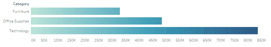
We’ll start with a bar chart. The gradient bar chart I created for 538 used a method whereby the bar was broken into 100 small segments, then colored based on the segment number. This worked well for a single bar chart, but it breaks down when you have multiple bar charts. For instance:

Notice that each bar has the full range of color. While it may look cool, it is problematic because the gradient color doesn’t really tell us anything. It would be best if the bar looked like this instead, with the color being consistent across all of the bars:

Doing this will require a slightly different approach. We still need to create multiple segments, but instead of coloring by the segment number, we’ll want to color each segment according to their position on the axis. If that doesn’t quite make sense to you, no worries—we’ll explain further shortly.
Note: I’m going to use the Superstore data set for this tutorial, but the same basic steps can be used for any data set.
We’ll start by creating an additional data set, which I’ll call Model. This will have just one column called Range with values 1 and 500.

Next, we’ll perform a cross-join of the model data to the superstore data. Tableau doesn’t support cross-joins out of the box, so we’ll use a join calculation with a 1 on each side (for more on cross-joins, have a look at SQL for Tableau Part2: Combining Data).
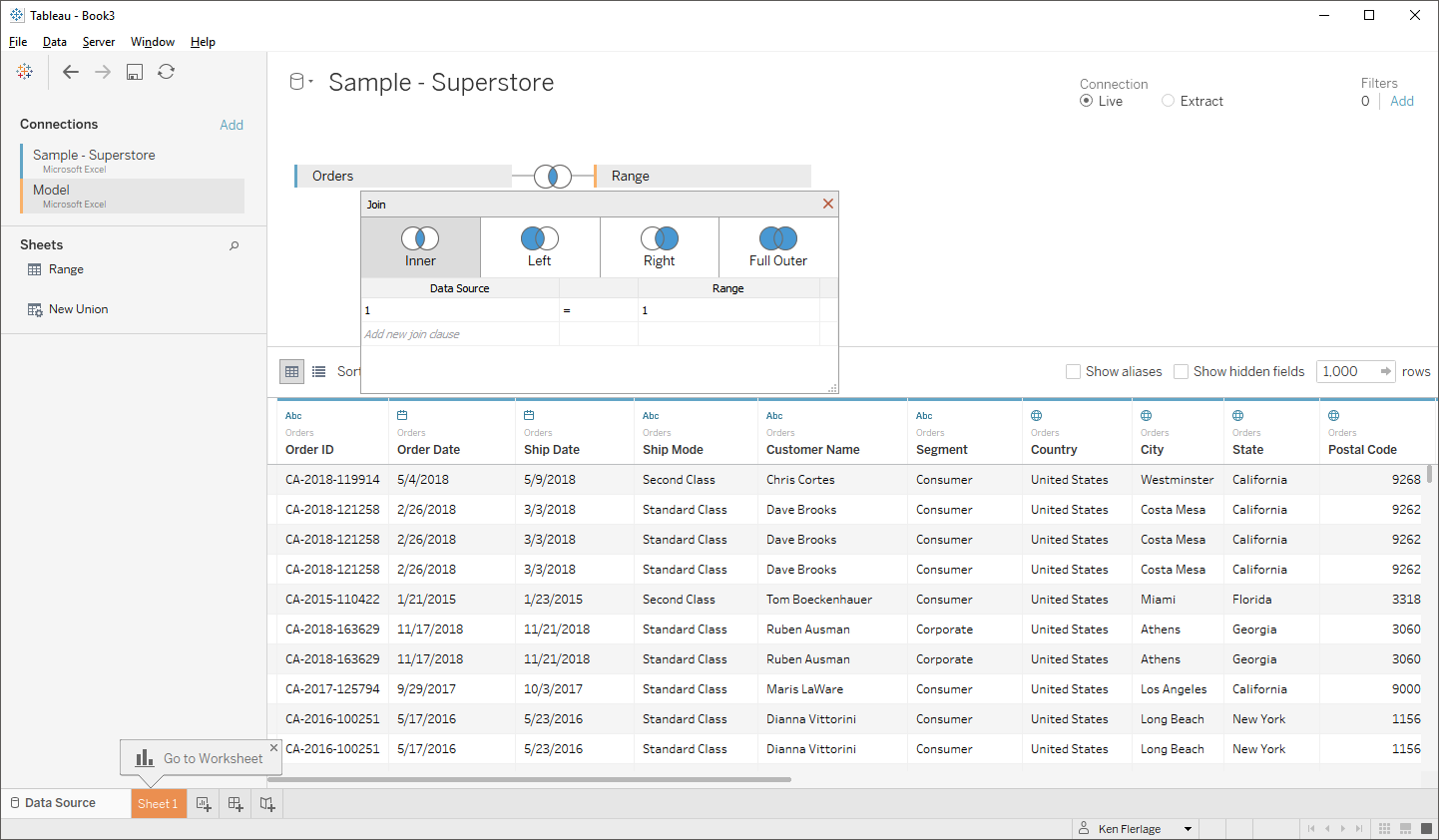
Note: This will duplicate each row in my primary data set twice, so we’ll need to be careful about this when we perform aggregations. We’ll actually use a calculated field to deal with this later.
Next, we’ll create bins on Range with a bin size of 1. This will allow us to artificially dissect the bar into 500 segments. To make sure that our bins will show all values, start out by dragging Range (bin) to the rows shelf, then right-click on the pill and choose “Show Missing Values”. Once that’s done, move the Range (bin) pill over to the detail card.
Next we’ll need a couple of calculated fields. First, we’ll create an Index calculated field.
Index
INDEX()
Drag Index to the detail card, then right-click on it and change it to compute using Range (bin). You should now have something like this:
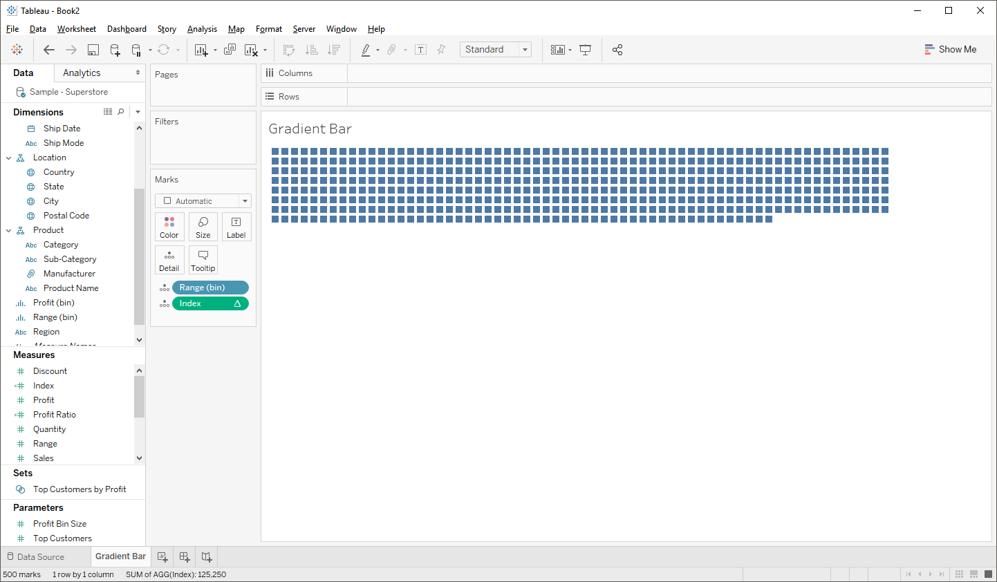
The 500 individual squares is a good sign as it means our data densification is working properly.
Now, we’ll create a few more calculated fields that will help us to determine the size of each segment as well as the color to be assigned to each segment:
Sales Adjusted
// Sales adjusted to account for the two range values.
[Sales]/2
Max Segments
// Total number of segments we're plotting (max value of range).
// Using this instead of hard-coding the value, in case you wish to change the value.
WINDOW_MAX(MAX([Range]))
Total
// Total sales for the dimension.
WINDOW_SUM(SUM([Sales Adjusted]))
Size
// The size of each segment, based on the total sales for the dimension.
[Total]/[Max Segments]
Color
// Color of the segment.
([Max Segments] - [Index])*[Size]
The Size field will determine the size of each individual segment based on the total sales for the given dimension. And Color will calculate a numeric value to which a continuous color can be assigned, but will do so in a way that ensures consistency across all bars.
Note: We’re using a fixed LOD here, which means you’ll need to be very aware of the Tableau Order of Operations as you build out the rest of your workbook, especially when considering dimension filters.
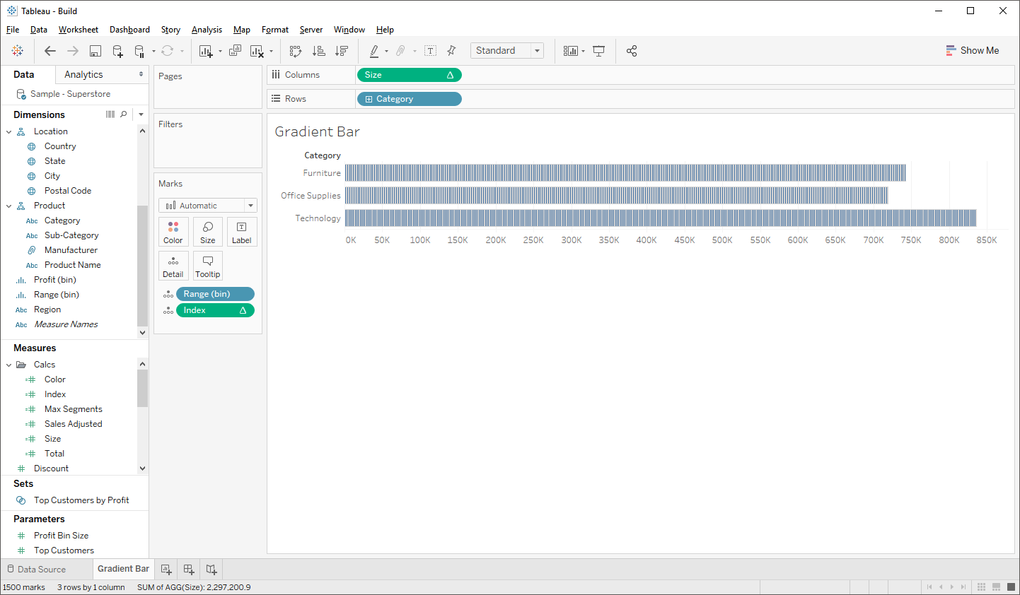
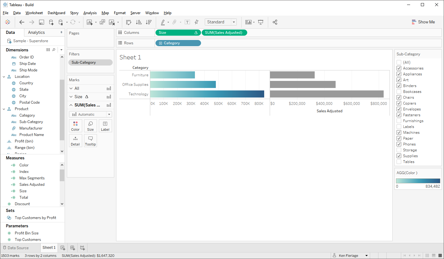
Now drag Category to the rows shelf and drag Size to the columns shelf. Set Size to compute using Range (bin). You’ll now see the segmentation that we’re shooting for.
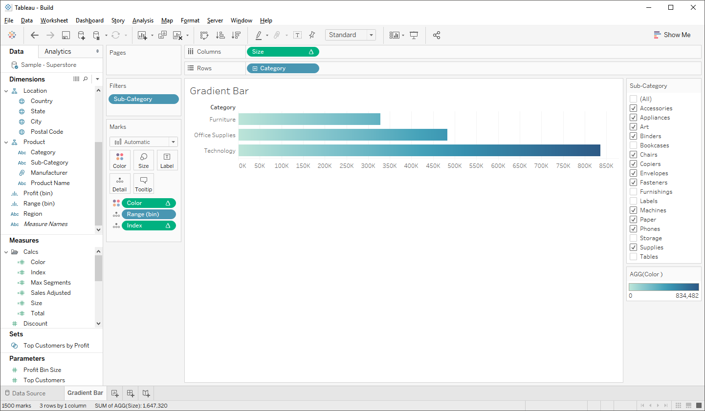
Next, drag Color to the color card and set it to compute using Range (bin).
Note: Because the three categories result in bars that are similar in length, I’ve filtered out a few values of Sub-Categoryto better show the color consistency across the bars.
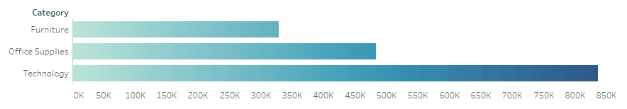
This looks exactly like what we want, but there’s a problem—if we mouse over the chart, we’ll see each individual segment.
We don’t want this, so we’ll trick it into looking like a single bar. Drag Sales Adjusted to the columns shelf. Then remove all pills from the various cards on this new axis. We’ll now have something like this:
Next, change it to a dual axis. Tableau will, for some reason, determine that the default mark type should now be circle, so change it back to a bar. The new axis should now completely cover the original gradient-colored axis, so click on that axis then edit the color, setting it to 0% opacity. This will make the bar invisible, which will allow the gradient color bar to show through, but when you mouse over it, you’ll only be able to interact with the second axis, making it look like it’s a single bar.
Area Chart
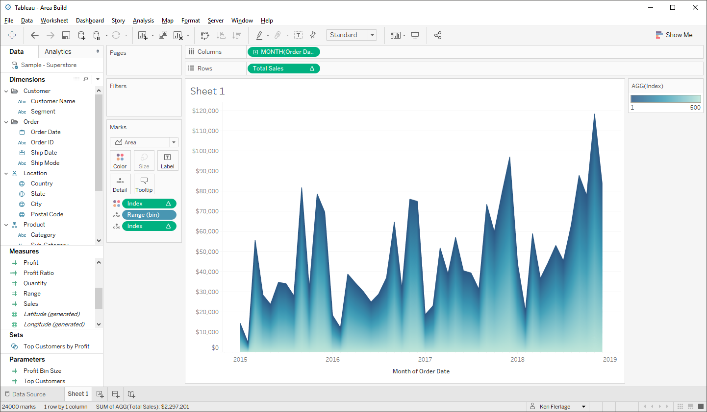
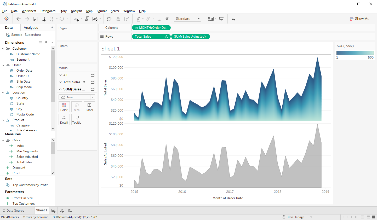
Next we’ll look at creating a gradient area chart. My first attempt at this ended up like this:

This has the same problem as my first attempt at the gradient bar chart, but I thought it had some visual appeal, so I’ll start out by showing you how to create this. We’ll then circle back and create a version that has consistent coloring along the axis.
The first few steps for creating this chart are the same as the bar chart. You’ll use the same Model data set, so start out by performing a cross-join to Superstore. Then create your bins field on Range and create the calculated fields, Index, Sales Adjusted, and Max Segments. Then create one new calculated field:
Total Sales
// Total sales, adjusted for the number of segments.
WINDOW_SUM(SUM([Sales Adjusted]))/[Max Segments]
Next, repeat the process with Range (bin) to ensure that it shows missing values, then drag it to the detail card, along with Index, setting it to compute using Range (bin).
Now drag Order Date to rows then make it a continuous month. And drag Total Salesto the rows shelf and change it to compute using Range (bin). Change the mark type to area. If you hover over the area chart, you’ll see the segmentation.
Now drag Index to the color card and change it to compute using Range (bin). Finally, click on the color card and reverse the order of the palette. You should now have something like this:
But this has the same problem as our bar chart—if you mouse over the chart, you’ll see each individual segment. So, we’ll follow a similar approach to hide this. Drag Sales Adjusted to the rows shelf, then remove all the pills from the cards on the new axis.
Change the color on the new axis to 0% opacity, make it a dual axis, then synchronize the axes. Now, when you mouse over the chart, it will only interact with second axis.
Area Chart Method 2
While the above method may be okay to add a little of visual appeal, like my original bar chart, the color isn’t very meaningful. It would be best to have consistent color across the entire axis, like this:

So, how can we accomplish this? Unfortunately, this is pretty difficult so we’re going to have to get a bit hacky! Essentially, we’re going to build one sheet that just has a large gradient rectangle, then we’re going to overlay a normal area chart on top of it, using transparent sheets, to let the background show through.
Repeat many of the steps from the first area chart method, including the cross-join to the Model data set, creation of bins on Range, and creation of the Index, Sales Adjusted, and Max Segments calculated fields. Also be sure to ensure that Range (bin) is set to show missing values.
Due to the hacky nature of this method, we’re unfortunately going to need to fix our axes to a specific value and we’re going to need to use that fixed value within a calculated field, so we’ll create a parameter called Max Axis to store this value. For the chart I’m creating, I’ll set this to 125,000.
Next, we need to create a calculated field which will divide our segments up equally as part of the max axis (125,000). So, when stacked together, they’ll add up to that total.
Gradient Line Size
// Size of each gradient line
[Max Axis]/[Max Segments]
Since we’ll be stacking charts on top of each other and attempting to line them up nicely, it will be ideal for the numbers on the axes to be formatted the same way (so that the width of the axis labels are the same). So, before we start building the charts, set the default number format of Sales Adjusted and Gradient Line Sizeto be the same.
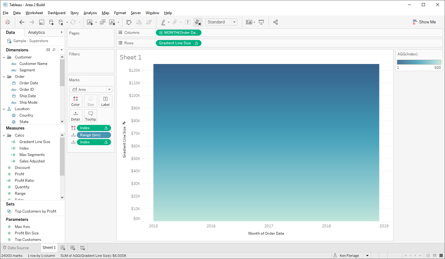
We’ll start out by building the background. Drag Range (bin) and Index to the detail card and set Index to compute using Range (bin). Then drag Order Date to the columns shelf and change it to a continuous month. Now drag Gradient Line Size to rows and set it to compute using Range (bin). Change the mark type to area, then drag Index to the color card and set it to compute using Range (bin). Choose your favorite continuous palette and reverse the order of it. Finally, fix the vertical axis to have a maximum of 125,000. It should look something like this:
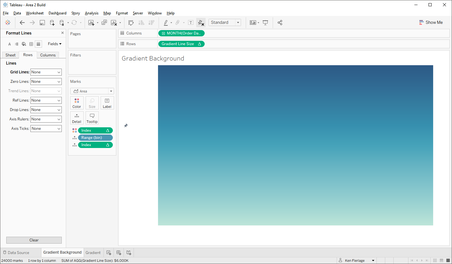
As this will be in the background, we won’t want any axis labels, but we don’t want to hide them because the chart won’t easily align with the foreground, so just format them, changing the font color to the same as the background (white in this case). Also, turn off all lines on the chart. We’ll now have a plain gradient rectangle.
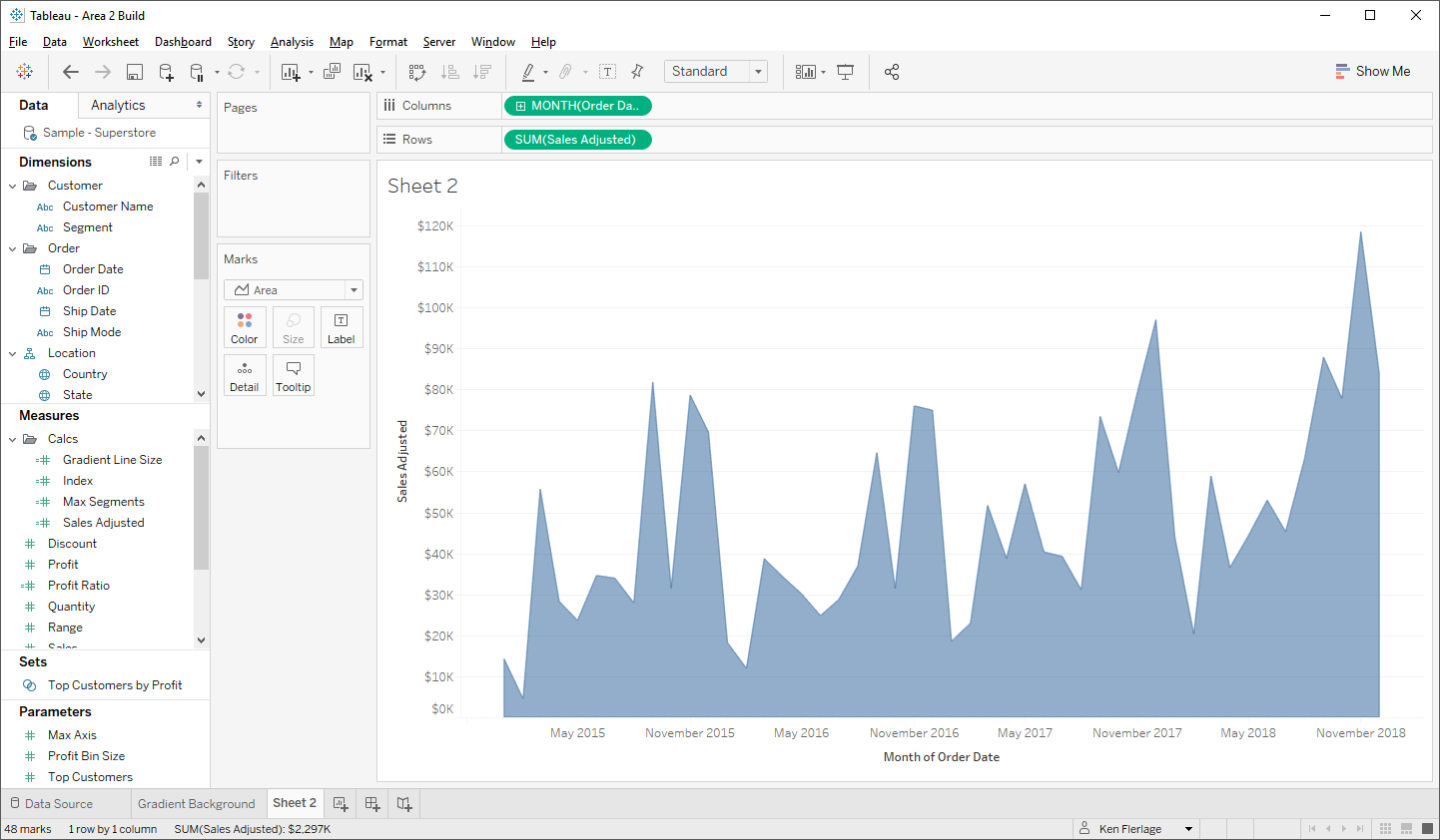
Now we’ll build the foreground chart. Start out by building a simple area chart. Drag Order Date to columns and change it to a continuous month. Then drag Sales Adjusted to rows. Finally, change the mark type to area. It should look something like this:
But here’s where it get’s tricky. Ultimately, we want the actual area chart above to be invisible (so the background gradient color can show through), but we also need the empty space above the area chart to be solid so that it can block the background color. So, we’ll create a dual axis area chart to fill in that space above. Start by fixing the axis to a max of 125,000. Now create a calculated field which will determine the size of the blank space.
Blank Space
// How big should the blank space area chart be?
[Max Axis]-SUM([Sales Adjusted])
Now drag this to rows to create a new axis. Once there, reverse the axis and fix it to a max of 125,000. Also, to distinguish our two axes, change each to separate colors. Then change it to a dual axis and hide the header of the secondary axis (on the right).
You’ll now have two area charts stacked on top of each other and fitting together like a puzzle.
Change the color of the blank space area to match the background (white) and make it 100% opaque. Then, on the actual area chart, change the opacity to 0% so that it’s invisible. Finally, change the background color of the chart to None. You’ll now have what looks like a blank screen with a couple of axes.
The last step is to add these to a dashboard. It’ll be easiest to float both charts, so start out by floating the background sheet, then use the Layout panel to manually change the x & y positions and width and height. My dashboard is 900 x 600 and I want the sheet to fill the entire dashboard, so I’ve set y and x to 0, width to 900 and height to 600. Then do the same exact same thing with the foreground chart.
Both the primary area chart and the blank space area chart will be interactable, so you’ll want to set a global tooltip (one the “All” axis) so that you don’t see the value of Blank Space.
Okay, so that is a lot of work just to get a gradient color on an area chart and, ultimately, it’s probably not worth the effort. But there could be cases where having such coloring might be of value, so now you have a method for doing it. Of course, as always, I’d stress you not to use this just because it’s cool. Always consider your use case, your data, and your audience when choosing charts to use in a visualization.
If you'd like to download copies of these workbooks, you can find them here:
Bar Chart Attempt # 1
Bar Chart Attempt # 2
Area Chart Attempt # 1
Area Chart Attempt # 2
If you'd like to download copies of these workbooks, you can find them here:
Bar Chart Attempt # 1
Bar Chart Attempt # 2
Area Chart Attempt # 1
Area Chart Attempt # 2
Thanks for reading! If you have any questions, feel free to leave them in the comments section below or reach out to me directly.
Ken Flerlage, February 17, 2018


Wow, it is indeed super hacky and not really worth the effort. but thanks anyway :)
ReplyDeleteHaha! Yes, it is!
DeleteHi! Thanks for this tutorial! How do you perform the data densification with Tableau's new 2020.3 which replaced joins with Relationships?
ReplyDeleteThe new data model didn't actually replace the old model--it just created a new layer on top of it (I have a blog on this actually: https://www.flerlagetwins.com/2020/05/tableau-data-model.html). So you can just double-click on a "logical" table and that will take you to the physical tables. Within there, you can do the densification just like in the past.
DeleteThanks so much! I was able to make the data densification work (I cheated and used Prep but I will read the blog post as well!). Everything is working brilliantly... except for I am trying to use a Gantt chart instead of a bar chart and I cannot seem to get the bars to offset by the minimum amount (everything starts at 0). Any recommendations?
DeleteHmmm. I'd probably need to see the workbook. Any chance you could send it to me? My email is flerlagekr@gmail.com.
DeleteHi Ken. Is there a way we can set up gradient background in the dashboard? I am using tiled sheets and I am looking to get a way where we can place the gradient background sheet behind the tiled sheets. Wondering if there's a way out we can do this?
ReplyDeleteThanks
You could create an image and use an image object. You would then need to put all your tiled objects into a single floating container which sits on top of the background image.
DeleteHello!
ReplyDeletegreat work!
Is it any way to get around creating a new model for range and joining?
I.e, can I in any way create a range(bin) calculated field and use instead?
You could potentially use this method: https://rosariogaunag.wordpress.com/2019/09/06/manifesto-of-internal-data-densification/. But it is somewhat complicated and can add complexity. If you have the ability to join, then that's what I'd recommend. If you cannot join, then this method might work.
Delete