
Who’s Afraid of the Big Bad Radial Bar Chart?

radial bar charts are not that scary
Edit 12/16/19: The following blog post was published in Feb 2019 and focuses on the concept of a radial bar chart and works through how to map out the data in Excel then bring into Tableau. At the 2019 Tableau Conference, Ken Flerlage and I presented and during that presentation, I show all the math and build a Radial Bar Chart from scratch, all within Tableau. You can view this video here:
Approximately three months into my Tableau journey, I decided to create a radial bar chart. At that time, I didn't even have a clue what it was called. However, through some Google searches, I eventually found some blogs and some videos. But then it happened! I got scared! I was afraid of that big bad wolf and I quit! I looked at the chart, thought it looked incredibly complicated, I let it intimidate me, and I tucked my little piggy tail between my legs and ran away.
Fast forward six months to November 2018 (9 months into my Tableau journey) when I saw Ellen Blackburn create a beautiful radial bar chart for her Viz of the Week, Meteorites Through Time. The chart was just so beautiful and inspiring. I decided that it was time to bail on my house made of straw and build a house made of brick. It was time to overcome my fear of this big bad wolf.

Before we proceed, I’d like to insert a short disclaimer. This particular chart may not be a preferred chart in a corporate environment and you may never see one in one of your corporate dashboards. However, creating these types of charts helps will most certainly stretch your understanding of data and how Tableau interacts with that data.
Now that we’ve said that, let’s take a long look at the chart before looking up any other radial bar chart information or blogs. Let’s do this together.

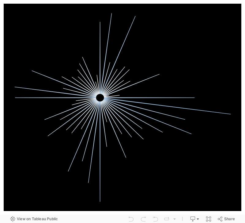
The chart looks like a bar chart wrapped around a circle. I see an inner circle and bars poking out from that inner circle. But why are a bars so thin? It seems like with every radial bar chart I’ve seen; the bars are really thin. Let’s zoom in a bit.

Wait, do you see what I see? No it can’t be! The bars aren’t bars at all! They are lines!!! Light bulb!!! There are no bars, they are just lines.
Once I realized that these were just lines, I decided that I could create this chart myself without looking any blog post or instructional video. I decided to figure it out on my own. So that’s exactly what I did.
So here’s what I knew up to this point:
· The bars are not bars at all, they are lines.
So what do I know about lines? Well I’ve built a ton of line charts and basically they just connect one data point to another. But I’ve also used lines to draw a circle and I’ve also used lines in barbell charts. For the radial bar chart, the process of building line chart, a circle, and a barbell chart are very eye opening, so let’s first dig into this.
Everybody knows how to build a line chart in Tableau, so let skip that and go right to building a circle in Tableau. Why are we doing this? Well, I’ll get there; just stay with me.
Ken Flerlage wrote an incredible blog post using trigonometry: Beyond Show Me Part 2. If you already know how to draw a circle in Tableau, then continue reading below. If you do not know how, then please read Ken’s blog post and when you get to the section where it shows 36 points forming a circle, come back to this post (feel free to read the entire thing…and it will mention radial bar charts…but please come back). In Ken’s post, he shows that drawing a circle with Tableau is just a matter of some simple math. First, download the following “circle data” from Google Sheets. This data is just a collection of 36 points that will ultimately form a circle like in Ken’s post and I’ve already done the math. Click on the link, go to File, Download As, and save as a Microsoft Excel document.
· Open Tableau and connect to this data.
· Drop X on Columns and Y on Rows
· Convert Point to a dimension
· Drop Point onto Detail
· Drop Point onto Label
· You should see a circle made of points with each point labeled

Okay, here is the key point I want to demonstrate. In Tableau, change the chart type to a line then drop Point onto Path. What did you see happen? Tableau drew a line from point 1 to point 2, then from point 2 to point 3, and so on ultimately forming a circle (note it does not connect 1 to 36 as that is not logical to Tableau to connect point 36 to point 1).

So all you did was plot the points in a scatter plot (which happened to be structured like a circle) then you told Tableau in what order to draw the line. It’s no different than any other line chart where a line connects data points, it is just being done in a circular format. Make sense? Hopefully you said “yes”.
Now, Tableau is really good at interpreting how to draw these lines in general. In the above example, you had points labeled sequentially, you dropped that sequential points onto Path, so that is how Tableau drew the lines. Tableau drew the line from point 1 to point 2 to point 3, etc. But what if the numbers weren’t sequential. In a recent Makeover Monday viz, I created a barbell chart that looks at top Diversity in Tech Companies in 2015 to 2018.
Now, Tableau is really good at interpreting how to draw these lines in general. In the above example, you had points labeled sequentially, you dropped that sequential points onto Path, so that is how Tableau drew the lines. Tableau drew the line from point 1 to point 2 to point 3, etc. But what if the numbers weren’t sequential. In a recent Makeover Monday viz, I created a barbell chart that looks at top Diversity in Tech Companies in 2015 to 2018.

This viz looks a little different than a normal barbell chart because I changed the width of the line with the intention of showing direction. However, let’s back that off to see what it would look like as a normal barbell chart (I also removed the labels for clarity).

So, let’s take tech giant Google as an example, all I did was tell Tableau to draw a line between the 2015 value and the 2018 value. Like we did with the circle above, let’s walk through this process. (Yes, I’m leading to a point here). First, download this Tableau workbook from Tableau Public.
In this workbook, the prep work has already been done to create a barbell chart. It is set with a dual axis with circles on one axis (one data point for the 2015 value and one for the 2018 value for each company). The other axis is set as a line chart. However, you will see it’s a mess.

Tableau knows you want to use a line chart, but it has no idea what order you want to draw the lines. That is, until you tell it how to. Now, drop Date onto Path. See what happened? Tableau understood that you wanted to connect the 2015 data point to the 2018 data point for each company. (As a side note, Ryan Sleeper has a great blog post about how to create a barbell chart. The very bottom of the post discusses how to create it using a line chart and the Path card).

Okay, so in the circle example, Tableau connected point 1 to point 2 to point 3, all the way to the final point in one continuous line creating a circle. In the barbell chart example, Tableau created numerous individual lines, connecting 2 points for each company. I hope you are following, but if you are not, that’s okay. All you really need to know is that Tableau can intelligently connect the dots for you and it can do it in a continuous line or a bunch of individual lines.
Now, we are adding to our bank of knowledge regarding radial bar charts:
· The bars are not bars at all, they are lines.
· All it takes is a little bit of simple math to calculate coordinates of a circle.
· Tableau can draw a bunch of individual lines.
Okay, armed with this information, how do we create this chart? Let’s talk through how I looked at it. But before we do so, please note the data set. I opted for Superstore data and to look at Sum of Sales for each month over the course of four years (Jan 2015 – Dec 2018). Also before we continue, I know that there are hundreds of people out there like me that come from the Excel world and have a high comfort level within the tool. For this blog post, I am going to plot out how I structured this data in Excel then brought it into Tableau to let Tableau do its magic (the magic really is all with Tableau). I am in no way suggesting that this is the preferred way, but I want people to see the simplicity first. Later, I will show you how the Excel data easily translates itself into doing this strictly in Tableau as well as point you to a really great blog post. The hope is that walking through it in this manner will greatly increase your understanding of the actual data structure and how Tableau uses it to, once again, do its magic!
Okay, let’s look at this chart again.
Okay, let’s look at this chart again.

Like the barbell chart, this chart is made up of numerous, individual lines. The length of the line is reflective of what we are measuring. In this viz, it is reflective of the number of meteorite landings for each year. In the data that we are going to use, it is reflective of total sales for each month. And like the barbell chart, we could draw each line by using two data points, one on the inner circle and the other extending out from there (in the length of the measure). In fact, that’s all these lines are, two data points connected by a line. Below is an example of what it might look like if we actually showed the points. (In the image, I removed a few years to clean up the view).

Okay, let’s see where we stand:
· The bars are not bars at all, they are lines.
· All it takes is a little bit of simple math to calculate coordinates of a circle.
· Tableau can draw a bunch of individual lines.
· Each line just connects two points.
Before proceeding, please download the Excel spreadsheet and go to the Step 1 worksheet. This shows only the month/year and corresponding sales – this is our starting point. Like before, click on the link, go to File, Download As, and save as a Microsoft Excel document.
So where do we begin? Well that inner circle of points should look familiar. It is exactly the same as what Ken showed us in his blog post. So, let’s plot those inner circle points. So how do we do that? Trigonometry! I had 48 records in my data (12 months per year over 4 years), so let’s create 48 points of a circle to match up with those records. Like Ken’s blog notes, I’m just going to spread that out over 360 decrees of a circle. This is equivalent to 360/48 or 7.5 degrees for each point. So in my spreadsheet, I added a column to calculate the angle (in degrees) for each record. To make the calculation easier (and because it is typically helpful to have when building these types of charts in Tableau), I also added a Record Number column which ranged from 1 to 48. So, the angle would simple be the Record Number * 360/48 (or 7.5). (Record 1 would be 1 * 7.5 = 7.5. Record 2 would be 2 * 7.5 = 15. And so on). I encourage you to do this yourself, but I’ve went ahead and done it for you. See the Step 2 worksheet.
We now have Record Numbers ranging from 1 – 48 and that the Angle in Degrees runs 7.5, 15.0, 22.5, 30.0 all the way to 360.0. Now, as Ken’s post discusses, Tableau doesn’t like angles in degrees, so we must convert it to Radians. To do that in Excel, simply use the function =Radians(Angle in Degrees). You’ll see that 7.5 degrees converts to ~0.1309 Radians. Just repeat that for every line. See the Step 3 worksheet.
Now in order to draw the points, we need a radius. For this example, the smallest sales value for any months is $4518, so I decided to just use a radius of 4000 (though you could really use anything). In my data, I added a column of Radius and entered a static figure of 4000 on all lines (because all lines will share the same radius to make that inner circle). See the Step 4 worksheet.
From here, we need to actually plot the points. If you read Ken’s post, you know that we can calculate Adjacent (a) (which is really just the X coordinate) and Opposite (o) (which is the Y coordinate) using the angle and the Hypotenuse (h). Our data already contains the angle and the hypotenuse is just our radius, right? So x = COS(Angle) X Radius and Y = SIN(Angle) X Radius. So let’s add those calculations to our spreadsheet. See the Step 5 worksheet.
Now you have is all the points of the inner circle. We also need to be able to plot the outer points of each line. In the image below, I’ve shown the outer points in a color of red:

So how do we do that? Well first, we need data to go along with those points. The data we currently have is now associated with the points of the inner circle. So we need to duplicate (copy) our month/year and sales data and paste it to the bottom of our data set (union). This will allow for us to create additional points, but while measuring the same thing. In the spreadsheet, copy all of your data and paste it below. Let’s also label the first set of numbers as Inner and the second set of numbers as Outer. See the Step 6 worksheet.
There are some things that we need to fix. First, the Record Numbers still need to run sequentially, so for the data you just pasted, change that first point from 1 to 49, then the second from 2 to 50, and just copy that down so you have points 1 to 96 in your data. See the Step 7 worksheet.
Now we should be able to see that in reality, the outer points are just an extension of the inner points we created, right? If you are not sure what I am talking about, let take a look. First, below you will see an image of both the inner points (blue) and the outer points (red) without the lines drawn to them.

Well what if we fit a right triangle to one of the inner points like Ken did it his blog post?

Okay, that makes sense. That’s exactly what Ken wrote about, right? Well, how do we extend that out to that outer point, the red point? Well, let’s see.

In the above image, I’ve drawn another triangle in purple (it is drawn slightly outside of the yellow triangle for the inner points so you can still see it, when in reality it overlaps it). In this drawing, you can see that the angle is still the same as with the inner points, but that we don’t yet know the outer radius in order to calculate the outer X and outer Y coordinates. Wait! We can easily calculate this, right? We mentioned before that the length of the line is associated with what we are measuring. In this case, we are measuring sales. So we want sales to be represented by the length of the line extending from the blue point to the red point. You with me? So we need to determine the length of the entire outer radius (purple line). Well it’s actually quite simple, it is the inner radius (the yellow line extending from the center to the blue point - which we selected to be 4000) plus what we are measuring (sales), which is the line extending from the blue point to the red point. The inner radius (yellow line from center to the blue point) is 4000. The line from the blue point to the red point is equal to Sales. So the total outer radius in purple is equal to 4000 + Sales.
Okay, to get to these red points, we need to update the radius of the additional records we just added (I made them purple in sheet 8 of the Excel workbook). So, the radius will be the inner circle radius (4000) plus the sales figure. As an example, Record Number 49 (the first record in purple) shows a sales figure of 14,238. So the full outer radius is the inner radius of 4000 plus the sales figure of 14,238 resulting in 18,238 (formula in cell F50 is 4000 + Sum of Sales or specifically “=4000 + C50”). This formula will be repeated for all records in purple. When the formulas have all been updated, the corresponding X and Y coordinates will also be updated - remember that they hinge on angle and radius length, which is what we just updated. (Please note that hardcoding numbers into Excel or Tableau, like I did with the 4000 figure, is not a recommended practice, but is being done in this case for the sake of simplicity). See the updated radius for the purple records in Step 8 of the Excel workbook.
The last thing we need to do is to put something in the data that will allow Tableau to know how to draw the path. For the circle we just used the sequential Record Number. For the barbell chart, we used the date (2015 and 2018 were the underlying values). For this, we will simply add 1’s and 0’s so that it will connect the dots between 1 and 0 for each Month/Year. In Step 9 of the Excel workbook, I’ve added a Path Order column with 1’s for the inner points and 0’s for the outer points. (As a side note, there are other ways of doing it outside of using 0’s and 1’s, but in my opinion, this is the most straightforward).
Now we should have everything we need. So let’s open Tableau and connect to the Step 9 data. In Tableau:
· Drop X on columns and Y on rows.
· You want to measure the values per Month & Year. So drop Month & Year onto Detail. Go to the pill and change it to an exact date as Tableau will want to aggregate up to a year by default.
· Change the chart type to a Line.
Now, you should see something like the following:

You will see that Tableau doesn’t know how to properly connect the dots, so it’s your job to tell it how to do so.
· First, convert Path Order to a dimension.
· Next, drop Path Order onto the Path card.
You should now see this:

And there you go, a radial bar chart and all it took was a little bit of trigonometry and an understanding of how Tableau draws lines. Pretty cool, huh? From here, you can clean up the tooltips, color, sizing, etc. Below is the first, simple radial bar chart that I created (click on image to view):

Now, I walked you through how to prepare your data in Excel to be brought into Tableau to let Tableau do its magic. I did this for the sole intent and purpose of transparency to those folks in the community that are very familiar with Excel and may not yet be totally comfortable with doing things like this in Tableau. I would, however, suggest that the preferred (and just as easy) way would be to prepare your data fully within Tableau. Basically, all you need to do is to perform all the same steps I showed in Excel, but perform them in Tableau instead. All calculations should translate very well from Excel to Tableau. The one portion that you may need help with is the duplicating of data or the union of your data.
For this example, I am going to assume you are using Excel (below I will reference a blog that talks about doing this in SQL). To union your data on itself (or duplicate your data), go to you Data Source then drag the same worksheet below the sheet that that is currently being used. When doing that, you will duplicate your data. If you then click the downward carrot on that sheet and choose Edit Union, you will see that the duplicated data has a different name. This entire process is shown in the below animation using Superstore data. When finished and you Edit Union, you will see Orders and Orders$.

Those two different names (Orders & Orders$) are now available as a dimension in your data. This dimension is called Table Name (shown below).

When walking through the development of the data in Excel, you'll recall that we labeled the original set of data as Inner and the duplicated data as Outer. You will use the dimension of Table Name to label these points as Inner and Outer. In addition, the Radius and Path Order calculations were adjusted based on whether they were Inner points or Outer points. You can use Table Name as part of the calculation to make these adjustments. The following example will label your data as Inner or Outer, but calculations for Radius and Path Order would use the same logic:
IF [Table Name] = 'Orders' THEN 'Inner'
ELSE 'Outer'
END
Outside of this technique, there are numerous great blog posts and videos that show how to build this chart solely in Tableau. My particular favorite is from Rajeev Pandey and can be viewed here. Rajeev does this a bit differently, but the general idea is the same (he also shows how to union the data using SQL).
To be very clear, this may never be a preferred chart type to use in a professional environment, but creating this chart certainly allows you to think critically and stretch your understanding of what is possible in Tableau. It also helps many of us (myself included) to realize that many of these charts are not nearly as complicated (or scary) as they might look. My hope is that your work on this chart with lead to your willingness to tackle other charts that may seem scary. And one thing to remember, it’s okay to build it out in Excel and understand the background, but it’s also keythat you learn how to properly build it within Tableau because Tableau provides much more flexibility and as I mentioned before, that’s where the magic really happens.
I hope you enjoyed the blog post. If you have any questions, feel free to contact me at any time.
Kevin Flerlage | February 6, 2019 | Twitter | LinkedIn | Tableau Public


Thank you very much Kevin for very detailed explanation, It really made me comfortable that i can built something like withthis blog post.
ReplyDeleteLove the Oh Night Divine Viz!! Great blog!
ReplyDeleteThanks, Kevin!
DeleteI follow it fondly. thank you for the content
ReplyDeleteCan we do it without a Union? Some fact tables can be really big and we want to avoid duplicating data.
ReplyDeleteGood question. Not sure... I'll have to think about that.
DeleteBe careful though, more often than not, this is not the right chart for the job.
I know this is an old post but wondering about a potential type above - should the angle calculation be Record Number * (360/48) rather than Record Number * 360/48 (otherwise Tableau would compute Record Number * 360 then divide by 48)?
ReplyDeleteHey Darragh! Well the angle increment would be 360/48, but you want to add that for each point. So if you had 6 points, the increment would be 360/6 (or 60) and the angle for Point 1 would be 60, angle for Point 2 would be 120, Point 3: 180, etc. So the angle for each point is the 360/(number of points) multiplied by the point number (1 - 6). Does that answer the question or did I misunderstand?
Delete