
Drawing Curves on a Map in Tableau (Guest Post)

I’m very excited to
have Wendy Shijia join us today as a guest blogger. I’m sure you’ve seen
Wendy’s work already. If not, what are you waiting for? Go check out her
Tableau Public page right this minute! Wendy has created some absolutely
amazing visualizations that combine her technical brilliance with fantastic
analysis and storytelling, as well as phenomenal design.
Wendy is a Freelance
User Experience Designer, based in Shanghai, China, and is very active in the
Tableau community. You can find her on Twitter @ShijiaWendy and Tableau Public.
Background
In a recent viz, I visualized the data
about the seeds at Svalbard Global Seed Vault. I was intrigued by their mission to protect the agricultural
diversity for the whole world from future catastrophes. Since its opening in
2008, millions of seeds have been deposited by hundreds of countries. So I
decided to build a viz around it and focus on the connections between the seeds
and their source countries.
After some sketches, I came up with the idea of combining a map
and a bar chart, linked with curves.

In thinking through the viz itself, I figured I could put the
curves into a worksheet that would be layered on top of a map. However, it
would be difficult to align Cartesian Coordinates (x, y coordinates) to a map
that uses latitude and longitude. Let me explain. By default, maps in Tableau
use the Mercator projection. In the Mercator projection, latitude and longitude
lines are parallel, but there is some distortion caused by vertical lines being
evenly distributed where horizontal lines are not.
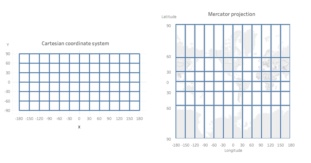
In Tableau, we typically draw curves using Cartesian coordinates
(x and y), but you can see the issue this might cause when overlaying it on a
map. So what if I drew the curves on the actual map instead? If I were to do
this, the end of the curve would match exactly the location of a country, no
matter how much the map distorts. So that’s what I decided to do.
Note: I’m going to be
using sigmoid curves in this example, but this technique will work for other
curve types as well. You’ll just need to change the formula used.
I found some techniques on the Tableau Magic website about drawing arcs on a map. I
decided to employ a similar technique. As a quick intro, I started with a non-densified sigmoid curve,
replaced x and y of each point with longitude and latitude, gave them
geographical roles, and drew the curves on the map. I then overlaid a stacked
bar chart in a separate worksheet at the bottom of the map. The curves aligned
with the stacked bar chart, so it seemed like the source countries and seed
groups were connected.

If you’ve never created a curve before or simply need a
refresher, please check out Ken’s blog post on Data Densification, which talks about drawing a sigmoid curve in detail. These
techniques are foundational to the following tutorial, so if you are not
familiar with them, please be sure to read Ken’s blog first.
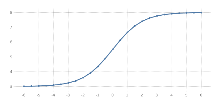
Before we start, let’s take a quick look at a sigmoid curve
using standard X and Y coordinates. You’ll see that X is evenly distributed and
the sigmoid function is applied to Y.

Now we will take this curve and turn it into a curve on a map.
As mentioned, we will be converting Cartesian coordinates to geographical
coordinates. I’m going to start with just one country and one grouping, so that
we can demonstrate the technique. Then we’ll add in more countries and groups.
Okay, let’s go!
Step 1: Define Start and
End Points
In my design, the curve starts from the bottom of the map (where
the bar chart resides) and connects to the geographical location of each
country. I started by simply defining the start point as calculated fields.
We’ll tune these at a later stage.
startX:
0
startY:
-90
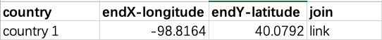
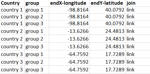
Next, we need to create a data table with endX and endY (longitude
and latitude) for each country (again, we’ll start with just one country). The
fourth column “join” will be used to help generate points along the curve. (see
step 3)
Step 2: Densify
As Ken detailed in his data densification blog, Tableau does not
draw curves natively. Instead, we have to use densification to plot individual
points, connected by lines. If we create enough of these line segments, the
result is an approximation of a curve. To do this, we’re going to prepare a model table of 100 points. Why 100?
This is just to ensure that we draw enough line segments to create a smooth
curve.
The table has two columns, join
and point. Like before, the join
column will simply contain the word “link”. The point column will contain
numbers 1 - 100.
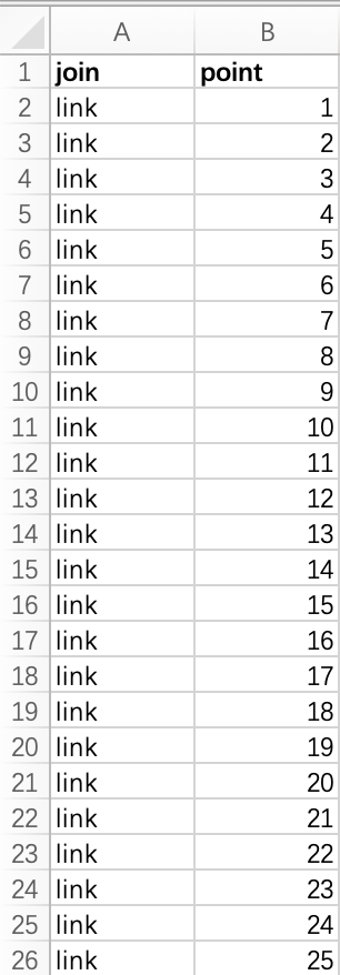
You’ll then join this data set to your original data set,
joining on the join field.
This join will take our single row of data for our country and
turn it into 100 rows of data. These 100 points will be used to draw the curve.
Step 3: Draw the Curves
To draw the curves, we need some calculated fields. The first
just tells us the total number of points. We could use the data for this, but
since we’re not planning to add more points, we can just hard-code it.
# point
100
Next, we’ll create a calculated field for the sigmoid function.
sigmoid
1/(1 + EXP(0.2)^ -(([Point]-([# point]+1)/2)*([endY-latitude]-[startY])/([# point]-1)))
You may adjust the number in red to change the smoothness.
Finally, we create calculated fields to get the X and Y
coordinates for each point along the curve.
CurveX
[startX] + ([endX-longitude] - [startX]) * [sigmoid]
CurveY
[startY] + ([Point]-1) * ([endY-latitude] - [startY]) / ([# point]-1)
Now we’ll set the geographic role of CurveX to longitude and CurveY
to latitude.
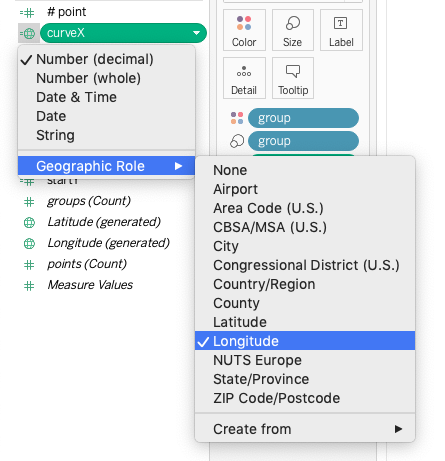
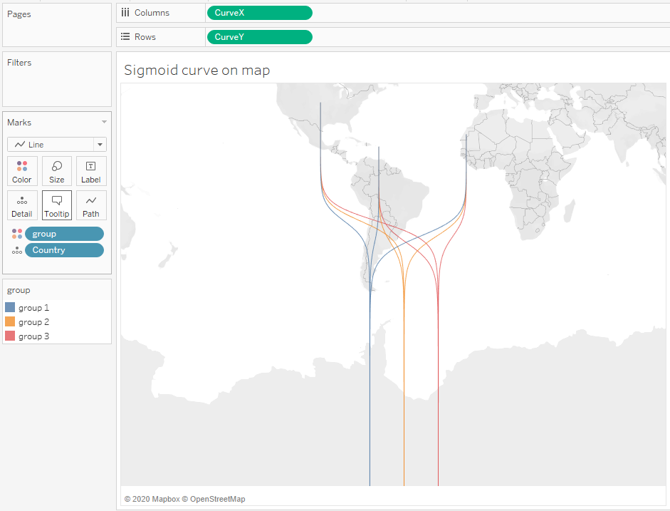
Next, drag CurveX to
the columns shelf and CurveY to the
rows shelf; change both to dimensions. Make sure the mark type is Line. If
you’ve done it right, the sigmoid curve should now appear on the map.
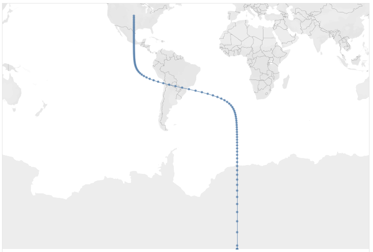
If you look closely at the above, you’ll notice that the curve
is somewhat distorted. The curve is sort of pushed to the top, resulting in a
long, straight line segment at the bottom. To help illustrate this, let’s look
at the curve compared to a straight line and a sigmoid plotted using cartesian
coordinates.
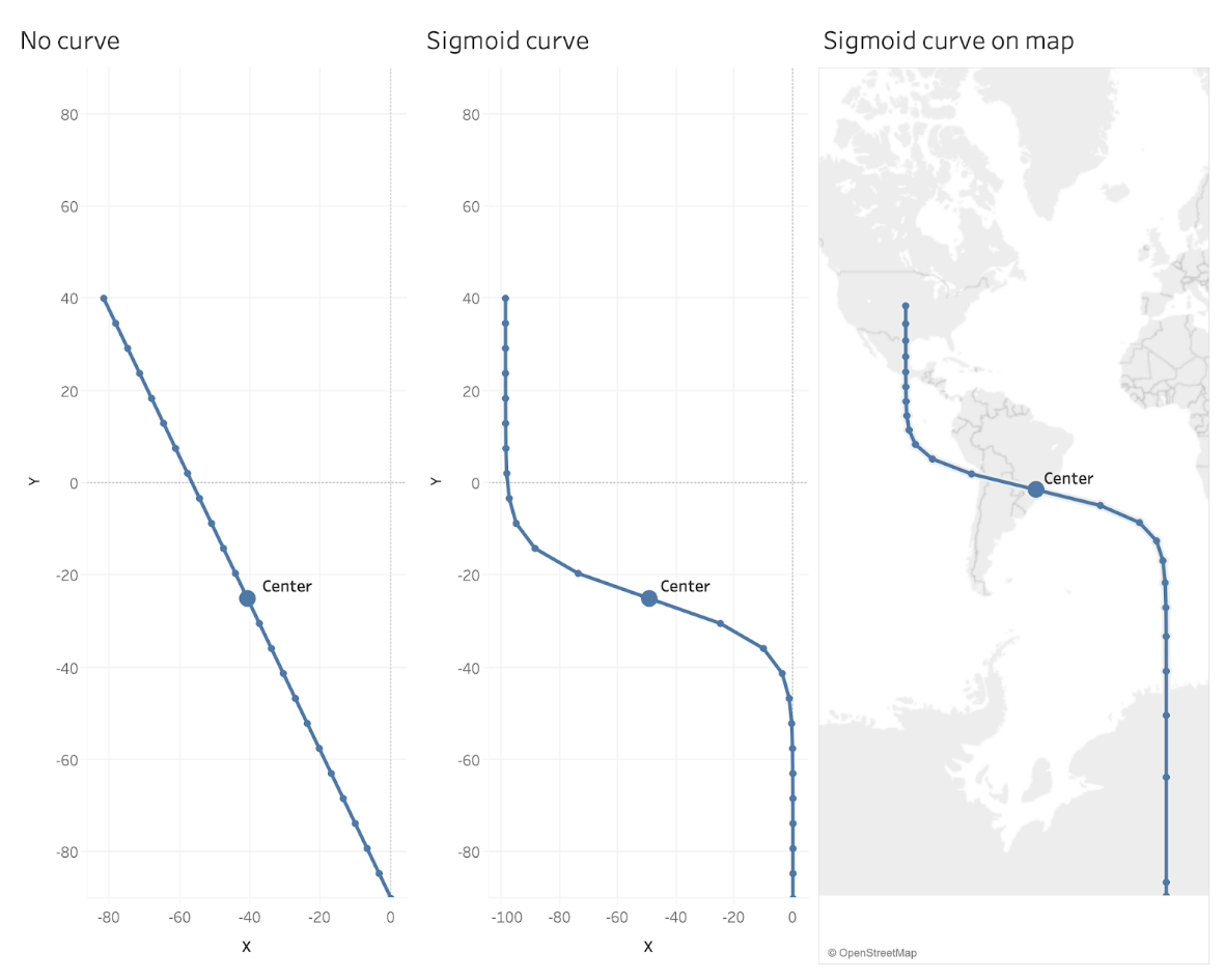
This is because of the distortion created by the Mercator
projection, as noted earlier. This causes points at the bottom of the curve to
be spaced further apart vertically, which makes the center point higher on the
curve. That said, in our case, this is not of a lot of concern. I just want to
make sure to point it out in case you notice it.
Step 4: Multiple
Countries and Groups
Now we’ll add more countries into our original data set. We’ll
also add in our different groups. Here’s an example using 3 countries, each
with 3 groups.
You’ll recall that we created a calculated field, startX for the horizontal position of
the starting point. We set this to -90, but now that we have different
groupings, we need them to start at different horizontal positions. So, we’ll
edit the calculation to something like this:
startX
CASE [group]
WHEN "group 1" THEN -70
WHEN "group 2" THEN -50
WHEN "group 3" THEN -30
END
Now, when we plot the curves, we see separate curves for each
country and each group, as shown below.
And that’s it! The data prep and calculations can be a bit
tricky, but the result is quite lovely.
I want to reiterate something I mentioned earlier. While we’ve
used sigmoid curves in this example, you could use any curve type you like. If
you’re interested in learning about some other curve types, please check out
the following blog by the brilliant Chris DeMartini: More Options for your Tableau Sankey Diagram
Thanks for reading. I hope this has been helpful. Have fun
playing with your own data! And, if you have any questions, please feel free to
contact me on twitter @ShijiaWendy
Wendy Shijia, August 17, 2020


This post has inspired me into a corner.
ReplyDeleteI'm trying to make the StartX co-ordinates dynamic based on the rank, so the most left is rank 1 and the most right 57 (in this case). It doesn't work because the rank is an aggregated calc which breaks the CurveX calculation.
The goal is to be able to sort the categories(cities) in X by various fields (in my case population, or distance, or median income, etc) and have the start points realign to the changes.
I'm stuck. Any ideas?
"Inspired me into a corner" -- I love that!!
DeleteOK, that will be a bit tricky because it will then force you to make all following calculations aggregates. I think that should be doable, but I'd need to see it. Any chance you could send me a sample workbook? flerlagekr@gmail.com
Thanks Ken for this mind blowing blog, I have referred your Data Densification post where I could understand the reason behind everything done over there.
ReplyDeleteWould be great if here you add the logic behind the Sigmoid function also, as it looks little unclear.
I have the same question. Could you explain the logic behind the Sigmoid function? Can y be expressed as a function of x instead? Thank you!
DeleteI'm not entirely sure what you're asking. You can absolutely express y as a function of x and vice versa.
DeleteI tried this and when I see the final chart I have weird lines in the North America cities only. Is it because of not proper matching of the city latitudes and longitudes?
ReplyDeleteHard to say for sure without seeing it. Could you email me? flerlagekr@gmail.com
DeleteThanks for this terrific post. Really super clear and helpful. Forgive me if this is a dumbass question... could and how would I link (in tableau) both a sheet with cooridinates on and a model table to third dataset? I've already made a bunch of vizzes in tableau with a large faostat dataset on crop production. I just want to add the sigmoid curves as the final touch..
ReplyDeleteWould be super grateful for a pointer.
You'd need to join it or blend it. This might be too complicated for this comments section. Feel free to email me. flerlagekr@gmail.com
DeleteHi Ken and Wendy, thanks a lot for the post: very well explained and easy to follow. I have only one doubt: how to create the second map with the bubbles on each country? I tried duplicating it, changing frm line to circle, using the "end point" calculated field and giving a value but I'm not able to get rid of the curve
ReplyDeleteYes, this is a trick that we didn't include in the blog. Happy to show you, but it's more than can be done in this comments section. Would you be able to send me an email? flerlagekr@gmail.com
Deletehow can i reverse the line, meaning making the line start from top rather then bottom ?
ReplyDeleteLooks like this approach has some problems when you do that. If interested in pursuing this, please email me. flerlagekr@gmail.com
DeleteHello Ken ! Can you teach me how to put the seeds or at least give it to me please ? It's for a university project and I liked yours a lot. Thanks !
ReplyDeleteWhat do you mean by "Seeds"?
DeleteTo clarify, you asked "how to put the seeds". I'm not sure what you mean.
DeleteMy lines are coming out completely straight. I have checked the data to see what may be causing it and I noticed my sigmoid function field is either 0.00 or 1.00. I imagine that is causing it, but I have copied the formula exactly. Any ideas why this may be happening? To clarify, I am only doing this for my local area (about 46mi/74km East-West), so could it be the scale of the map, perhaps?
ReplyDeleteThanks!
I'd need to see the workbook. Can you share it with me? flerlagekr@gmail.com
DeleteHi Ken, thanks a lot for the tutorial. I have a different use case though and I want to change the curved lines to vertical instead of horizontal. I have switched the CurveX and CurveY calculated fields, but it seems that whenever I used a number in my startY which is above the country's Y, then it adjusts the country's Y and not the startY. Any idea what could I possible be doing wrong?
ReplyDeleteCould you email me? flerlagekr@gmail.com
Delete