
Hover to Scroll to the Selection in the Bar Chart

Recently at work, I was redesigning an old dashboard that was showing actuals to projections at a county level. The original version was just a county map. To further explore the data, I built a bar chart of the counties and it was there that it became obvious (not in the map), that there were only a handful of counties that were not hitting their targets...most were. And some of those were wayyyyy off.
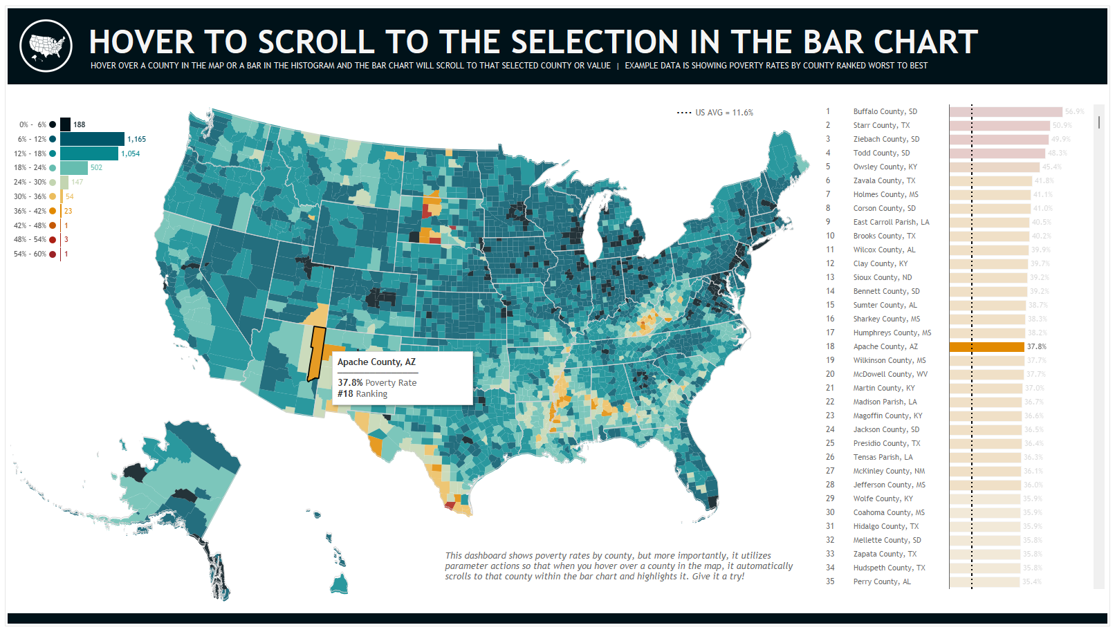
So, I added a bar chart showing the actuals to projections for all 3000 plus counties in the US. (I also built a histogram). From there, I added a highlight action in order to highlight by county. This worked great when hovering over the bar chart - when you hovered over a bar, it would highlight the county in the map. However, when you hovered over a county in the map and tried to highlight the bar...that's when this broke down. Why? Well, take a look at the screenshot below (note that this is not the actual dashboard I built at work, it is just a replication using poverty rate data). You'll see that in the bar chart, only 35 of the 3000+ US counties are visible. When I hover over a county that IS in the top 35 (say, Apache County, AZ - ranked 18), then it highlights that bar in the bar chart and this layout works perfectly.
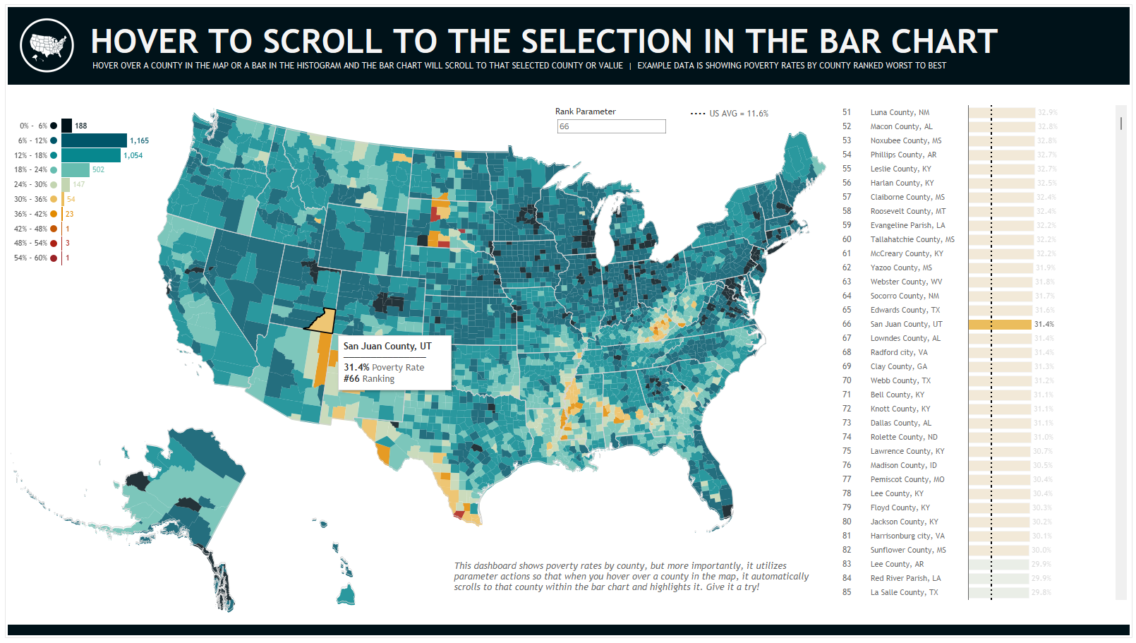
However, when I hover over a county that is not in the top 35 (say, San Juan County, UT- ranked 66), then it highlights that bar in the bar chart, but you can't even see it highlighted (again, because it's not in the top 35).

So, I thought about how we might solve this. In my head, I simply wished that when I hovered over a county in the map, it would then "scroll" the bar chart to where that county is shown. I wasn't sure how I could do something like that, but it did give me an idea. What if I were to just filter every thing above it to make it look like it was scrolling to that value. To refer back to the example above, San Juan County ranked 66, so I could set this up so that when you hover over that county in the map, it filtered out those counties ranked 1 - 65 so that San Juan would be easily seen. (Note that in the end, I opted to filter out all but 15 of the counties ranked higher so that the highlighted county would appear in the middle of the bar chart, not at the top. More on that later).
So, this was actually pretty easy to do. If you want to follow along, check out this dashboard on Tableau Public. First, I created a calculation called Rank: RANK_UNIQUE(SUM([Poverty Rate (Poverty Rate)]), 'desc'). This would use poverty rate to rank the counties. I placed that on the detail card in the map (and showed in the tooltip). I used the same Rank calculation on the bar chart.
From here, I create a parameter called Rank Parameter and set up a parameter action so that when I hovered over a county in the map, it would send that county's Rank value to this parameter. I then created a filter calculation called Filter to Hovered Rank: IF [Rank] >= ([Rank Parameter] - 15) THEN 'SHOW' ELSE 'HIDE' END. This basically said that if the rank of the county was greater than 15 less than the parameter, then show it, else filter it out. This was then placed on the filter shelf of the bar chart and SHOW was checked.
So as a little example, when we hover over San Juan County, the rank of 66 would be fed into the Rank Parameter. Then the filter calculation would be take over. It would calculate 66 - 15 to get to 51 then filter out counties that ranked 1 - 50. As shown below:
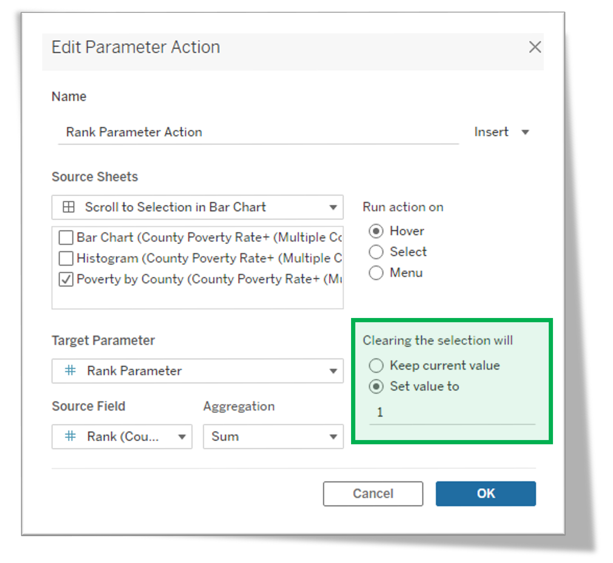
It worked great! There was, however, one last thing. As I set it up originally, when it filtered the bar chart, it wouldn't clear that filter out unless you highlighted another county. So if you moved your cursor off the map completely, it just kept the bar chart filtered. To fix that, I edited the parameter action so that when the action was cleared, it would set that parameter value back to 1 causing the filter calculation to show everything in the bar.
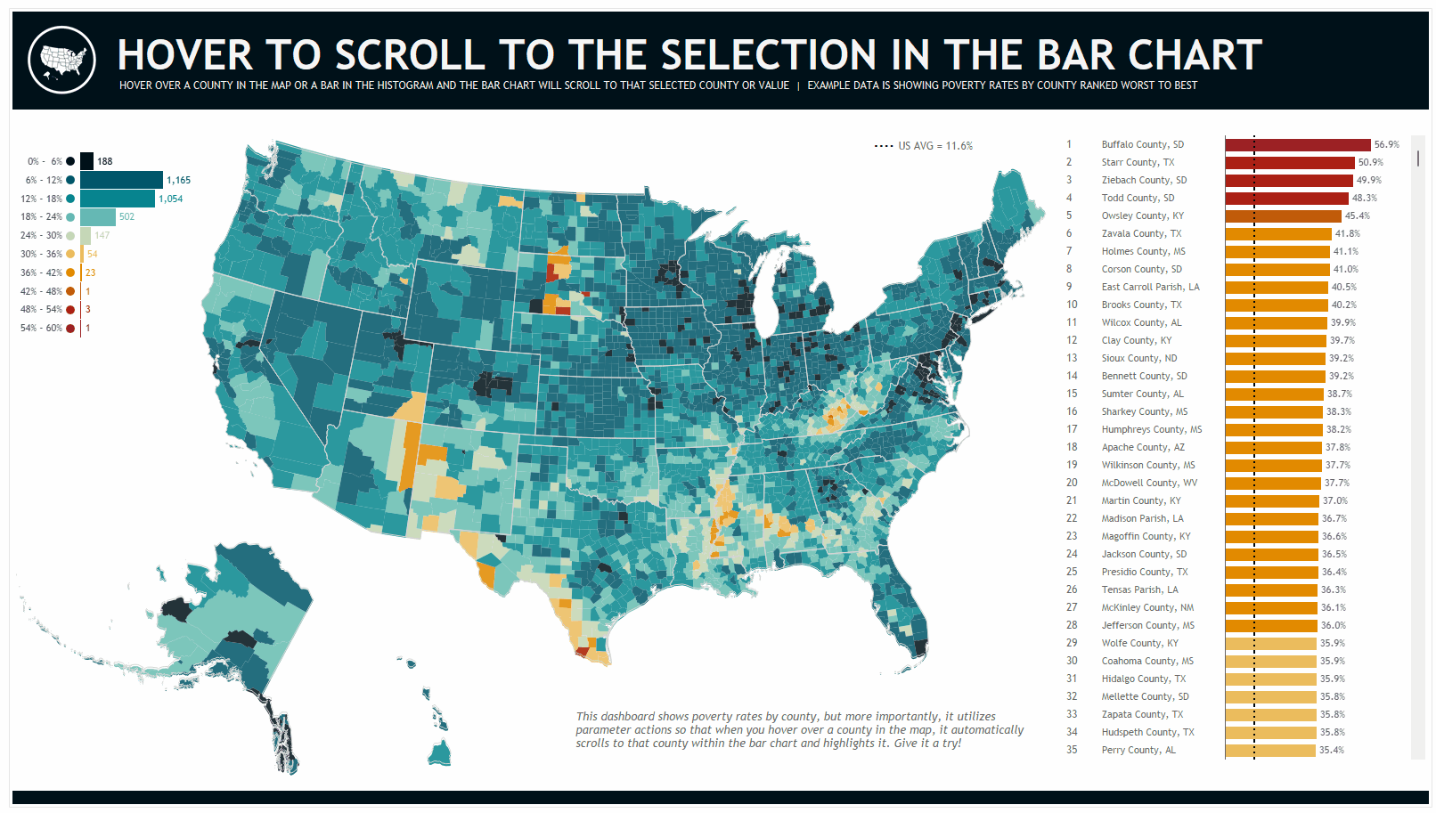
And here is the resulting dashboard in action (note that the parameter actions do have a bit of pause to them):
Again, you can check out this dashboard on Tableau Public to see exactly how it works. And I will note that the live dashboard has a similar structure to allow you to do the same thing with the histogram and bar as I did with the map and bar.
As always, thanks so much for reading and please feel free to reach out any time if you have questions.
Need help with anything related to Tableau? Through Moxy Analytics, Ken and I provide consulting services such as Tableau Lifeline (get us for 1 hour to help solve sticky problem), Fractional Data Here (get us on your team for N number of hours a month for whatever you want us for), Tableau Training, and of course, project work. Click the Icon below if you are interested.
Kevin Flerlage,August 14, 2023
Twitter | LinkedIn | Tableau Public


No comments: