
Let Stakeholders Have Their Pie & Eat it Too!

Stakeholders (and the whole world if I am being honest) LOVE PIE CHARTS! If you do a Google image search for "dashboard template", you'll find some form of a pie chart (pie, donut, etc.) in nearly every single one. Or try going on MidJourney and imagine "dashboard templates" - you'll get the same thing...pie charts galore:
I think Michael Scott said it best when he said this...

Data visualization practitioners know that pies are typically not the best chart for the job. It is challenging to compare the size of pie slices, they are incredibly difficult to label when lots of slices are introduced, pies unnecessarily introduce color, and the list goes on. For example, let's look at the following pie chart (where I've removed the labels) showing % of Sales:
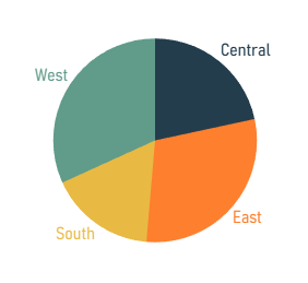
Can you tell me if the West or East region had more sales? I can't. You can see how difficult it is to get precise comparisons.
How about this pie chart showing % of sales by Sub-Category?

Again, same problem with comparing sizes of slices, but we've added labels to solve that problem, right? Well, in this pie there are simply too many values and adding those labels just causes it to be cluttered and illegible. And what if I wanted to label each sub-category? That would be impossible. Finally, look at all those colors - it's too much! In my opinion, this pie chart provides nearly zero value.
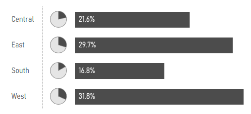
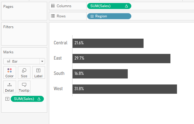
As data visualization practitioners, it's our duty to build charts that are easy to read and provide quick insights. I believe that most of us would turn these pie charts into another chart, most likely a bar chart. Below is a replication of the first pie chart in bar form.

With the pie, we could not determine if the West or East was larger. With this bar chart, it's easy to see at just a glance that the West has a larger percentage of the total sales. In addition, we've removed unnecessary color encoding and easily labeled the bars with both the region and the percentage. It looks great with no clutter and is simple to read.
But...and it's a big but...
1) There is something about a bar chart that doesn't scream "part to whole", at least in my opinion.
2) There are some great use cases for pie charts. When there are just two slices, it's very easy to quickly estimate a percentage. Check out the following pie chart. Can you guess the percentage it represents?
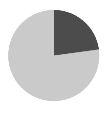
Without cheating, I estimated this at 23%. I bet you were close to that as well. The actual value is 22.8%. So yeah, this totally works.
3) To come full circle, your stakeholders love pie charts!
Because of this reason, I think a great way to satisfy your stakeholders' desire for pie charts is to use pie charts. Let me clarify that a bit, we can satisfy that desire for pie charts by implementing good usage of pie charts coupled with the best way to compare values - bar charts. The following chart is something I use often in my work with clients.
This chart shows the bar chart with its strengths of comparison, but also brings in the pie chart for its strengths for quick estimates and the immediate understanding that it is a part-to-whole visualization. With this design, we completely cover our bases while avoiding all the pie chart pitfalls. We provide a great visual with quick insights while satisfying your stakeholders' adoration of pies. (Note that Steve Wexler has written on this same topic and we share many of the same opinions. I strongly recommend you read his blog post on the topic and see how he solves a similar issue).
Although you can create this visual in any tool, I think Tableau is the bee's knees, so I'll show you how to build it in Tableau Desktop.
First, I've built this using two sheets, one for the pie charts and one for the bar chart. We could probably build this in one sheet using AVG(0) on columns, but the spacing would be really weird. Or we could build it using map layers, but in general, this is probably a huge waste of resources. So unless I have dozens and dozens of values, creating this in two sheets and just putting them into a container together on the dashboard makes the most sense.
So let's start with the bar chart. That's simple. Using superstore, put Region on Rows, SUM(Sales) on Columns (edit it to be a % of Total Table Calcualtion) and then put that same field on the Label card. With a bit of cleanup, it should look like the following.
Okay, now let's build the pie charts...which is a bit more complicated. We could build it in four charts, but let's just do it in one.
1) Start by duplicating the bar chart you just created.
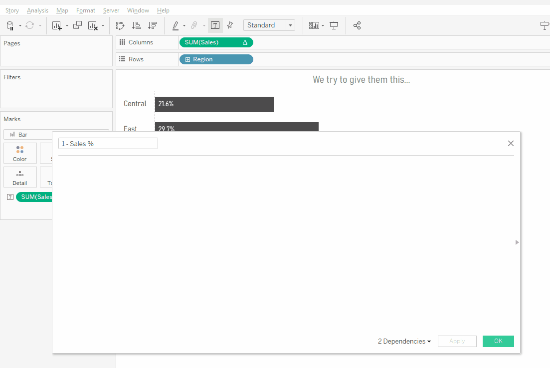
2) Right now, each region just shows its percentage, but when we create a pie, we will need that percentage plus "the rest". The rest is what is left of the 100% total. For example, if the Region measures 25%, the rest will be 75%. So create a calculation called "1 - Sales %" and the calculation should be: 1 - SUM([Sales]) / TOTAL(SUM([Sales])). (Note, I just typed "1 -" then dragged in the SUM(Sales) table calculation into my calculation window)
3) Change the mark type to Pie
4) Add Measure Values to Angle
5) Move the SUM(Sales) table calculation that is currently on Columns onto the Measure Values Shelf. Remove everything from this shelf except this and the 1-Sales% calculation that you just created.
6) Remove SUM(Sales) from the Label card.
7) Add Measure Names to Color
8) Change both the Sales and 1-Sales% table calculations to Specific Dimensions and check Region.
9) Adjust the colors and move the % of Total Sales color to the top in the legend.
That's a number of steps that could cause issues, so here is a gif of me doing it.
The final steps are simple. On a dashboard, bring out a horizontal container, and tile the pie chart on the left and the bar on the right. Right-click on the Region header in the bar chart and uncheck "Show Header". You'll also want to remove the ability to sort from each sheet. And you're done. If you'd like, check out my finished workbook on Tableau Public.


Nice article Kevin, I am working on power bi and planning to implement the same. Will try it and let you know
ReplyDelete