
Ten Tableau Gauge Styles

I built my first gauge chart in Tableau way back in 2017, only about a year after I started working with Tableau. Since then, I’ve created several other styles of gauges. Some of those have resulted in blog posts, while others were an attempt to address a need on the forums or a question asked of me directly. I recently looked through all these gauges and thought it would be fun to share them in a blog. So, in this blog, I’m going to share ten different gauge styles. Each is built slightly differently from the others, so providing detailed steps for the creation of all ten would create a blog so long that no one would ever want to read it (or write it, for that matter). That said, I’ve written about many of them already and I explained how to create most of the others on the forums. So, as I share each style, I’ll provide the basics of how each is created and, when available, I’ll link to the blog or forums post for further instructions.
A Brief Warning
Before I jump
into these examples, I do want to acknowledge the fact that these types of
charts are generally not considered data visualization best practice. They are not
as easy to read as other chart types such as bar or bullet charts and they can
be quite difficult to create. I addressed this topic in some detail in my blog,
Alternatives to NPS Gauges in which I share some alternatives to standard gauges. I also
talked about gauges in the context of data visualization best practices in a post
for the Data Visualization Society’s Nightingale blog, It’s Okay to Break the Rules, Sometimes. In that post, I said the following about
gauges:
Pretty
much all of us agree that it’s not the most effective way to show information.
Other charts, such as bullet charts, are better in almost every way. So, why is
it that executives still want gauge charts? It could be that these executives
simply aren’t data literate enough to know that they’re bad. But it could also
be that gauges are more visually pleasing and because executives have an
existing mental model that allows them to automatically understand them (if
you’ve driven a car, you know how a gauge works). Sometimes, we just need to
get our audience to the table, and if that means breaking a best practice or
two temporarily, then it may be worth it in the long run. Over time, as our
audience becomes more comfortable with data visualization techniques, we can
start to guide them towards less-familiar visuals.
I think that
gauges do have a time and a place and, when used carefully and sparingly, can
be quite effective. I’d just ask that you use caution when using gauges in your
own work.
1) NPS Gauge
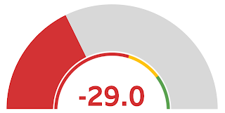
The first gauge I ever created in Tableau came from a challenge from Rajeev Pandey to visual Net Promoter Score (NPS). This technique essentially hacks a donut chart to make it into a gauge with a color key. NPS is measured from -100 to 100, but this can be easily modified to measure different scales.
How
To: Creating NPS Gauges in Tableau
Tableau
Public Example: NPS Gauge
2) Percentage
Gauge
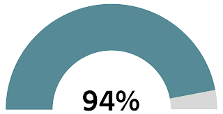
Not long after I
created the NPS gauge, I saw a Makeover Monday by Andy Kriebel where he
used Highcharts to create a series of percentage gauges. That inspired me to
create a technique for creating this type of chart in Tableau. The technique
was quite similar to that used by the NPS chart—essentially a hacked donut
chart. And like the NPS gauge, this can be modified to use different scales.
How
To: Percentage Gauges in Tableau
Tableau
Public Example: Percentage Gauge
3) Apple “Gather
Round” Gauge

In 2018, Apple
announced an iPhone event they called “Gather Round” and I particularly liked
the circular marketing design they used for the event.

So, I created a
gauge chart inspired by the design. Unlike my previous examples, this is a full
circle gauge visualizes a measure in a clockwise manner. The technique used was
essentially a sunburst with a numeric text element in the middle.
How
To: A Template for Creating Sunbursts in Tableau
Tableau
Public Example: Apple “Gather Round” Gauge
4) Rounded Gauge
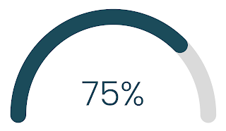
Recently, someone
on the forums asked if it was possible to create a simple gauge chart to
visualize percentages. I originally shared my percentage gauge blog, but they wanted
something slightly rounded. I created a solution that used trigonometry and
data densification to draw an arc using a line mark. It was exactly what the OP
wanted so he was thrilled, but he also couldn’t help but ask about another
gauge design he had seen. I asked him to create a new post, which we’ll review
in the next design.
How
To: How to Create a Rounded Gauge Chart?
Tableau
Public Example: Rounded Gauge
5) Rounded Gauge with
Circle Point
This design is
similar to the previous one but instead of a filled colored line, a simple
circle/dot is used to visualize the value and the chart is a little more than a
semicircle (though less than a full circle). I think the result is quite
lovely. This one also uses trigonometry to draw the line (plus a shape mark for
the circle).
How
To: Rounded Gauge Circle Point Chart
Tableau
Public Example: Rounded Gauge with Circle Point
6) Speedometer
Gauge

During a car
trip, my wife and I listened to an episode of her favorite podcast that
discussed a documentary called “The Impostor.” A key character in the story was
someone named Nancy and, throughout the podcast, they measured her on the “Nancy
Scale” where Nancy Kerrigan was on one end and Nancy Grace was on the other. I got
a good laugh out of it but also couldn’t help but create a visualization
showing how Nancy moved along the scale throughout the episode (I tweeted it to
the podcast and was quite happy that they liked it and retweeted 😊).
This gauge chart used a sort of speedometer layout. The speedometer itself was a
background image I created in PowerPoint. So, in
Tableau, I just needed to draw the needle. I did this using some trigonometry.
How
To: NA, but check out my blog on Trigonometry
Tableau
Public Example: The TCO Nancy Scale
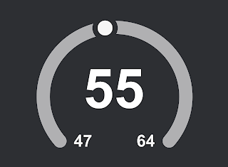
7) 3 Measure Gauge
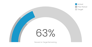
In 2020, a forums
poster asked if it were possible to visualize three metrics on a gauge. He
wanted a semicircle where the full 180° represented a target and two other
sections represented the progress towards the goal and the prior year, respectively.
I was able to create this using data densification and trigonometry.
How
To: Gauge or Donut Chart for Three Metrics
Tableau
Public Example: 3 Measure Gauge
8) 3 Measure
Gauge with Line

After creating
the 3 Measure Gauge, I thought it might work better for the prior year to be
showing using a simple line, rather than an arc, so I made a slight
modification to chart.
How
To: Similar to the 3 Measure Gauge (Download the workbook for
specific changes to the calcs)
Tableau
Public Example: Gauge
Chart with Target & Prior
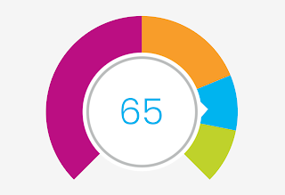
9) Half Donut Gauge
I’m not quite
sure why, but the forums is full of people asking how to create half-donut
charts. Unfortunately, these are very hard to create, even if you try to hack a
pie chart. I’ve seen a few approaches, but they fall very short and are quite
problematic, so in 2022, I created a reusable template for creating half donut
charts. As a bonus (not included in the blog), I created a gauge-like version
that includes a needle.
How
To: Half Donut Chart in Tableau (Download the workbook to see how the needle was
created)
Tableau
Public Example: Half Donut Gauge
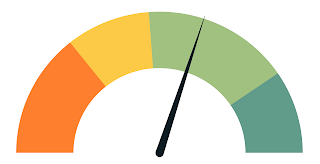
10) Thermostat
Gauge
I saved my favorite
for last! In 2022, a forums poster asked if it was possible to create a 270°
gauge with a sort of arrow that points to the value (kind of like an old-fashioned
thermostat). I thought the example they shared was lovely so I just couldn’t
resist creating it. While visually different, it uses a very similar technique
to the half donut gauge detailed earlier.
How
To: Designing 270° Gauge Chart
Tableau
Public Example: Thermostat Gauge
Wrap Up
I had fun
reviewing all the different gauges I’ve created in the past six years, and I
hope you enjoyed it as well. And maybe this will provide you with a little bit
of inspiration the next time you need a gauge chart. But just remember that,
more often than not, there is a better chart option available. Gauges should be
used sparingly, if at all.
Thanks for reading.
If you have any questions or comments, let me know in the comments section
below. And feel free to check out my Tableau Public workbook that displays all ten gauges.
Ken
Flerlage, September 18, 2023
Hire Us! | Twitter | LinkedIn | GitHub | Tableau Public


Will love to see how these compare to my own! https://public.tableau.com/app/profile/shanetville/viz/GaugeChartwithTargetLine/GaugeChartWithTarget
ReplyDeleteThank you. Download is disabled on your public chart: HalfDonutChartwithNeedle. Please could you check, if could please enable allow download workbook. https://public.tableau.com/app/profile/ken.flerlage/viz/HalfDonutChartwithNeedle/HalfDonut
ReplyDeleteSorry about that. Should be downloadable now.
DeleteHi the workbook was disabled for download, it would be very helpful if it’s enabled
ReplyDeletehttps://public.tableau.com
/views/HalfDonutChartwithNeedle
Donwload is enabled on the workbook, so not sure what's going on. Feel free to email me and I can send the workbook. flerlagekr@gmail.com
DeleteIs there a way to dynamically color the Actual portion of the 3 Measure Gauge with Line? I love this chart and figured out how to recreate with my own data, but I'm really struggling with trying to color it based on a particular measure, like % of Prior Period or % of Target.
ReplyDeleteThat should be possible. Can you email me? flerlagekr@gmail.com
DeleteIs there a tutorial video of Gauge Chart with Target and Actual Sales with needle? Filter by eg territory/country
ReplyDeleteNo, we haven't recorded a video on this.
Delete