
5 Ways to Filter a List of Measures

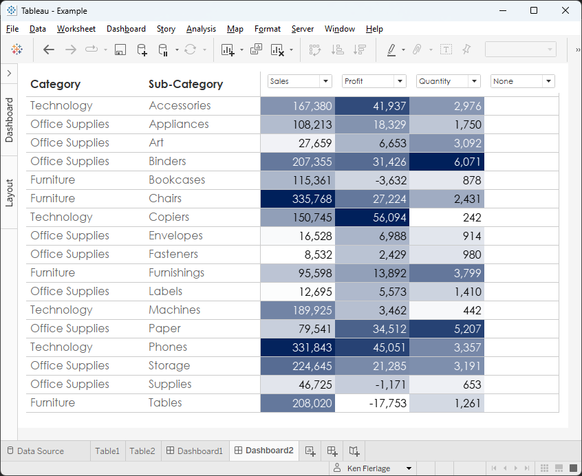
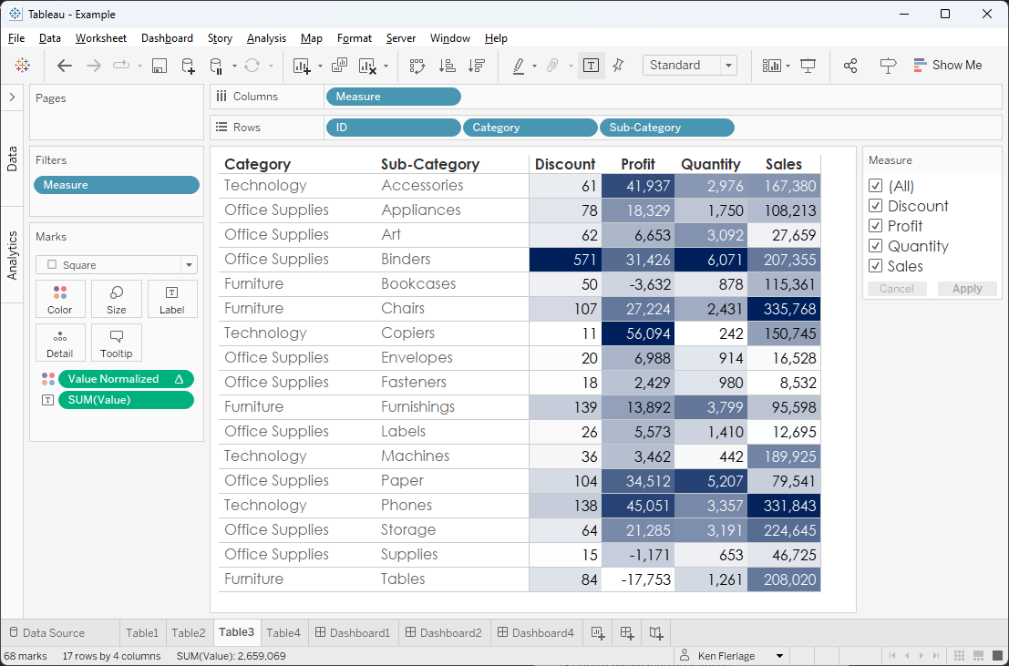
A common Tableau request I’ve encountered—on the Tableau Community Forums and elsewhere—is a need to provide a filterable list of measures for end users. For example, using Superstore, we might have a table and want to allow our users to select which measures they’d like to show:
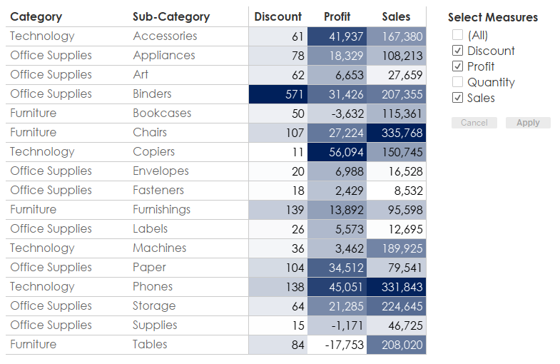
There are some relatively straightforward
ways to do this, but we’ll start to run into problems quickly. So, in this
blog, I’m going to share five different methods for allowing our users to
select which measures they want to display. I will warn you upfront that none
of them is perfect—each has its own limitations and complexities—but hopefully,
we’ll find a method that works in our particular situation.
1) Filter on Measure Names
The most straightforward method is to
filter on the special dimension, Measure Names. Just create a filter on
this field and voila, we have a filter allowing users to select which measures
will be displayed. But this has one major drawback as shown below.
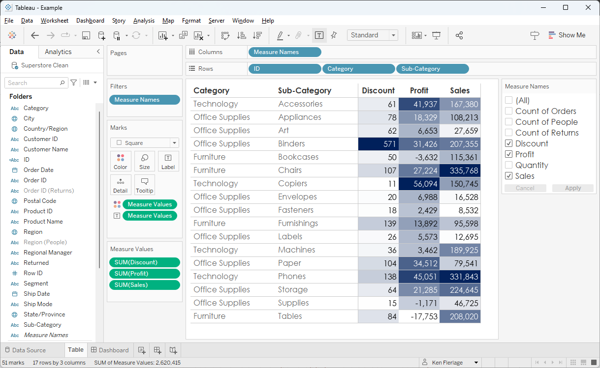
When we use Measure Names as a
filter, it will automatically show all our measures. This will include the
table counts (Count of Orders, Count of People, etc.). And if we create any
calculated fields that are measures, those will be included in the filter as
well. If this were a normal dimension, then we’d create a copy of it and use
that as a filter excluding the values we do not want to show, and then modify the
filter that is exposed to the user such that it only shows “Only Relevant Values.”
Unfortunately, we cannot copy the Measure Names dimension or use it in a
calculated field, so that’s not an option here, so we’re a bit stuck.
In most cases, we probably want to allow
our users to select some of the measures but not all of them. So, this method
rarely works without some additional hacks (we’ll come back to these
momentarily).
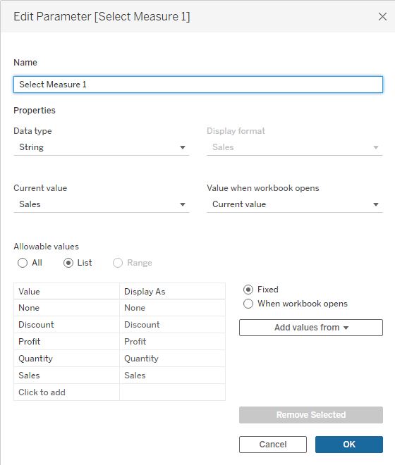
2) Create Multiple Parameters
Another method I’ve used is to create
parameters to allow our users to select the measures they’ll be showing. Parameters
are single-select, so we’ll have to create multiple parameters. We start by
creating a parameter like this:
Then we create a calculated field to
get the correct measure:
Measure 1
// Which measure
should be used?
CASE
[Select Measure 1]
WHEN
"Discount" THEN [Discount]
WHEN
"Profit" THEN [Profit]
WHEN
"Quantity" THEN [Quantity]
WHEN
"Sales" THEN [Sales]
WHEN
"None" THEN NULL
END
Then repeat this process multiple
times, adding these new Measures to our table, resulting in something like the
following:
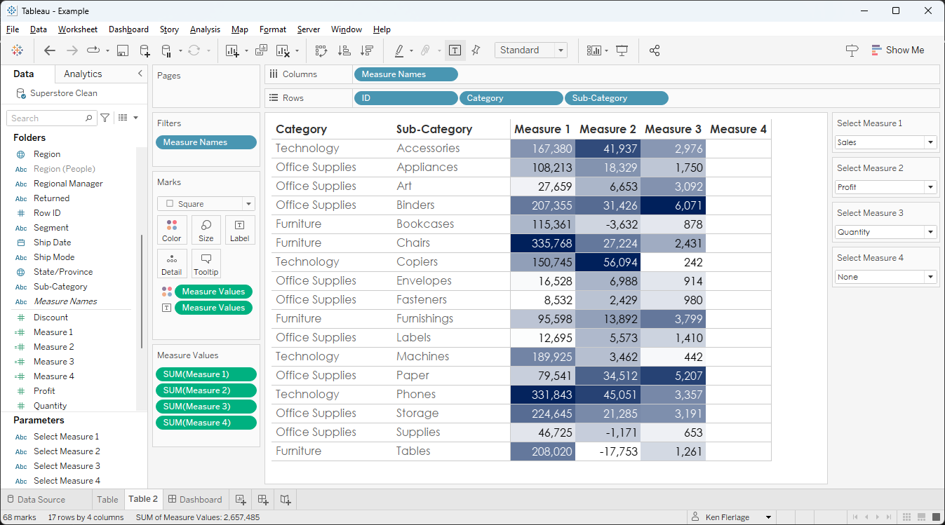
This has several problems. First, we must
create multiple parameters. What if we create too few and people want to display
more measures? Or, if we create too many, we end up with a table with a bunch
of unnecessary columns. The other big problem is that the column headers
display as “Measure 1”, “Measure 2”, etc. I’ve solved this problem in the past
by floating parameters over the column headers on the dashboard.
But this introduces an additional
problem—we can no longer sort the measures by clicking on the column headers.
3) Pivot the Measures
Our third approach is to pivot our
measures. By pivoting our measures, we’ll end up with a data structure like the
following.
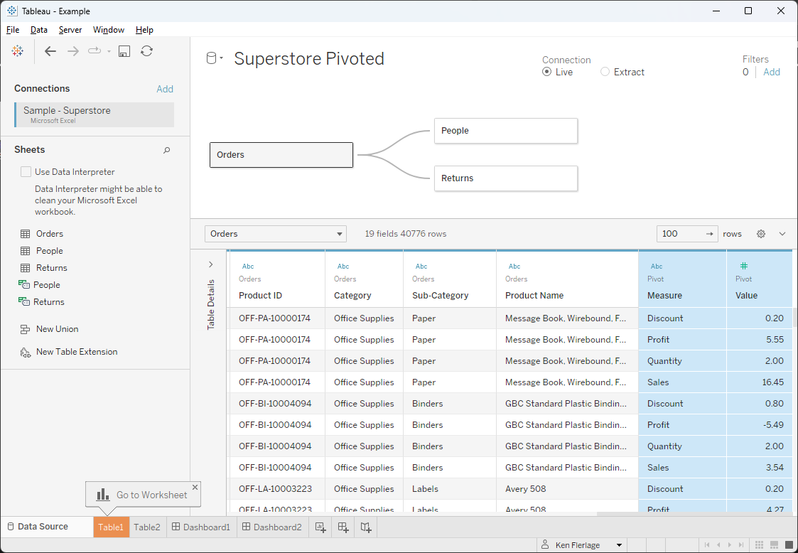
Note: I’ve changed the names of Pivot
Field Names to Measure and Pivot Field Values to Value.
We’ve only pivoted the measures we
want our users to be able to select, so all we need to do is expose our new Measure
field as a filter.
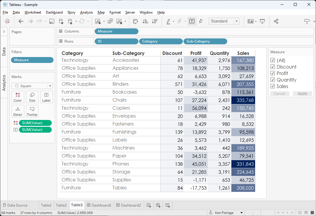
This method also has several flaws. With
approach # 1, we can right-click the Measure Values pill on the color
card and select the option to use separate legends for each measure, but that’s
not an option here. To deal with this, we need to normalize the values so
that the lowest value for a given measure is 0 and the highest value for that
measure is 1. We can do that using the following calculated field:
Value Normalized
// For each measure,
set the lowest value to 0 and highest to 1.
// Formula: (Value -
Min)/(Max - Min)
(SUM([Value]) -
WINDOW_MIN(SUM([Value])))
/ (WINDOW_MAX(SUM([Value])) - WINDOW_MIN(SUM([Value])))
We then drop this on the color card
and compute the table calculation so that it restarts at each measure.
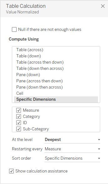
That will give us independent color
scales (though we’ll have to use the same color palette for all four measures).
Another issue is that some things are
difficult to do in Tableau with this “tall” format (as opposed to a “wide”
format). Something like calculating Profit Ratio (Sum of Profit ÷ Sum of Sales)
becomes difficult because those two values are on separate rows. And there are
several other scenarios where this tall format becomes problematic (for more on
this subject, see 4
Common Tableau Data Model Problems…and How to Fix Them).
And, of course, this method
essentially duplicates our rows multiple times. That’s not a huge deal with a
small data set like Superstore, but it could be problematic with a data set of
tens or hundreds of millions of rows.
Finally, not every data source can be
pivoted easily right within Desktop. We may have to use either Tableau Prep or
custom SQL to pivot our data (for more on this, see 3 Ways to Pivot Data
for Tableau).
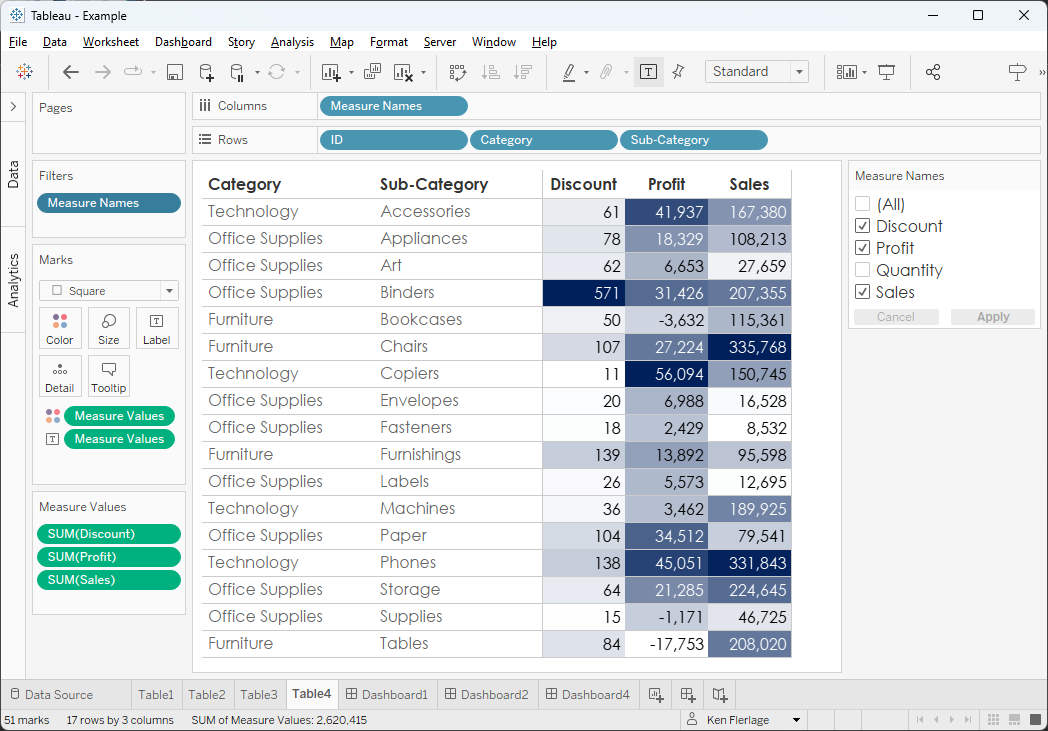
4) Hide Measures or Change Them to
Dimensions
I personally don’t love methods 2 and
3, so let’s return to the use of Measure Names. Remember from the first
approach that the biggest issue was that the filter shows measures we don’t
want our users to see. Perhaps we can find a way to remove those measures? In
our example, we want to remove the table count measures. Well, we’re in luck! All
we must do is hide those in our data set.
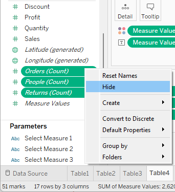
With those hidden from our data
source, they’ll no longer appear as options in the Measure Names filter
(Note: We may have to remove the filter then add it back to get the table
counts to disappear from the filter).
This works great, but what if we want
to use those measures elsewhere in our workbook? Or what if we have calculated measures
that we don’t want users to select? The fact of the matter is that we’ll almost
certainly have some measures that we cannot hide, but we don’t want visible
to our users. So, while this method seems viable, it will rarely work in real
use cases.
Here’s a slight variation on this
method. Instead of hiding the measures we don’t want to show in the filter,
change their default state to dimensions. Since they are dimensions by default,
Tableau will not include them in the Measure Names filter. But we can still use
them as measures elsewhere in our workbook by changing individual pills to measures.
The biggest drawback of this approach is that it only works with non-aggregate
measures. For example, if we wanted to hide “Discount”, we could do that since
the field is not an aggregate. However, something like Profit Ratio or the
table count fields are aggregates so we won’t be able to change them to dimensions.
5) Create a Separate Data Source
The final method requires that we
create a separate data source. Essentially, we’ll make a copy of our data
source that will only be used for the sheet on which we want our users to
select their measures. Since this data source will only be used for that one
sheet, we can hide any measure we don’t want to be visible to our users—without
impacting all of the other sheets.
The biggest problem with this
approach is that we’ll likely want to have some filters that apply across multiple
sheets in our workbook. For example, let’s say we have a page in our dashboard
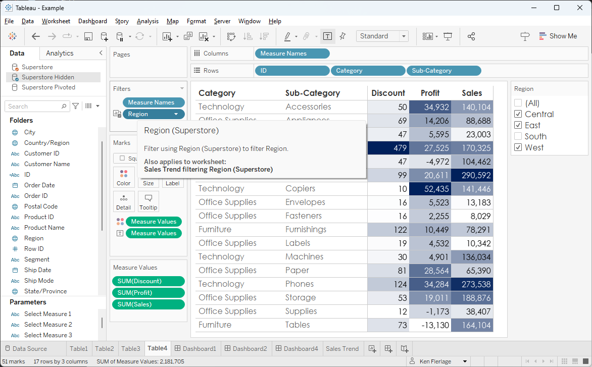
that shows sales trends, and we have a filter on Region.
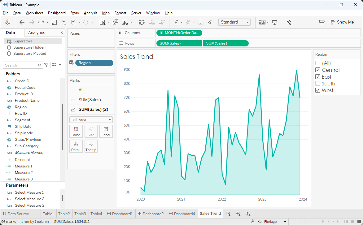
We might want that same Region
filter to apply to both that trend chart and to our table. Fortunately, we can use
blending to apply that filter across two different data sources.
Unfortunately, this breaks down
pretty quickly. If the primary data source use relationships to link tables
together (this refers to the method of “joining” tables in the data model, not
blending relationships), then the cross-data source filters won’t work. And
certain types of filters (e.g. Measure Filters) do not work across data sources.
Wrap-Up
So, there we have it—five ways to filter
a list of measures. As we have seen, none of these methods is perfect. Each has
several flaws. But I’m hopeful that, when you’re dealing with this requirement,
one of these methods might prove to be good enough.
Thanks for reading. If you have any
questions or comments, let me know in the comments section below.
Ken Flerlage, November
6, 2023
Twitter | LinkedIn | GitHub | Tableau Public


No comments: