
Ten Tips & Techniques Including the Easy Way to Clear All Filters (Round 7)

Well, I've done six previous Ten Tableau Tips blog posts, how about a seventh one? I hope at least one tip is something you've never seen before.
Please note that some of these GIFs may appear small on screen. They are, however, recorded at a higher resolution. For a closer look, you should be able to simply zoom into your web browser or right-click and open in a new tab (which will show it as it was recorded).
1. Copy & Paste Values into List Parameter
I am 99% sure that in past versions of Tableau, there was an option to paste values into a parameter. However, that seems to be gone. I fiddled with this the other day and really struggled to get it work...but I did. So the trick is to copy your list of values (from Excel or wherever) then click in the space below "Display As", then press CTRL V to paste it. (If you click in the space under "Value", it will paste them all into a single cell).
2. When Adjusting your X & Y Coordinates, Tableau Jumps to Another Object
I'm sure you've all run into this before. You are adjusting the X Y coordinates of floating object in the Layout pane. You adjust the X position then TAB to the Y position and Tableau selects a different object...it doesn't stay on the object you were trying to adjust.
The solution to this is simple and it has yet to fail me. When you enter a value (say in the X potion box), before you press TAB to go to the Y position, click the ENTER key. So it goes like this, Enter a X value, press ENTER, then TAB. Enter a Y value, press ENTER, then TAB. It works every time!
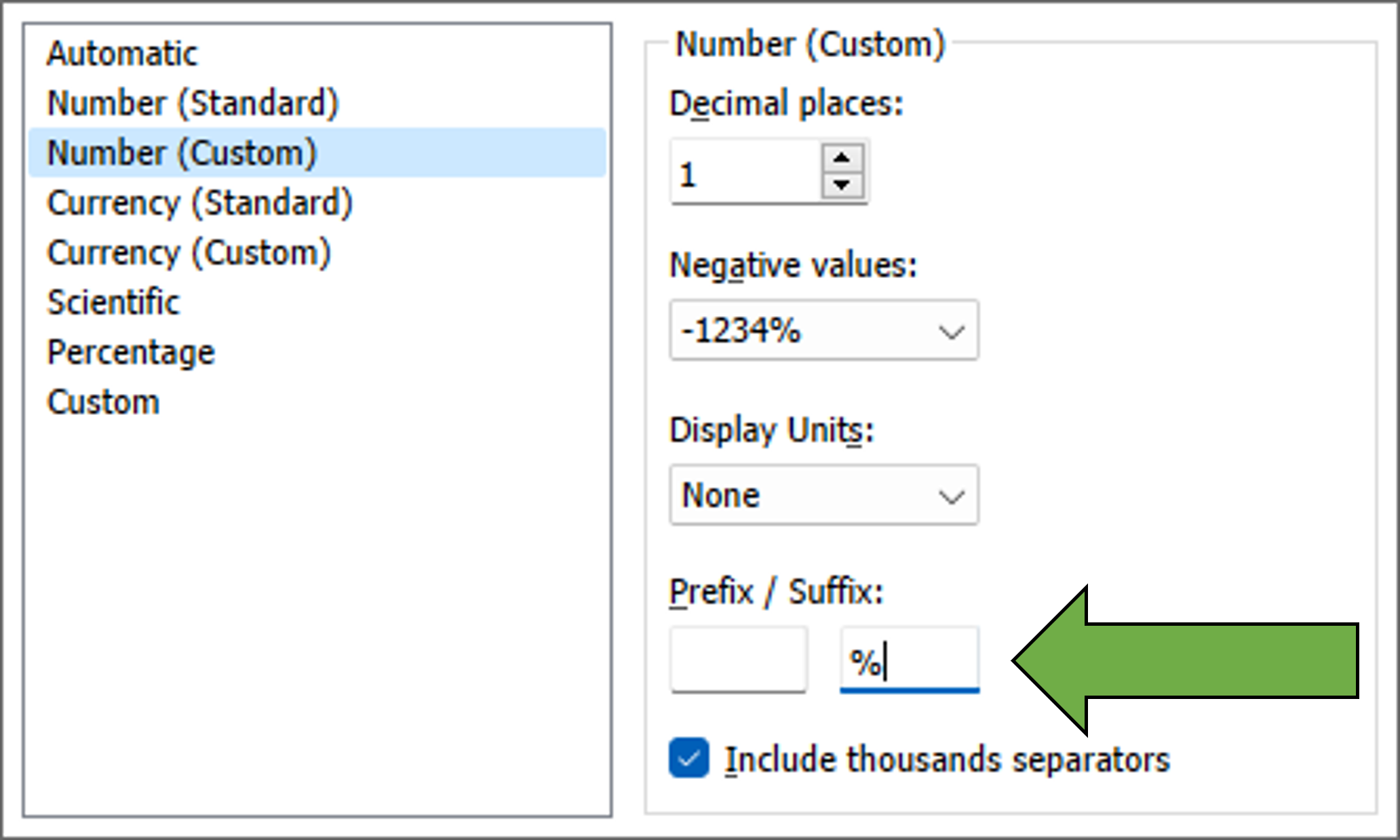
3. Prefix & Suffix
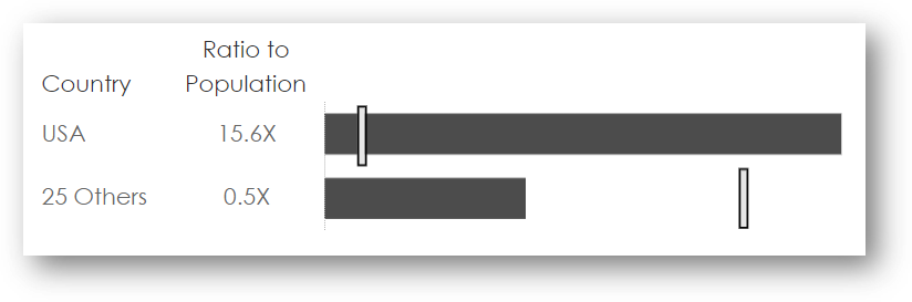
Assume you have a percentage but it is coming in from your database as a whole number - say 28 instead of .28. If you change the formatting to be a percentage, that 28 value becomes 2800%. You could create a calculation to divide your number by 100 (and that's likely the best way to handle it) or you could just use a Suffix. To do this, format the number, set your number formatting and add "%" as your suffix value:
I recently did this in my Serial Killers viz where I wanted to show a ratio. So instead of just showing 2.5, I wanted to show 2.5X. So I did that with a suffix. And you can do prefixes as well! I've got a lot of hours into using Tableau and I've never literally never noticed this before!
4. Remove the Weirdo Yellow Sticky Note on Highlight
I talked about this one in our TC23 presentation, but realized I've never written about it. The problem is when you utilize a highlight action and you get that weird yellow highlighting. Here is the example from TC23. See that wierdness at the bottom right? Well, we can fix that! To see how, start watching at 22:39 into this TC23 recording. (You can sign up for Salesforce + for free to watch).
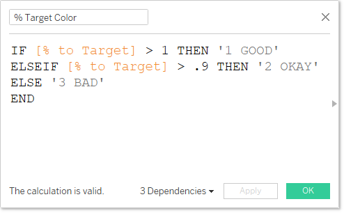
5. Apply Colors but Value is Missing
Okay, here is the scenario. You are tracking % to target and you want the bar to be one color if it's 100% or more (GOOD), another color if it's 90% - 100% (OKAY), and another color if it's below 90% (BAD). The calculation might look like this:
You then add that calculation to the Color card and you get this.
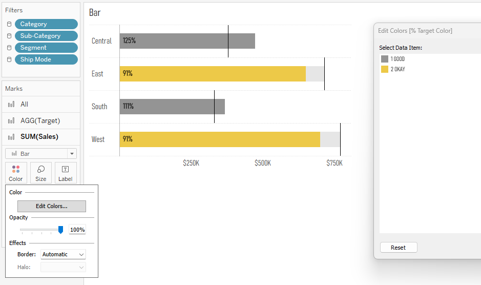
Our above calculation is supposed to yield 3 values (GOOD, OKAY, BAD), but in this case, with actual data, there are only GOOD and OKAY values. There is no BAD value so we can't assign a color to BAD. Inevitably what happens is that we publish this dashboard and set it to refresh, then a week later, one of the values moves to BAD and Tableau just automatically assigns a color to it.

You see that the BAD value dropped in and Tableau just assigned a green color to it. That's really a bad thing because you are now telling your users that something that is bad looks good (green typically means good).
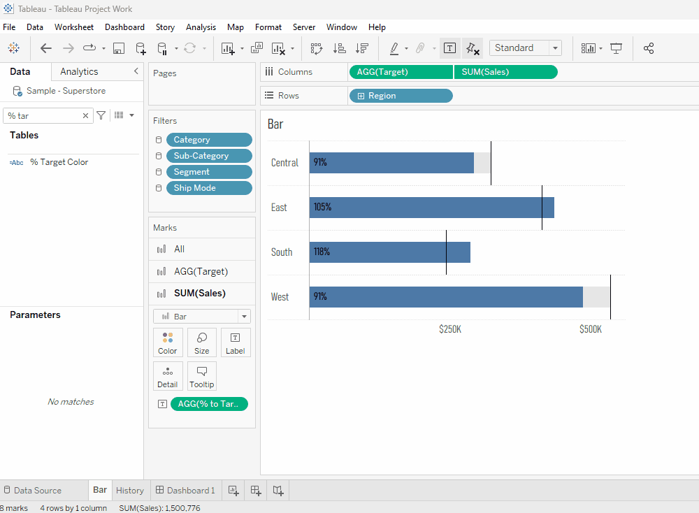
So you need to make sure your dashboard will reflect the proper color when the data updates even if that value is not currently available. The easiest way to do this is to simply edit the calculation and force that value to show, then assign the color, then change the calculation back. Then when your data updates, the proper color will be assigned to the value. Check out this gif to see what I mean.
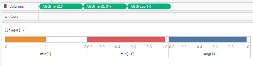
6. Use AVG(1) instead of MIN(1) or MIN(1.0)
In Tableau Tips round 5, I suggested users utilize MIN(1.0) instead of MIN(1) so that the axis becomes a decimal instead of an integer therefore providing more flexibility. For that tip, see #1 in this blog post.
Well, this came up on LinkedIn and Valerija Kirjackaja suggested that AVG(1) would have the same impact. MIN(1) or MAX(1) yield integer values whereas AVG(1) yields a decimal. This may not be a huge time savings over MIN(1.0), but conceptually I thought it was quite interested and logical that average yields a decimal versus an integer. Below, I've plotted MIN(1), MIN(1.0), and AVG(1). Check out the axes to see that the first is an integer and the second and third are decimals. Cool stuff, Valerija!
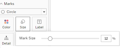
7. Input Size Value on Size Slider
In Tableau, I've always wanted tick marks or a number entry filed on the size slider. This would allow us to get the size perfect and also sync up with sizing on other sheets. In fact, for years, I've been promoting this Idea on the Ideas Forum asking Tableau to implement this (and I'd appreciate an upvote on that).
Well, Whitney Wood found out that Web Edit allows for this exact functionality! Check out her tip here on Twitter. I've included an image of it below. Really cool, stuff!
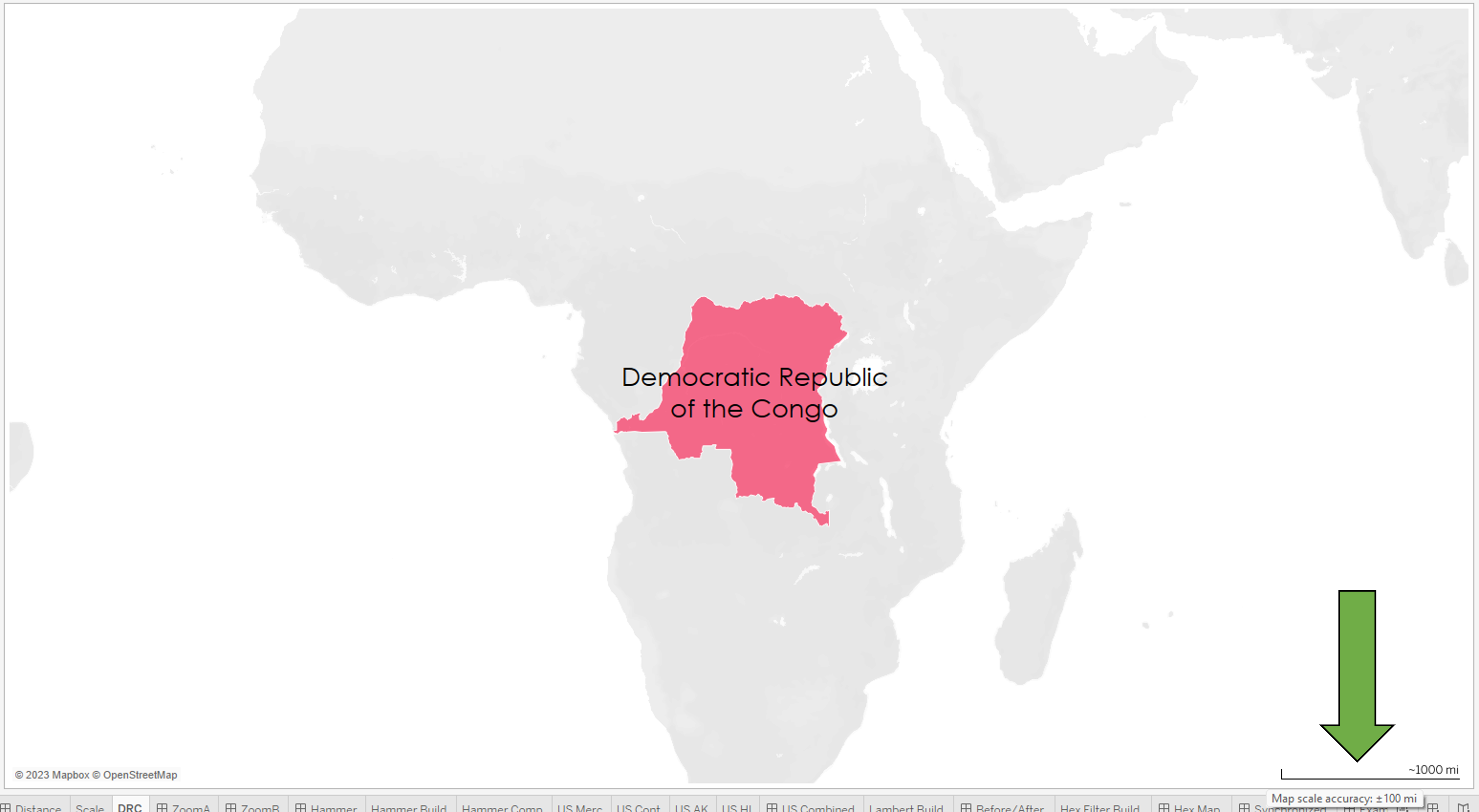
8. Map Scale Margin of Error
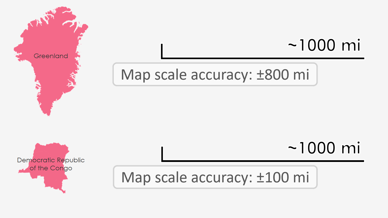
Here's another tip we shared in our TC23 presentation but have not yet written about. This one comes from Sarah Battersby who was influential in getting this added to Tableau many many years ago. It has to do with map scale margin of error. If you create a map and add the legend, you can hover over the legend to see the margin of error. Before I show this, you should be aware that the standard map projection (Mercator Projection) used in Tableau (and in most applications as a default) skews land mass more and more as you get further away from the equator. For example, Greenland shows about the same size as the continent of Africa, but if you bring Greenland down to the equator, it is way smaller than Africa.

Okay, now the tip. We will use Greenland and the Democratic Republic of the Congo (DRC). First, let's look at DRC. Here you see it on screen, I've added the legend at the bottom right that shows ~1000 mi, then when you hover over that legend, it says Map Scale Accuracty +/- 100 mi. That's pretty cool.
But if you do the same thing with Greenland, you get the same ~1000 mi, but with a Map Accuracy of +/- 800 mi!!!!!!!!! Wow, what a difference. Here they are together with the legend zoomed in.
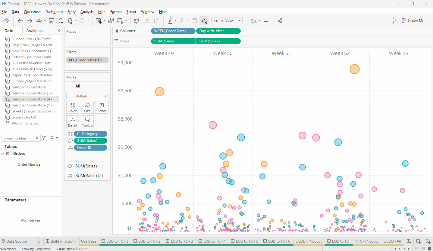
9. A Simple Way to Create a Random Value
Jeff Shaffer has a great blog post about jitter plots and within that blog post, he talks about a variety of ways to create random and pseudo-random numbers. This is a great blog post, so I suggest you check it out.
During my time at Unifund, I almost always utilized Method 2 (which is a couple of steps). But one day, my colleague, Ethan Hahn, made a suggestion that I absolutely loved. He just took an Account Number (or any unique number - must be an actual number) and just put SIN in front of it - SIN([Account Number]). This creates a pseudo-random number in just seconds.
The following GIF shows an example from our TC22 presentation where I have orders by week and I've jittered it using Jeff's method. The gif shows how I swap it out for the SIN of the order number with basically the same results - just way faster.
10. Clear All Filters
There are a bunch of techniques, hacks, and extensions out there to clear all filters, but I've always struggled with them all. They just never seem to do what I want them to do and take too long to implement. My solution to clearing all filters and parameters...well really, just to reset the entire dashboard...is SUPER SIMPLE and only takes about 10 seconds.
Take a look at the gif, which I did in Web Edit. First, you must have published the dashboard somewhere. Next, copy the URL. Edit the dashboard and add a "clear filters" image to the dashboard. Paste the URL into the link of the image. Clear out all filters and parameters, then publish. Now when a user clicks this button, it will open a clean new dashboard in a new tab. (The fact that it opens in a new tab is likely the biggest drawback, but the time it takes and the fact that it always works...well, that's worth it).
10a. Clear All Filters
That's a wrap...10 more tips! Thanks for reading!


The TC 2023 recording (under tip #4) (https://www.youtube.com/watch?v=QFAFanbLPDc) is invalid/not opening
ReplyDeleteHmm. Not sure what happened there, but I fixed it. Thanks for the heads up!
Delete