
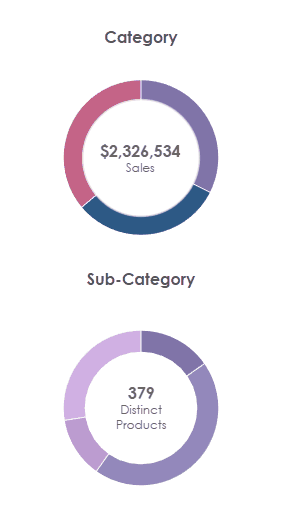
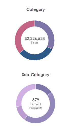
Using a Donut to Filter Another Chart in Tableau

In November, Jennifer Dawes
issued a challenge on Twitter (Yeah, I know the name changed, but I’m
gonna keep calling it Twitter…). She was attempting to use a donut chart to
filter another donut chart. To build a donut chart in Tableau, the typical
approach is to use a dual-axis chart where one axis is a pie and the other is a
white circle that sits atop the pie, creating the donut hole. Jennifer needed
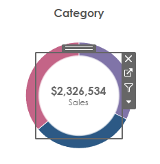
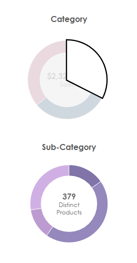
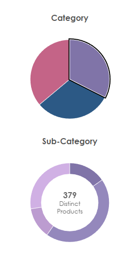
to be able to click on one donut and filter the other. The problem is that,
when you click one “slice” of the donut, Tableau selects that entire pie slice
as shown below.

This creates an awkward and confusing
user experience, so she wanted to find a way around this. The Tableau Community
is amazing so some of us jumped in immediately to try to find a solution to the
problem. In this blog, we will share a few potential solutions we tried and
some of the drawbacks we encountered along the way. Feel free to follow along using
the workbook on
Tableau Public.
Float the Donut Hole
Kevin had a quick and dirty
solution—instead of creating the donut hole with a second axis, create a
separate sheet that is just a white circle with the total sales label. Then
float that over the pie chart, creating the donut hole effect. Since this is a
separate chart that floats over the pie chart, it’ll cover up the rest of the
selected slice.
This works pretty well, but it has a
flaw. The floating sheet is a square and that square covers up large portions
of the pie chart behind it. If you click on a portion of that square, it won’t
select the pie behind it. In the end, unless the donut hole is very small,
you’ve made it quite difficult for your users to click on the donut slices.
Map Layers
Jeffrey Shaffer, a member of the
Tableau Visionary Hall of Fame, thought that perhaps map layers could provide a
solution to this problem. Essentially, we could create the first donut chart
using map layers, thereby allowing us to have more than the two “layers”
allowed by dual-axis charts and that might provide some flexibility. For this
solution to work, we need a geographic field—we can do that by creating the
following calculated field:
Layer
// Create a single
geographic point for our donut chart.
MAKEPOINT(0,0)
We then drag
that onto our view as many times as we like to create our different layers. As
with any donut chart in Tableau, we start with one layer for the pie chart and
one for the donut hole (a circle mark).
Note: There
are some other tricky bits to this. Making the pie and hole marks big enough
and just the right size is difficult (I used a parameter on each size card).
And getting the pie chart centered is also a bit tricky (I used the “pan” tool
to move it into the right spot). To see these solutions, please look at the
workbook, available on Tableau Public.
At this point,
the result is pretty much the same—when you click a pie mark, Tableau selects
that entire slice. Jeff’s first solution was to make the filter action trigger
on hover. By doing that, the slice never gets selected so we never have the
problem (Note: This would also work without map layers).
It still gives
a sort of highlight of the pie as you hover, but that’s not a huge deal. But
what if you want your users to actually click the mark to trigger the filter? Jeff
had a clever idea for this—what if we create a third map layer that is a sort
of invisible clickable pie so that, when someone clicks the donut chart,
they’ll actually be clicking the invisible pie? And, since it’s invisible, it
won’t matter if it’s selected. So he created a third layer with a pie chart,
then assigned the transparent
hex color to each section. I was personally
feeling pretty good about this solution, but it didn’t quite work as expected.
Unfortunately, that transparent hex color doesn’t remain transparent when a
mark is selected, so we end up with a white selected pie slice.
So close!
Fake Highlights & Filters
Several of us had the idea to try a
few of the “fake highlight” or “fake filter” techniques that the community has
invented. The fake highlight techniques use a highlight action to force a mark
to appear that it’s not selected, while the fake filter techniques use a filter
action to force the sheet to be filtered. Since mark selections are reset when
a sheet is filtered, these techniques essentially deselect the mark. There are
three primary techniques that I’ve used:
Yuri Fal’s Filter
Technique (as Documented by Luke Stanke)
Ryan Sleeper’s
Filter Technique
(part of a larger blog on Boolean toggles—see the very end of the blog for this
specific technique)
I love Brian’s technique and use it
regularly, but I suspected it might not quite work in this case because it does
sort of keep the mark selected—it just removes the grey highlighting in all the
other marks. So, in this case, it would remove the grey highlight on the other
pie slices, but it wouldn’t necessarily force the donut hole to be in front.
Next, I tried Yuri and Ryan’s
techniques. I’ve used Yuri’s with some success in the past (though I’ll admit I
don’t really understand why it works), but I’ve run into some problems where it
works differently on the web than on Desktop. Ryan’s technique is one that I
recommend all the time and it works in many scenarios, particularly the Boolean
toggle scenario shared in the blog. But neither of them quite worked in this
scenario either—the pie charts still remain visible above the donut hole.
Forced Filter
With none of the “fake” options above
working, I decided to turn to a trusty method that has never failed me—forcing
a filter. I first learned this technique from Jacob Olsufka when he and Rody Zakovich employed it for
a color-changing toggle in their Triple Play Art viz. I’ve shared
this technique previously so I won’t go into a lot of detail here (see the
How-To section of Customize Your
Tableau Filters
for a bit more detail), but the technique essentially entails relating your
data to another data set that contains two rows. We then use filter actions to
force the sheet to toggle a filter between those two rows. I’ve used this in
countless scenarios and it has always worked for me since it is always
filtering the view. So, I gave it a try in our pie chart scenario and voila, it
worked!!
It does have a couple of strange
problems. As you hover, you can see the entire slice highlighted and, when you
click, the entire slice is temporarily visible before it disappears.
Note: This problem is even further
exacerbated if you have animations turned on, so I recommend turning those off.
The reason we
see this behavior is because the viz is being rendered client-side. When rendered server-side, the amount of interactivity is reduced, so what if we
force it to render server-side? I created a new sheet using a polygon
mark, floated it on the dashboard then used the coordinates in the Layout pane
to push it beyond the bottom edge of the dashboard (essentially making it
invisible to users). Polygon marks cannot be rendered client side, so this will
have the effect of forcing server-side rendering for the entire dashboard.

And, with that
in place, I think we’ve got it working exactly as we intended!! That was way
harder than it should have been!
But, I think
there are a few other solutions we should consider...
What About Polygons?
One option would be to dispense with
the pie chart-based donut chart altogether and build our donut chart using
polygons. We’d simply draw the outside portion of the donut chart. And, since
there are no pie slices, we wouldn’t have the same problem as we’ve detailed
above.
I’ve previously used a sunburst template to create a
donut chart (in the blog, I even talked about the problem with selecting a pie
slice) and I’ve also created a template for a
half donut chart.
So, creating a donut chart with polygons is clearly doable. The problem is that
it’s hard—it requires data densification, trigonometry, and more than a few
complex calculated fields. In my opinion, that’s far too much work just to solve
this problem—the juice isn’t worth the squeeze.
Choose a Different Chart
A final option is perhaps the most
obvious. Kevin suggested just using an entirely different chart. If you wanted
the same basic idea as the donut chart, you could just use a pie chart.
This works well and doesn’t require
any of the hacks we discussed previously.
Another option would be to leverage
bar charts. That would also be easy to build and would have the secondary
effect of making it easier to see exact precision in the different categories
and sub-categories.
Closing
Okay, well that should cover it. We
thought this was such an interesting challenge that we couldn’t resist trying a
few things and writing about it. While I think this is a somewhat niche use
case, the underlying problem of deselecting a mark is one that I run into
frequently, so I’m hopeful that some of the different techniques shared here
could come in handy for you in the future.
Thanks for reading!! As a reminder,
you can see all these examples on Tableau Public.
Ken Flerlage, January 16, 2024
Twitter | LinkedIn | GitHub | Tableau Public


I had the same issue once and I think I solved it by using a parameter and filter action on the control donut. For example, put category on color and then make a "selected-category" field that adds an extra character (like '*') to the detail if Category=Category_param. Use the parameter to filter sub-cat donut. I had to set up a parameter action to assign the Category and create a fake-filter action (Ryan's method). It took some playing around and I'm not really sure why it worked. I think the original slice you selected gets filtered out and is replaced with a slice that has the extra character in detail. The only issue I have is selecting the same slice twice colors the entire pie.
ReplyDeleteThis comment has been removed by a blog administrator.
ReplyDelete