
Our Top Ten Favorite Tableau Vizzes of 2023

In late 2021, Ken and I chose our favorite Tableau Public vizzes ever. Then in 2022, we started an annual tradition of choosing our favorite vizzes of the year, this time was for 2021. We continued that tradition in 2022 and are doing it again for 2023. In this blog post, we will reveal our top ten favorite vizzes of 2023 starting at number ten and moving down to our favorite viz of the year. For each, we will provide a small screenshot, but we encourage you to click on the links to see them in their full glory. Please note that although I am composing this blog post, all of the selections and commentary were developed as a team between Ken and me.
But before we press on, we do have some ground rules. Some of these rules have been slightly modified from previous years.
1) Data Visualizations Only: Throughout the year, people create some absolutely amazing and incredibly useful instructional workbooks on Tableau Public. We love these so much, but for this list, we will be focusing on “pure” data visualizations only.
2) No Flerlages: We can't pick any of our own vizzes or each other’s.
3) Brian Moore Rule (also known as the Adam McCann Rule): We will pick no more than one viz from any single author (note that if we allowed more than one, Brian would have, in fact, had more than one).
4) Attribution: we chose these vizzes because we love them. We will do our very best to provide information about the author's original inspiration and give attribution if applicable. That said, we did not create these vizzes so we simply may not know where the author was inspired.
5) There are Thousands of Amazing Vizzes: There were soooo many amazing visualizations published to Tableau Public this year, way more than we could ever begin to mention here in this blog post. If you don't get a mention here, don't worry. Keep learning, keep creating, keep inspiring others, and keep doing amazing work!
Okay, before we move on, you might be wondering why the title image shows a mouse wearing sunglasses while dancing at a disco. Well, because it's awesome just like these vizzes!!! And because Bing Image Creator is also one of our favorite things from 2023 😊.
Okay, now onto the top ten!
10) 100 Years of July Heat by Christian Felix

9) Video Volunteers by Nur Adhyaksa

8) Corporate Finance Dashboard by Pradeep Kumar G
.png)
Pradeep had a viz in our all-time top ten, our 2021 top ten, our 2022 top ten, and this year is no different. He is an absolute master of business dashboards and everything he releases goes viral within a couple days. We'd be willing to bet that he owns 5 of the top 10 most favorited dashboards on Tableau Public. This dashboard has several different views, is perfectly designed, and is the gold standard when it comes to the use of white space. Some may disagree with the use of a gauge chart (and yeah, there may be a more effective choice), but there has never been a perfect visualization...although this one is darn close.
7) Dwight's Resume by Lisa Trescott

Lisa is one of the most creative and certainly the most witty author that we know on Tableau Public. This resume for Dwight from the Office is beautifully done, but more importantly, absolutely hilarious! On top of that, how cool is it that it looks like it's typed with a typewriter with hand-drawn notations? Ken and I have been arguing for the last hour over who should get to be Lisa's best friend (although we might not be cool enough). Lisa, will you hang out with us at the Tableau Conference?
6) Consumer Duty Scorecard by Ellen Blackburn

Ellen's business dashboards...dang! She is an absolute master of keeping things clean and organized, while using color absolutely perfectly. This dashboard does exactly that. To be honest, we could have picked any of her 2023 vizzes to add to this list, they are all so well done.
5) Nigerian Heads of State by Adedamola (Damola) Ladipo

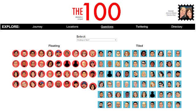
4) The #Datafam Project V2 by Jessica Moon and Denis Kao

3) Star Wars Films by George Koursaros

2) The Fellowship | Iron Viz 2023 by Brian Moore

1) Gdynia by Kasia Gąsiewska-Holc

Kasia (a regular contributor on our website) lands our favorite viz of the year for the second year in a row! Last year, we picked her Diet viz and this year, we chose her Gdynia viz...and it was unanimous (both this year and last year). The idea is simple, visualize the weather over time...and she did it perfectly. As I wrote this blog post, I started typing up the fact that she used map layers to create layers upon layers of data. But to make sure she did that, I downloaded the viz and wait...she didn't use map layers????!!!! How the heck did she do all of that with just a dual axis??!!! Kasia is so talented, one of the very best that I know technically, potentially the very best with design, truly a Tableau master. Kasia, we might need to have you write a guest blog post about how you pulled this off. Bravo!
Although that's a wrap on our ten favorite vizzes of 2023, there were numerous other vizzes that could have easily made the top ten. Since it was so close, we just wanted to mention those folks. The list includes Bea Katona, Ben Norland, Diego Parker, Jeff Plattner, Kashish Rastogi, Kizley Benedict, Louis Yu, Nicole Mark, Sam Epley, and Saverio Rocchetti.
Thanks to all the incredible Tableau Public authors for another great year. We can't wait to see what everyone does in 2024!


No comments: