
Zoomable Charts in Tableau

Last year, Zen Master Chris Love posted this visualization analyzing the Labour Party’s plan for a new tax bracket (click on the image to view the interactive version).

As always with Chris’s work, there was a lot to like about this, but the thing that most drew my attention was the small zoom window he created. I just thought it was such a great way to show dense data then focus in on some specific element of that data. After seeing it, I started to wonder if there might be a way that we could automate such a zoom feature. Alas, I could not figure out how to accomplish this at the time. But, I kept it in the back of my mind, just looking for that new feature that would allow it to be done. Then 2018.3 was released and I realized that we could do this using the new feature, set actions. In this post, I’ll show you how to do it with line/area charts and with scatter plots. Of course, you could do it with other types of charts as well (as long as they have at least one axis).
Note: For more on set action, I highly recommend Lindsey Poulter’s blog post, On Your Marks, Get Set, Go: Everything You Need to Know to Get Started with Set Actions
Zoomable Line/Area Chart
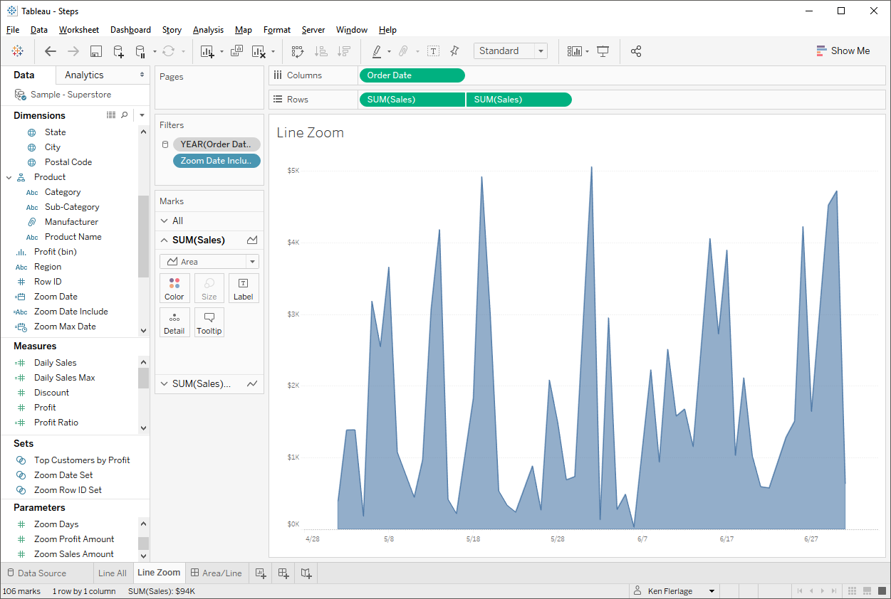
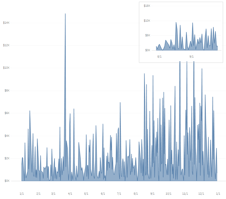
Let’s start with line and area charts. Using Superstore, let’s start out by creating an area chart or line chart by day. Something like this:
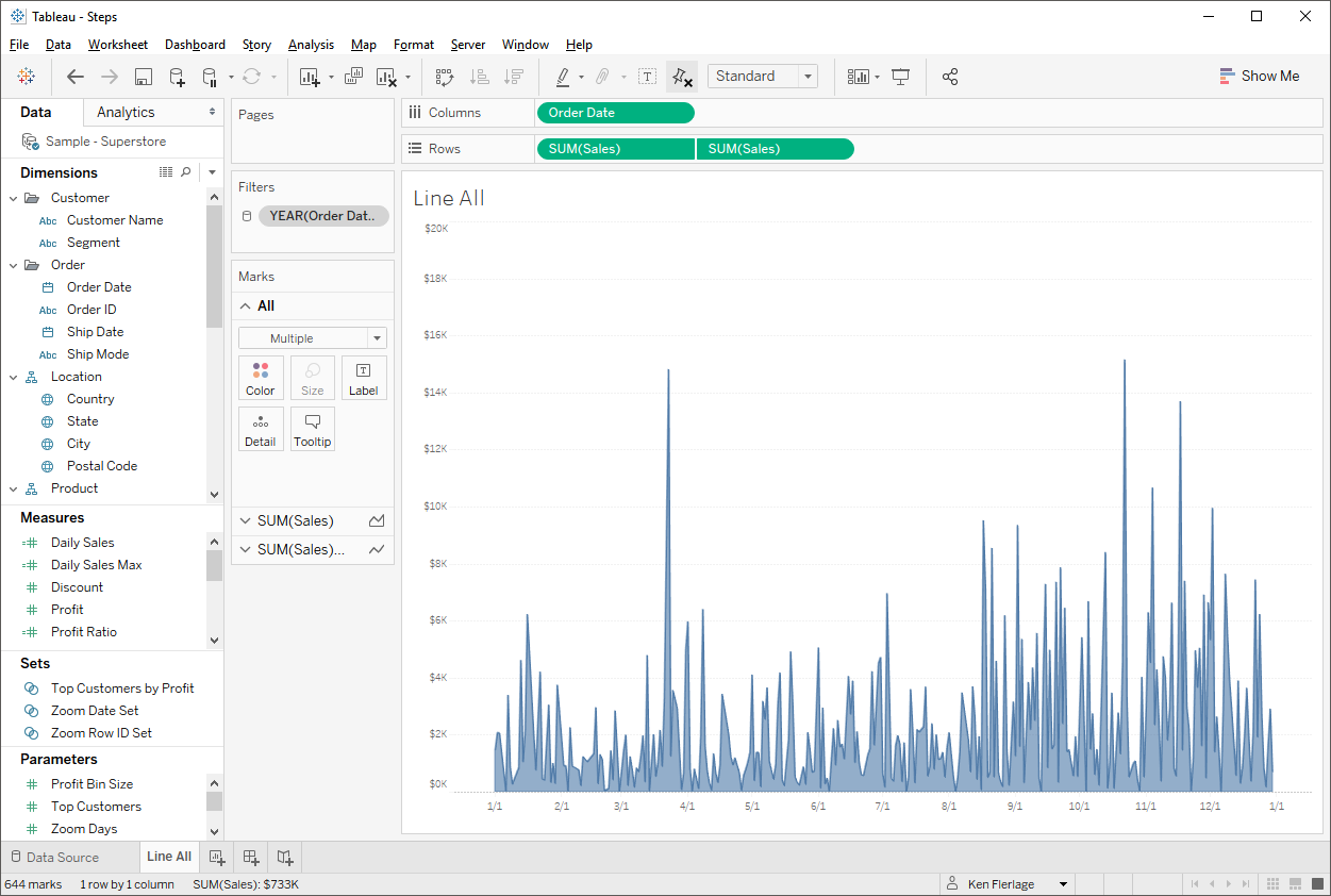
I’ve named this sheet Line All as it will show all of my data. Next, I’m simply going to duplicate this sheet and call the new sheet Line Zoom. This will act as my zoomed chart.
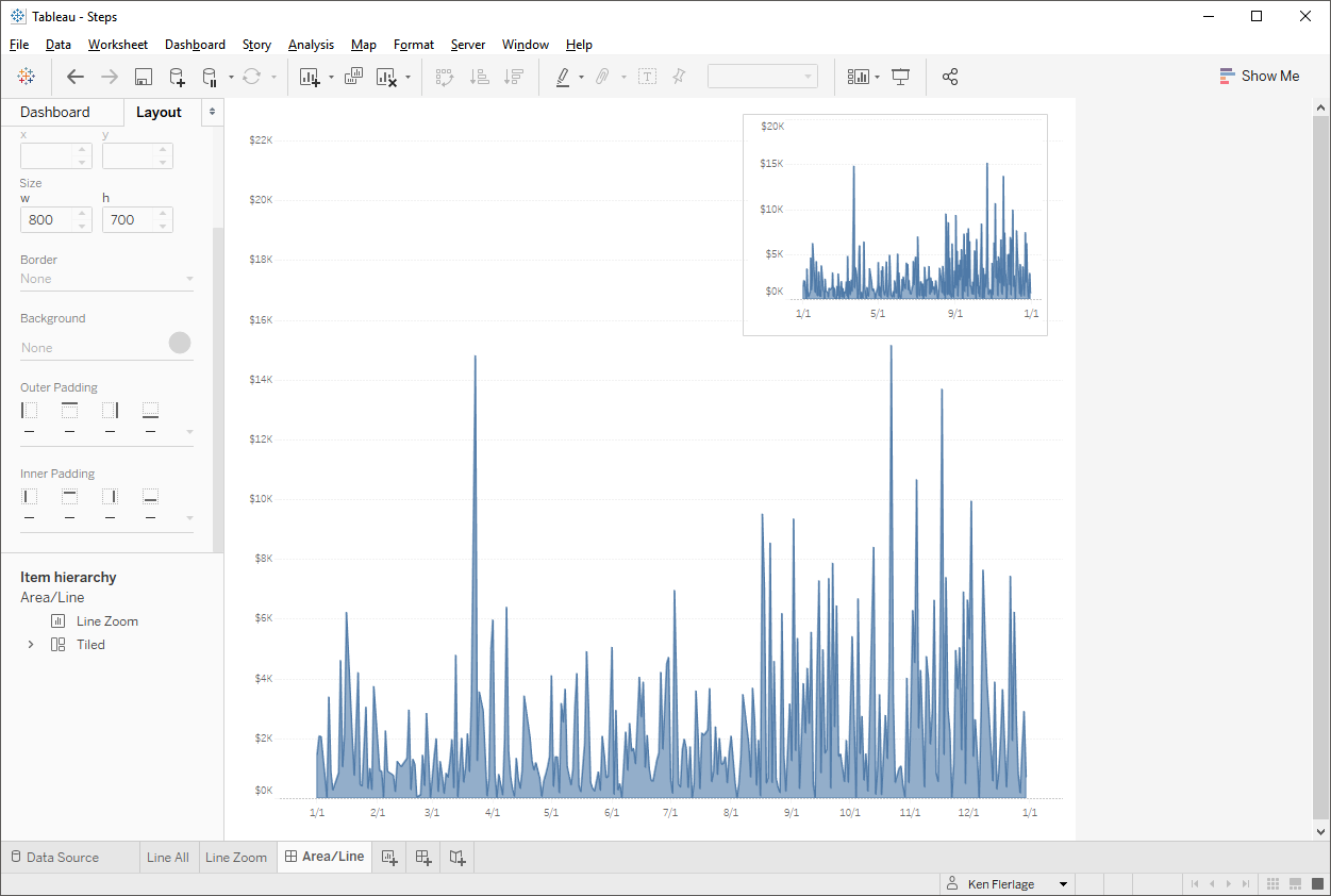
Now, let’s add both of these to a dashboard. I’ll tile Line All so that it fits the screen, then I’ll float Line Zoom in the upper right-hand corner. I’ll also add a border around it to give it some separation from the main chart.
Now, we’ll leverage set actions to create the zooming effect. Switch back to one of the sheets and create a parameter called Zoom Dayswhich will control the number of days we’ll zoom to before and after the selected date.
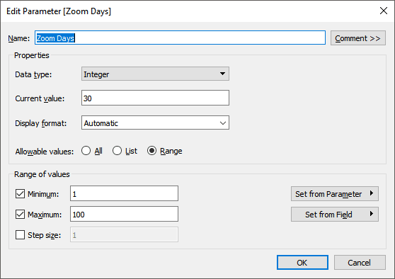
For example, when you hover over June 1, the zoom will show 30 days prior to June 1 to 30 days afterJune 1.
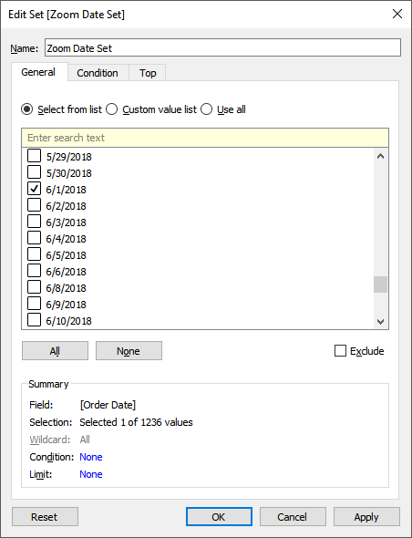
Next, right-click on Order Date and create a set. Select a single date—any date will do—as shown below.
Now, create a couple of calculated fields. First, we’ll create one that gives us the date selected in the set, which I’ll call Zoom Date. This starts by checking the order date and, if it’s in the set, it will return its value. It then performs a fixed level-of-detail calculation to get the MAX of this value. As only one value will ever be in our set, you could use MIN as well.
Note: Since we’re using an LOD here, you’ll need to be mindful of the Tableau Order of Operations, especially if you add filters.
Zoom Date
// The highlighted date for zooming.
{FIXED : MAX(IIF([Zoom Date Set],[Order Date],NULL))}
Next, we’ll create a field called Zoom Date Includewhich will return “Include” for any dates that are within the “Zoom Days” of Zoom Date.
Zoom Date Include
// Dates we want to include on the zoomed view.
IF ABS(DATEDIFF('day',[Order Date],[Zoom Date]))<=[Zoom Days] THEN
"Include"
ELSE
"Exclude"
END
Now, we can drag Zoom Date Include to the filters shelf and set it to only keep “Include”. You’ll now have something like this:
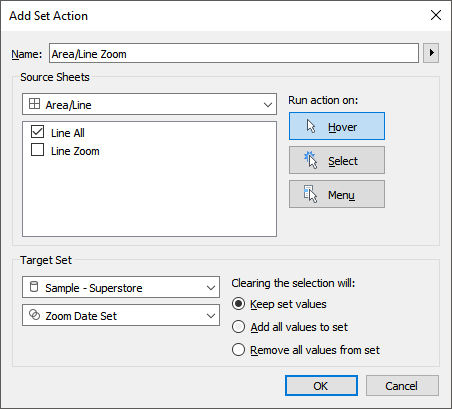
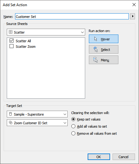
Now, flip back over to the dashboard and create a set action. Configure the action to only be triggered from the Line All chart, to work on hover, and to “keep set values” when the selection is cleared.
Now, when you hover over the Line All chart, it will zoom on the Line Zoom chart.
Scale
But, there are a couple of issues with this. First, we have the zoom chart’s axis set to automatic, so as we zoom on different parts of the main chart, the scale changes on the zoomed chart. In this case, it’ll be best if for the scale to remain constant. So, let’s use a reference line trick to force the scale to remain unchanged. Since our chart is showing daily sales, we want to find the maximum daily sales so we can then fix the axis at that value. Once again, we’ll need some LODs here. While I could cram all the logic into a single calculation, I’m choosing to create two separate calculated fields instead as it’s simpler to understand. First is Daily Saleswhich will get the total daily sales for each day:
Daily Sales
// Daily sales by date. Will allow us to get the overall max to fix the axis.
{FIXED [Order Date]: SUM([Sales])}
Next is a field called Daily Sales Max which will give us the maximum of all the daily sales totals.
Daily Sales Max
// Max daily sales.
{FIXED : MAX([Daily Sales])}
Now, on the Line Zoom sheet, we’ll drag Daily Sales Max to the detail card, then create a reference line as follows:
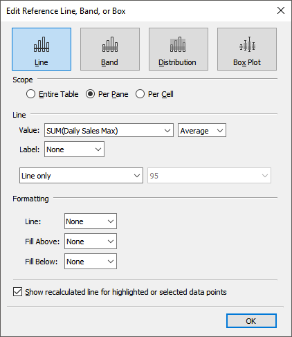
Since there is no line, it will essentially be invisible, but the value will remain constant, despite the zoom dates, so the scale will never change.
Highlighter
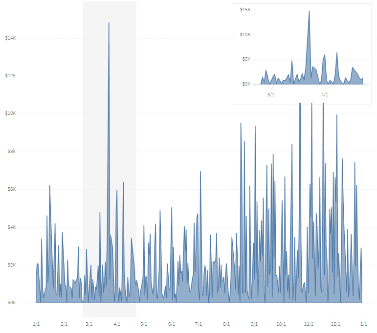
Another problem with this is that it’s not exactly straightforward which section of the main chart you’re zooming in on, so it would be nice if we could make that a bit clearer. To do that, we’ll use a reference band. We’ll need a couple more calculated fields which will give us the first and last dates of our zoom:
Zoom Min Date
// Minimum Date for Zoom Window.
DATEADD('day', -[Zoom Days],[Zoom Date])
Zoom Max Date
// Maximum Date for Zoom Window.
DATEADD('day', [Zoom Days],[Zoom Date])
Now we’ll create a reference band on the date axis like this:
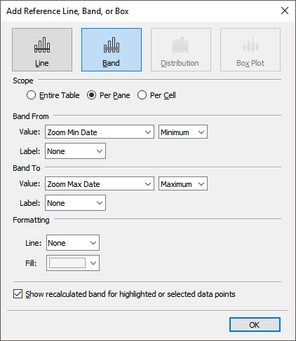
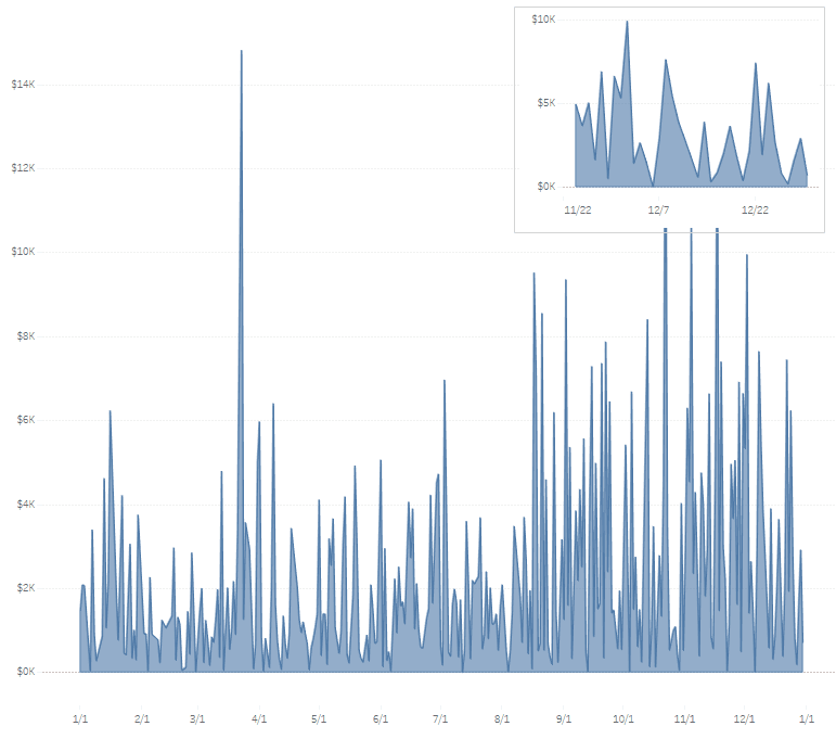
Now, when we hover, we’ll see a subtle grey highlight over the area on which we’re zooming.
As a finishing touch, you can add the Zoom Daysparameter to the dashboard to give your users the ability to set their own zoom period.
Zoomable Scatter Plot
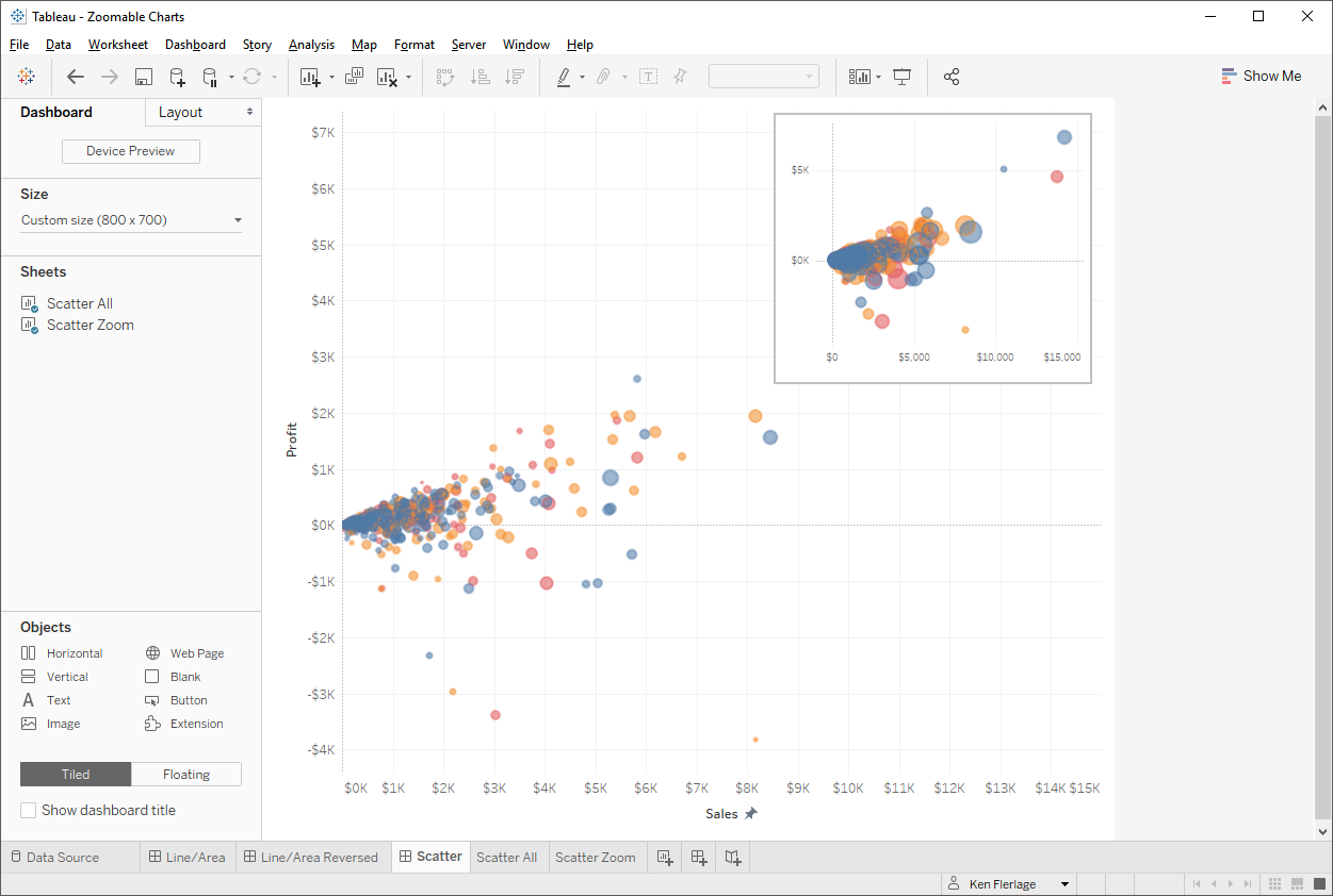
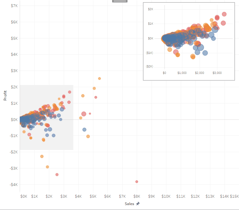
The process for creating a zoomable scatter plot is pretty similar to the line/area chart, but since we have two zoomable axes, it’ll take a bit of extra work. Let’s start by creating a scatter plot. This one compares sales to profit for each customer, sizes each dot by the total order quantity, and colors by the customer market segment. I’ve named this sheet Scatter All.
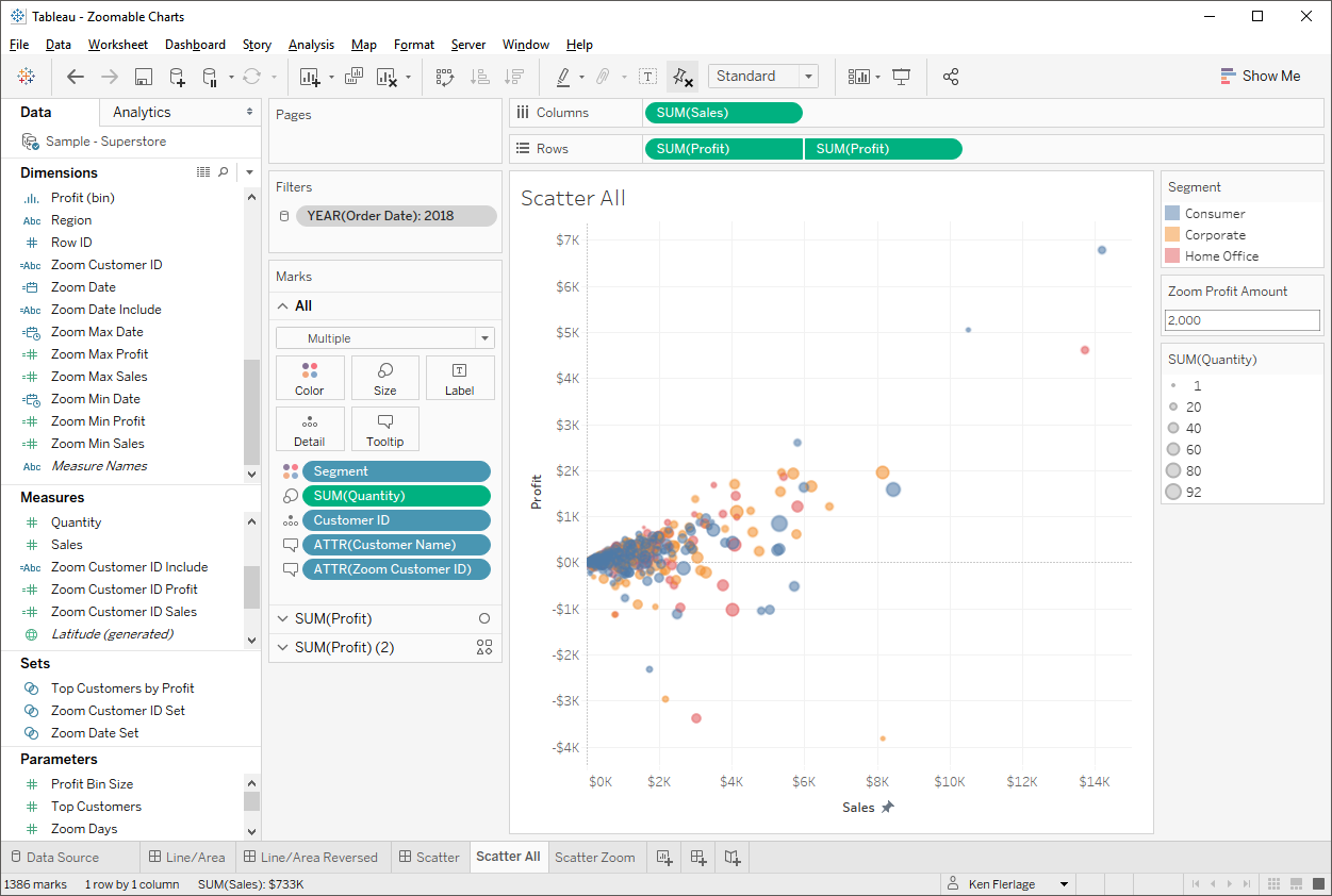
Like the line/area chart, we’ll need to create a parameter for the zoom amount, but we’ll need to create one for each axis. I’ve named mine Zoom Profit Amount and Zoom Sales Amountand I’ve set them both to 2000.
Once again, we’ll duplicate the scatter plot and call the new sheet Scatter Zoom.
Next, since our level of detail is the Customer, let’s create a set on Customer ID (Note: Customer ID is hidden, by default, in Superstore, so you may need to switch over to the Data Source tab and unhide it). Again, just select a single customer. I’ve called my set Zoom Customer ID Set.
Now we need a handful of calculated fields:
Zoom Customer ID
// The highlighted customer for zooming.
{FIXED : MAX(IIF([Zoom Customer ID Set],[Customer ID],NULL))}
Zoom Customer ID Profit
// Profit amount for the highlighted customer.
{FIXED : SUM(IIF([Customer ID]=[Zoom Customer ID],[Profit],NULL))}
Zoom Customer ID Sales
// Sales amount for the highlighted customer.
{FIXED : SUM (IIF([Customer ID]=[Zoom Customer ID],[Sales],NULL))}
These will give us the customer that’s in the set and the total profit and sales for that customer. Now we’ll need one more calculated field to give us any customers that have sales and profit within the zoom window (as defined by our two parameters).
Zoom Customer ID Include
// Orders we want to include on the zoomed view.
IF ABS(SUM([Sales])-ATTR([Zoom Customer ID Sales]))<=[Zoom Sales Amount] AND ABS(SUM([Profit])-ATTR([Zoom Customer ID Profit]))<=[Zoom Profit Amount] THEN
"Include"
ELSE
"Exclude"
END
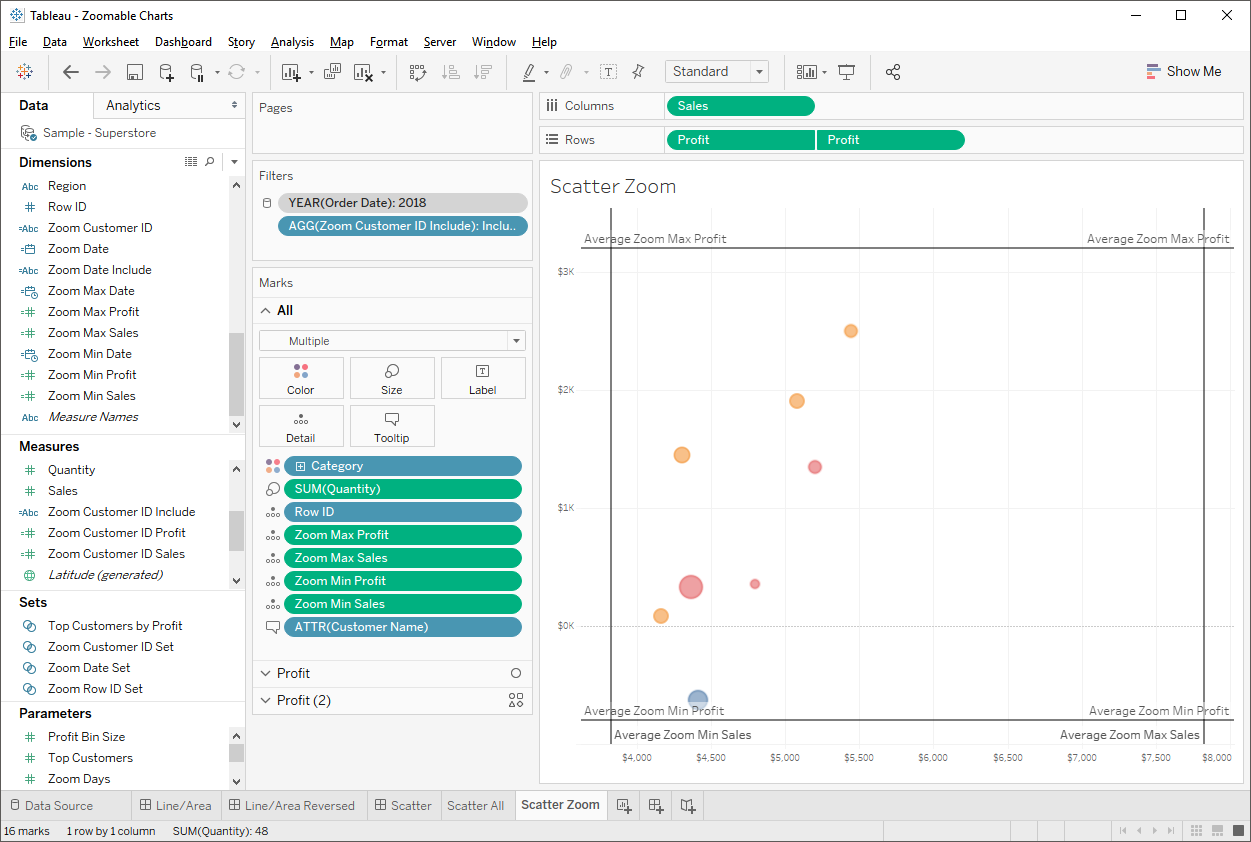
Now, on the Scatter Zoom sheet, we’ll use this as a filter and only keep “Include” values.
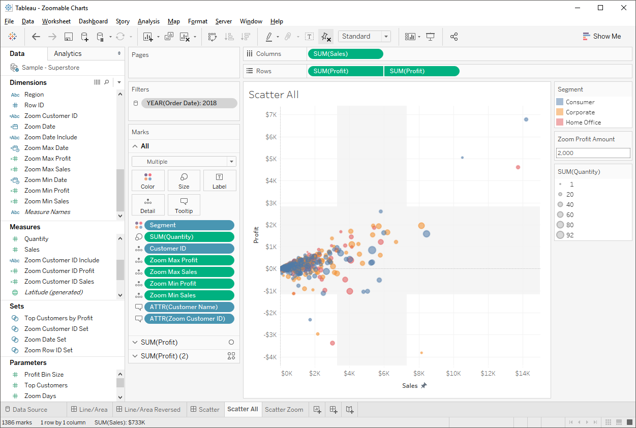
Next, we’ll add both charts to a dashboard.
And create your set action.
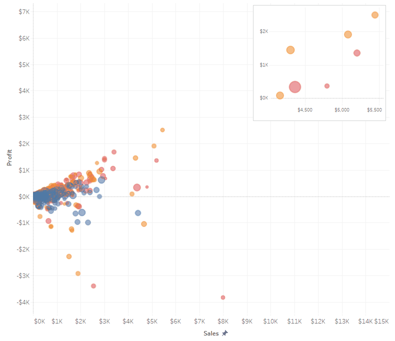
And we now have our zooming effect.
But, we have the same problem with the axis scaling as the area/line chart, so we can address it in similar fashion. Since we have two axes, we’ll need a couple of extra calculated fields.
Zoom Min Profit
// Min Profit Amount shown in Zoom Window.
[Zoom Customer ID Profit]-[Zoom Profit Amount]
Zoom Max Profit
// Max Profit Amount shown in Zoom Window.
[Zoom Customer ID Profit]+[Zoom Profit Amount]
Zoom Min Sales
// Min Sales Amount shown in Zoom Window.
[Zoom Customer ID Sales]-[Zoom Sales Amount]
Zoom Max Sales
// Max Sales Amount shown in Zoom Window.
[Zoom Customer ID Sales]+[Zoom Sales Amount]
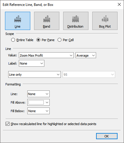
Drag all of them to the detail card on the Scatter Zoomsheet, then create reference lines for all four of them, in similar fashion to the reference line created for the line/area chart. Be sure to place the two sales-related reference lines on the sales axis and the two profit-related reference lines on the profit axis. To better illustrate this, see the screenshot below, which includes a line color and labels for each reference line (in your actual chart, you want to hide the labels and the lines).
Now change each of the axes to disable the “Include Zero”.
While the axes of the chart will change as we zoom, it will now always show consistent ranges. In our case, since both of our parameters are 2000, the window will always be 4000 by 4000.
Finally, we want to create a reference band to show the area that is being zoomed. In actuality, we want a rectangle showing the zoom area, which adds a bit of complexity.
Let’s start by creating a reference band on the Profit axis (on the Scatter All sheet) ranging from Zoom Min Profit to Zoom Max Profit.
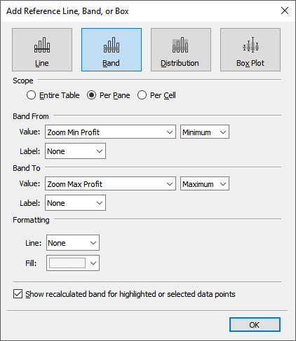
And create a similar one on the Sales axis:

This will give us a sort of cross like this:
But we want this to be a square, so we’ll trick Tableau a bit. On the Profit axis, create a new reference line on Zoom Profit Max.
Notice that we’ve set the “Fill Above” to be white, the same color as the background. This will make the area above the max profit white as shown below.
Repeat this, on the Profit axis, with Zoom Profit Min, setting “Fill Below” to white. Then repeat these steps for the Sales Axis. We’ll now have a nice square box around the zoom area, exactly as we had planned.
Feel free to download my sample workbook if you need some assistance in creating your own zoomable chart. If you have questions or comments, you can leave them in the comments section below or reach out to me on Twitter or LinkedIn, Thanks for reading!
Ken Flerlage, February 3, 2019


I've got a few uses for this one. I was stumped for a little while on my Order Date. Then I realized I forgot to set it to Exact Date. Really cool use of sets, parameters, and actions. Thanks!
ReplyDeleteFantastic!
DeleteHey Ken,
DeleteGreat article! Also got stumped on the exact date thing, couldn't work it out for ages.
Might be a common mistake and worth mentioning as a reminder.
Thanks!
Thanks for sharing. Have a couple of use cases for this at work. Thank you
ReplyDeletethis is such a great tip!
ReplyDeleteI wondered, would that work on maps too? Asking in order to replicate this thumbnail map reference Andy Kirk mentioned on his blog https://www.visualisingdata.com/2018/07/little-visualisation-design-part-53/
I'd have to tinker with it, but I think there would be some problems using this with maps, unfortunately.
DeleteGetting error in set action like "Missing fields on XXXXXX", But both the sheets are equal.
ReplyDeleteI'd need to see the workbook. Feel free to send me an email. flerlagekr@gmail.com
DeleteKen, this is a great post. With the addition of another parameter action you can have a measure names/measure values view, and have a popup tooltip that only shows the zoom for that measure name (you need to create a large case statement with every measure name possibility).
ReplyDeleteThis is great! It works fine with [date] type. Is there any way to make it work with [date&time] data type? it is kind of crucial for some of my graphics. When I place the equivilent of your "Zoom Date Include" as a filter, using [date&time] data type, it doesn't prompt an "Include" box only "Exclude", unlike when I change data type to [date] where I get both "include" and "exclude" and works fine.
ReplyDeleteIt should work. Any chance you could email me? flerlagekr@gmail.com
DeleteHi Ken, just come across this as I'm trying to do something similar but was hoping to do it in the tooltip i.e. I have a bunch of mini line charts which I'd like the user to be able to hover and either see a larger chart with all periods or a larger zoomed in chart, but when adding to the tooltip I can only see one period i.e. the period hovered on in the main 'mini' chart.
ReplyDeleteHave you seen this done anywhere before?
Sorry for the delay in responding. This should be possible. Any chance you can email me? flerlagekr@gmail.com
Delete