
Guest Blog Post: Percentage Trend Calculations - An Easier Way! by Kasia Gąsiewska-Hoc

This is a guest blog post from Kasia Gąsiewska-Holc. Based in Poland, Kasia works remotely as a Senior Data Analyst and data visualization consultant at SageData, a data analytics company based in Berlin. She is also a Tableau Public Ambassador and she loves using Tableau as a creative outlet for data viz experimentations.
Please note that some of these GIFs may appear small on the screen. They are, however, recorded in a higher resolution. For a closer look, you should be able to simply zoom into your web browser or right-click and open in a new tab (which will show it as it was recorded).
Introduction
Whenever I create any new business dashboard for my clients, I pay a lot of attention to the process of building the right structure and flow that will allow users to easily navigate through the viz. You might have heard of the Z-layout design, which is the core principle behind this concept. The premise of the Z-layout is to build dashboards (or any UX content such as websites) so that the key, high-level information is placed at the top left-hand side of the view. From there, users' eyes should naturally follow the pattern of a Z-letter to explore more detailed information. Here’s an example dashboard showing how this could be implemented in practice:
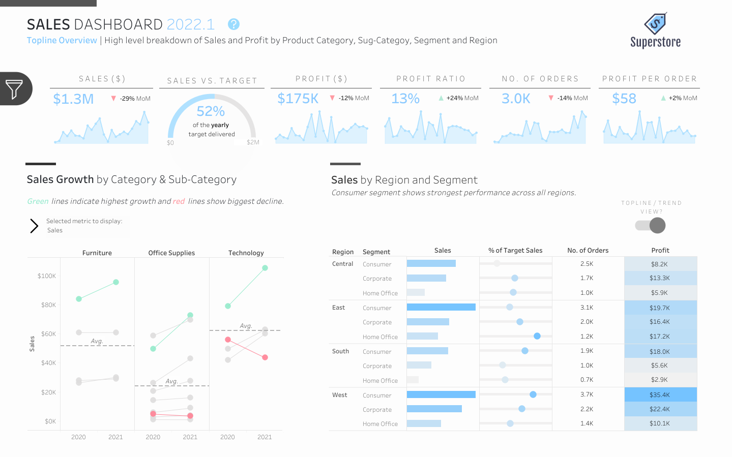
Obviously, the exact content and types of charts placed in each section of the view will vary from one project to another, but one dashboard section seems to be fairly consistent: topline widgets/ KPI BANs (Big Ass Numbers) at the very top part of the view. BANs are an amazing addition to any dashboard where it’s important to provide users with a context on performance at a very high level. In design, another one of the widely known concepts is the “3-second rule”, which assumes that we only have about 3 seconds to capture users’ attention. If this, in fact, is true, then BANs are here to help us make it happen!
The Quest for the Perfect BAN
So you know you need BANs on your dashboard. Now, how do you pick the right design that will resonate with your audience? There are lots of fantastic resources that should give you plenty of ideas on what you can create for your own dashboard. My personal favorite sources of inspiration are:
Flerlage Twins - 22 Different BAN Designs (of course! :) )
And here’s my personal library of some BAN designs that I use most frequently when working on dashboards for my clients:
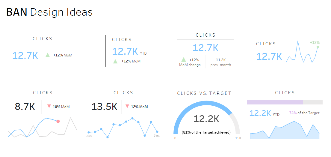
As you might have noticed, one of the elements that I try to always include in my BANs is a percentage trend indicator (apart from BANs designed to show performance against the target). However, in the past, I always found it to be the most painful to calculate. I used to create several calculated fields for each KPI’s trend change. Not only that, for each metric I would have needed to create a separate calculated field with an up/down arrow symbol. Suddenly a pane with all my measures and calculated fields turned into a seemingly endless list of calculations that I only used in one place. What a nightmare!
Luckily, as I grew older, I also grew lazier (what a weird thing to feel lucky about), so I started to look for easier ways of calculating these percentage trend indicators. And I am happy to report that I found one!
Calculating Percentage KPI Trend Indicators - The Easy (Lazy) Way
In a nutshell, the following method of calculating percentage trend indicators is based on table calculations and only requires creating two calculated fields, so no clutter in the measures and attributes pane! And did I mention that once you get a hang of it, it only takes about 3 minutes from start to finish (no kidding, I timed it :D)?
Without further ado, let’s jump into the tutorial:
Part 1: Creating a Percentage Trend Indicator Sheet
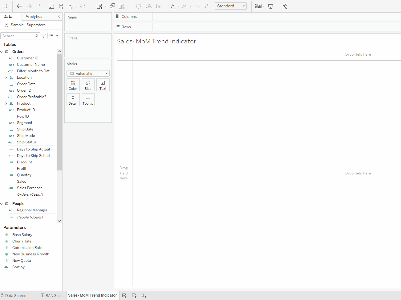
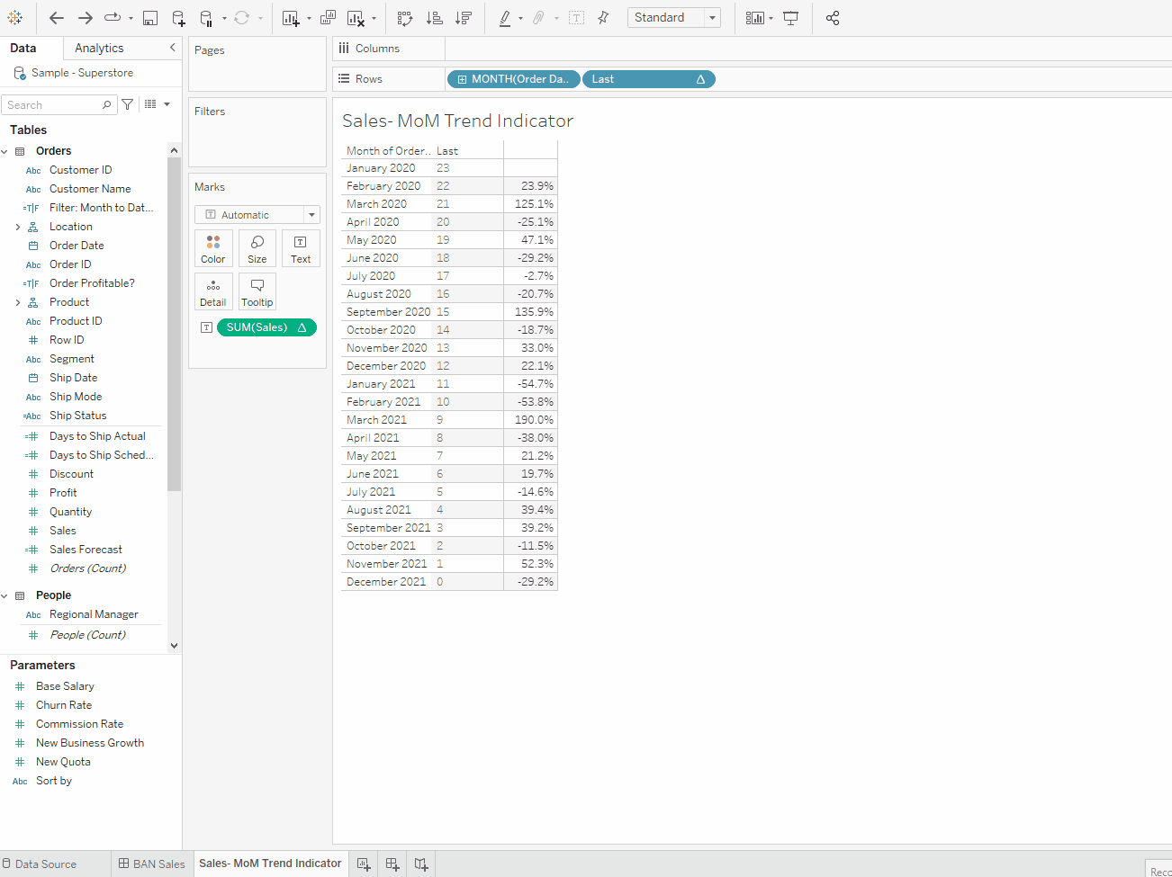
1. Begin by creating a tabular view of a selected metric by a desired period granularity level (for MoM differences, show the data by month). Use discrete pills.
2. Sort months in the ascending order (if they are not already sorted this way).

3. Create the Percentage Difference quick table calculation using the selected metric.

4. Create the Last table calculation (this is the only calculated field that is absolutely needed and you can reuse it for multiple BANs in the view). Bring it to the view using the ‘table down’ calculation method and change the pill type to discrete.

5. This step is optional, but in order to compare only month-to-date data, create a Filter calculation: DAY([Order Date])<= DAY({MAX([Order Date])}) (replace ‘Order Date’ with a Date field that you’re using in your dashboard) and use the value of ‘True’ to filter the view. If you chose to omit this step, you might not be able to compare apples to apples, as your comparison periods might include different numbers of observations. Also, if your dates go into the future then you might need to add AND [Order Date]<= TODAY() to the Filter calculation to ensure you’re not comparing the data for future dates.
6. Drag the Last calculation from the rows shelf to the Filters shelf and select the value of 0. This way we will always show only one number on the sheet which represents the last observation (in our case last month). If you skipped step 5, I would recommend choosing a value of 1 instead of 0 in this step. This will allow you to compare the latest completed period (e.g. month) to the period directly prior to that.

7. Right-click on the Order Date pill on the Rows Shelf and uncheck the ‘Show Header’ option. The basic percentage trend indicator is now ready!

Part 2: Formatting the Number (Standard Option):
1. Right-click on the remaining cell and format the view to remove any lines and row dividers.

2. Right-click on our Table Calculation and edit the Pane number formatting using the custom option. The custom option allows us to specify how we want the number to appear depending on whether it is positive or negative (or zero). In the custom format settings type in: ▲+0% "MoM";▼-0% "MoM";0% "MoM" (you can copy the arrow characters from here). The first part of this string (before the semicolon) represents the positive number formatting, the second part of the string tells Tableau how to format the number if it's negative and the last part includes formatting for the value of 0. The cool thing is, this will be completely dynamic as formatting will change based on whether it negative, positive, or zero.

Part 3: Optional Color Formatting Changes (Advanced Option):
1. Hit Ctrl on your keyboard, then drag and drop our table calculation onto the Detail shelf. Double click into the calculation pill and add 0+ at the beginning (or +0 at the end) of it. Repeat this action but instead of 0+ type in 0-. This way we will create duplicate calculations that could have their own formatting. At this point, we should have 3 different pills on the Marks card.

2. Move the two duplicate calculations from Detail to Text shelf. Edit the text label options, so that the two duplicate fields come before the original calculation. Also, make sure that all three fields follow one another without any line breaks/returns.

3. Now change the custom formatting of each of the three calculations, so that we can apply a condition on when to display each field:
The original calculation new formatting: +0% "MoM";-0% "MoM";0% "MoM"
The duplicate with +0 formatting: ▲;_;_ (the underscores here serve as empty placeholders for negative and 0 value formatting)
The duplicate with -0 formatting: _;▼;_

4. Navigate to the Text label settings window. Apply a green shade to the font of the “0+” calculation and red to the “0-” calculation. (You may opt to use other colors like blue and red, but if you use green and red, please test with a color-blind simulator such as Coblis).

Part 4: Creating a BAN Widget
1. Format worksheet tooltips before placing the sheet on a dashboard.
2. Navigate to the dashboard. Create a horizontal container and drag and drop the percentage trend indicator sheet into it, as well as a topline number (created separately). Change the size of both sheets to ‘Entire View’ and remove titles. Place the horizontal container, along with a title and an optional sparkline chart within a separate vertical container. To add a division line between the KPI name and numbers, format the padding of two sheets in the horizontal container.

3. Test out the widget to check if the percentage trend indicator is changing as expected when adjusting the date range.

4. Done!
Pretty neat, huh? Hope you enjoyed this little tutorial and learned something new! If you have any questions, feedback, or if you would like to share any ideas on how to make the process of creating percentage trend indicators even simpler, I would love to hear from you!
Feel free to reach out to me if you have any questions and connect with me via Twitter or LinkedIn. Thanks for reading!
- Kasia
Please note that if you want to see a very similar technique put into practice, please check out Lindsay Betzendahl's Columbus TUG presentation. She talks about this concept 7:55 into the presentation (and the rest of it is great as well).
June 6, 2022


hey Kasia, Great post
ReplyDeletecan you explain a bit more step #5: DAY([Order Date])<= DAY({MAX([Order Date])})
when I use this in my data for a WoW using fiscal weeks, i see that many fiscal weeks are omitted
This calculation is used to ensure that the same days of a month are used for MoM comparison. For example, today is June 7th and I would like to create MoM comparison between June so far and same period but a month earlier, in May. Without this calculation I would be comparing 1-31st May to 1-7th June. However, with this calculation in place I can ensure that only 1-7th May are used for comparison.
DeleteIt should be noted though, that this specific calculation applies to MoM trends. If WoW comparison is required, the calculation would need to be changed to the following: ISOWEEKDAY([Order Date]) <= ISOWEEKDAY({MAX([Order Date])})
Here we're making sure to remove any weekdays that we don't yet have data for this week (e.g. if today is Wednesday I might want to compare just Mon-Wed across two last weeks, rather than Mon-Sun last week vs. Mon-Wed this week). The premise is the same as in the MoM calculation, we're just changing the granularity level.
Hope this helps!
Kasia
Hello, I like how clean this option is .
ReplyDeleteCan you clarify how to show which year and month the comparison is for?
Also in step 3 in the dashboard part how did you set up that calendar to test the date field range?
Are you using other parameters or filters somewhere else?
Thanks
Hello!
DeleteIf you want to show which year and month the comparison is for then I would probably recommend to include this info in the tooltip. The MONTH([Order Date]) would already give you info on current period. For the previous period (which is the basis of the MoM calculation) you can use either one of these formulas:
- DATETRUNC('month', DATEADD('month',-1,[Order Date])) -- Limitation of this one is that it's fixed to a month
- LOOKUP(MIN(DATETRUNC('month', [Order Date])),2) -- This one is not fixed to a month so when you change level of granularity in your comparison calculation, this formula will always give you previous period name (regardless of granularity)
As for your other question, to add a date filter for testing, click on the sheet in the dashboard, a border will appear and in the right-hand side you will see a bunch of icons, including a down arrow. Click on the arrow and navigate to Filters -> Order Date. This should add a date filter to the dashboard.
Hope this helps! Let me know if any further questions :)