
Spicy Tables - Freeze a Row & Compare All Other Rows (Guest Post from Autumn Battani)

This is a guest blog post is from the incredible Autumn Battani. Autumn is a Senior Principal Consultant at phData, a Tableau Social Ambassador, Diversity in Data Co-lead, and has six viz of the days! Autumn isn't just incredible at Tableau, she's an incredible person who continues to share her creativity and build up others in our community. Autumn does have her own website, but she was generous enough to share this one with us - and we can't be more excited!
I’m a table loyalist through and through. Being someone with a career in visual analytics, tables don’t often get the credit that they are due. People’s common (and sometimes valid) critiques are that they are boring or that it can take too much time to see what’s really going on. I often try to find ways to change that and I’m going to walk through one of those ways in this blog.
Earlier this year I put out a Call Center dashboard and had a table where you could select a row and then freeze it to the top. This was great to be able to compare the values of one row against other values. But I wanted to take it a step further. In this new iteration, when you freeze that row, the actual comparison to the frozen values appears in the other rows.
Why did I do this? Well first it might be helpful to talk about why I created the freeze row technique the first time. If I told you that we sold 300 chairs last month, would you think that was a good thing or a bad thing? What if I added that the prior month we only sold 120 chairs? How about if I said the most chairs we’ve ever sold in a month previously was 150. Now that 300 is starting to look like a really great number. Values in a workbook are only as valuable (see what I did there?) as the context you provide them. Like I mentioned, one thing people don’t like about tables is that it can take time to orient yourself to all of the information and assess what’s going on. So I wanted to enable the user to analyze more quickly a piece of information they were interested in.
But why then leave that user to be left with napkin math for figuring out to what magnitude that piece of information is better or worse than others? Why not provide that context to them. I think this is a great way to make tables more meaningful and actionable and provide more colorful takeaways. Here’s how to do it (feel free to follow along in my Sales Dashboard example).
There’s two components to walk through: the freeze row technique and the comparison. But before we get to either of those, we need to set up a table in which we want this implemented. In the example, I’m using superstore data with a row by day and columns for the basic measures (sales, profit, quantity, and number of orders). It’s important to note that in doing this I’m using the MIN(1.0)/MIN(0.0)/AVG(0.0) trick (whichever suits your fancy). I default often to this as I find it results in more consistent structure and higher flexibility.
FREEZE ROW
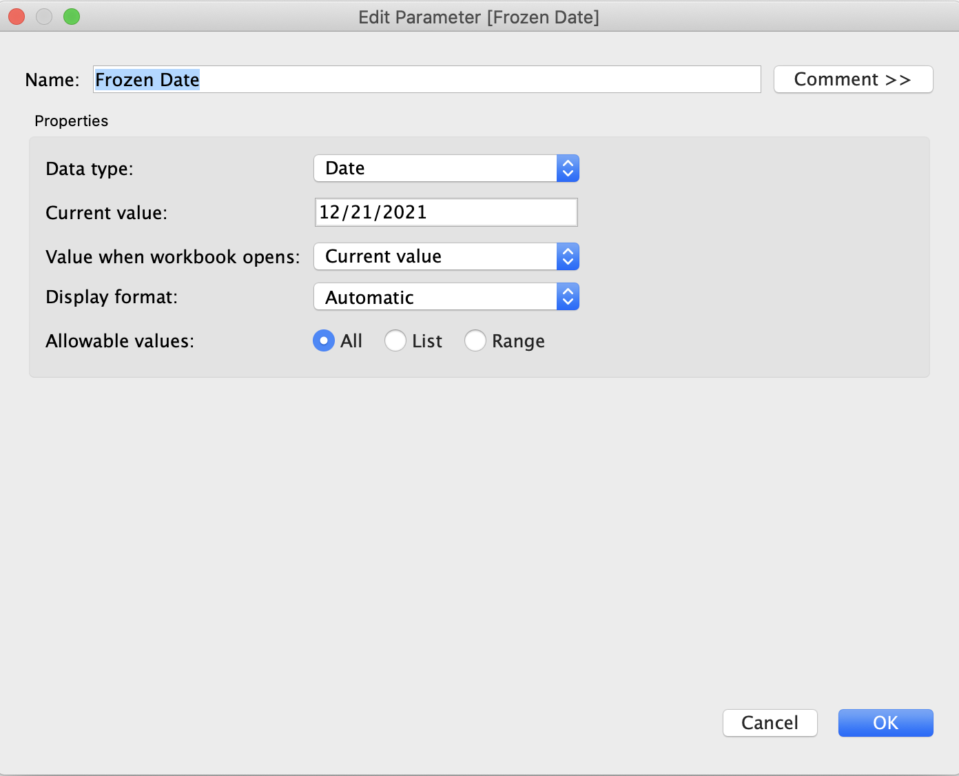
1. Create a Parameter
The parameter type is going to match the data type of whatever field you have on rows/is the field that determines what will be frozen. For me this is a date parameter because I have order date on rows. I will set it up to allow all values but set the current value to a value from the dimension on rows in your table.
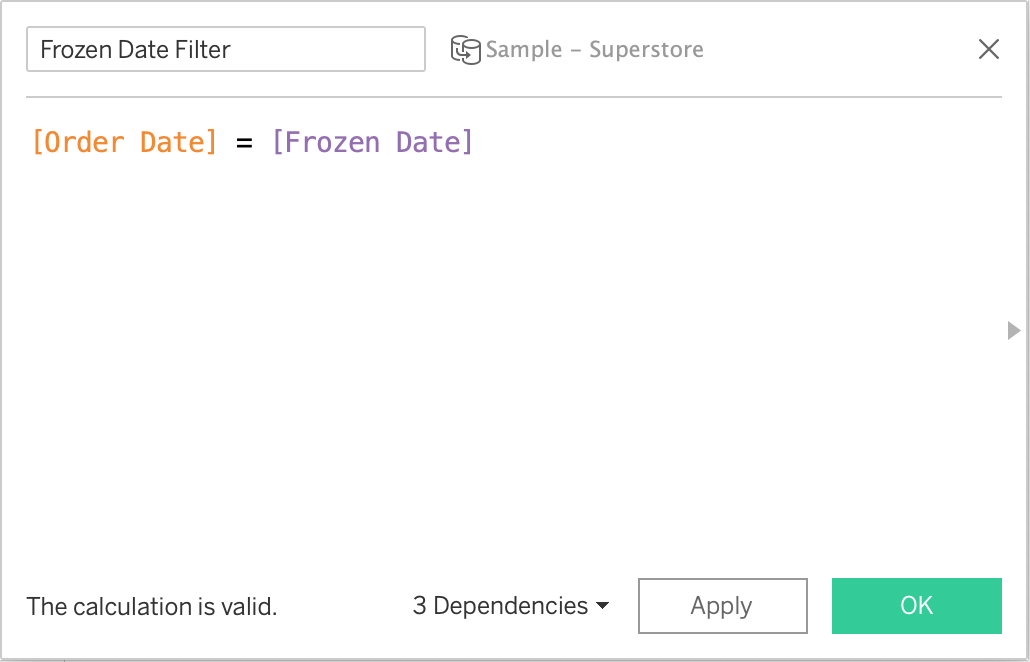
2. Create a Calculated Field
This calculated field will be a boolean and read [Parameter] = [Dimension]. As in, the parameter you just created in step 1 equals the dimension on rows.
3. Duplicate Your Table
Right click on the worksheet > Duplicate
4. Place the Step 2 Calculated Field on Both Sheets
Set it to TRUE on one sheet and FALSE on the other. Now we have one table showing all of the values except for the selected one and another showing only the selected one.
5. Place Both Sheets On Your Dashboard
I recommend using a vertical container for this and nesting both sheets within it. When placing your sheets, place the “single row table” on top.
6. Set Up Parameter Action
The source sheet will be the sheet with multiple values (I name mine main table). I set it to run on Select; I don’t think this would be a good opportunity for running on Hover but you can have it run on Menu if you’d like. The Parameter will be the one created in step 1. The field will be whatever is on rows. Finally, set the “clearing the selection will” option to be “keep the current value”.

And that’s it for the row freezing. How nifty and quick but great for large repositories of information. Next to the comparison.
COMPARISON
1. Create Dual Axes for Columns
On your main table (the one with multiple rows), we are going to create dual axes for each column with a synchronized axis. This part may take some revisiting at the end once you see how your values fit together. However what worked for my table is MIN(1.0) and MIN(1.7) with an axis that went from 0.9 to 2. The main point is that you’re going to want to create separation between the marks.
2. Create Comparison Calcs
We are going to need to do this for each measure in the table. In this example that would be sales, profit, quantity, and orders. For this I used the standard percent change formula (value - comparison) / abs (comparison) where the value is the measure value of that row in the table and the comparison is the measure value of the selected dimension value. What is slightly more complicated about this is that you are going to have to use an LOD to get the measure value for the comparison. This is similar to use case 3 in this blog on LODs from Ken.
Note: Practice safe LOD-ing. If you’re new to using LODs please read up on where it sits within the order of operations first. This blog by Jim Dehner is a great place to start. Or just anything Jim has ever said.
Extra Note: Is this possible without an LOD? Absolutely. You can do this technique with a table calc. But we would’ve had to set up the tables slightly differently.

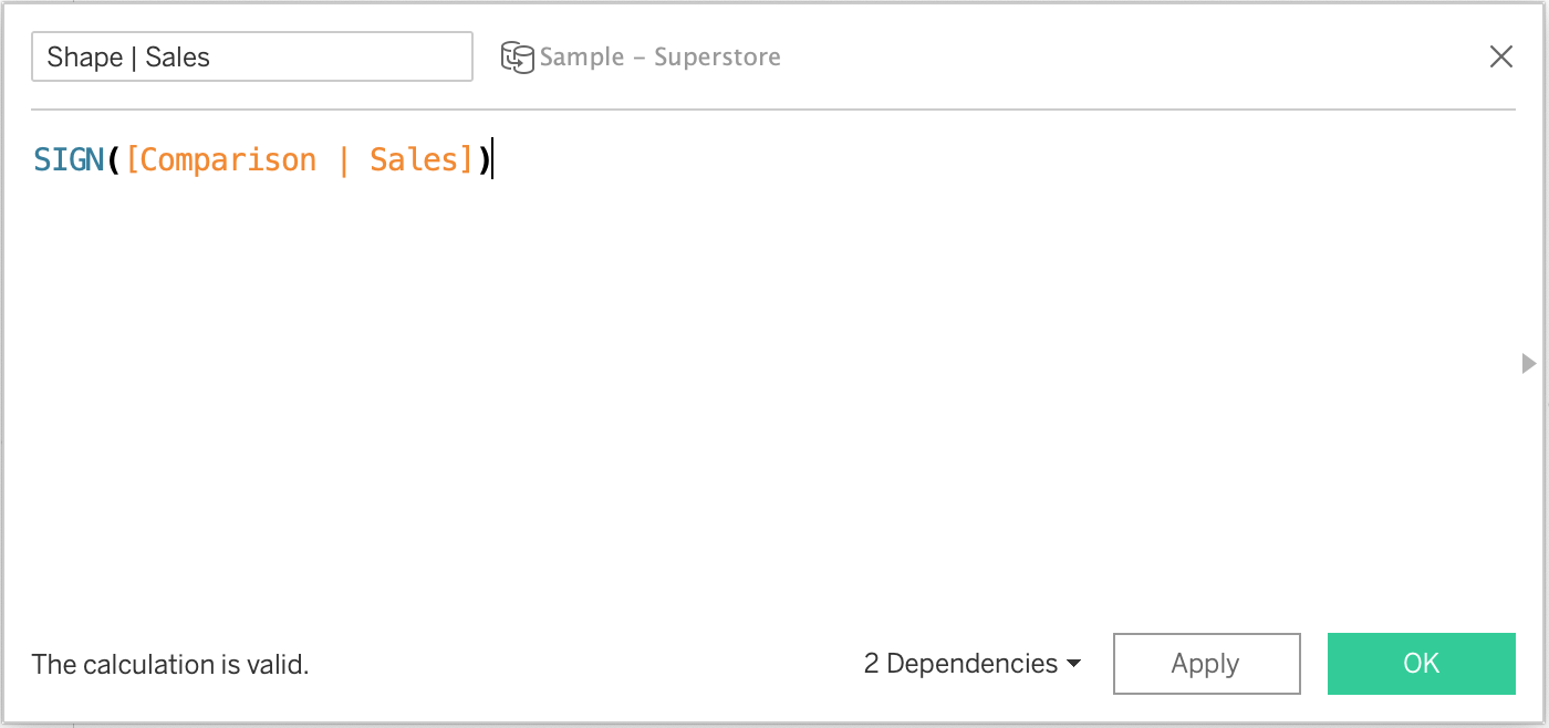
3. Create Shape Calcs
In this step we’re creating a calc that will help us with formatting. I named it shape calcs, both in the step and in my workbook, but it will be responsible for both shape and color. Similar to step 2 there will be one per measure column in your table. This calc is simple and is just SIGN(Comparison Calc). If you’re new to the SIGN function, it returns an integer of either -1, 0, or 1 depending on if the value is positive or negative.
4. Add New Calcs to Table
We’re going to add the calcs from steps 2 and 3 to the second marks we created for each measure in step 1. The calc from step 2 will go on text and the calc from step 3 will go on color and shape. Format accordingly. I set -1 (a negative change) to a down arrow, 1 to an up arrow, and 0 to a transparent shape. As mentioned in step 1, this may be where you have to reevaluate spacing. You can see all of this in my Sales Dashboard example.
And there you have it! Feel free to add bells and whistles. One thing I added to mine is the ability to turn off the frozen row at the request of CJ Mayes. I also added a changing date aggregation which is another blog for another time.
I hope this helps make your tables a little spicier. Please reach out if you have any questions.
Autumn


fantastic and thank you
ReplyDelete