
4 Design Techniques that I am Obsessed With

In late 2019, I started compiling a list of simple design techniques to improve both chart and dashboard aesthetics. That list grew to 26 in total, but it became more about clarity of charts, how to properly use color, layout...it became more of a collection / blog post about best practices. That blog post (with associated Tableau Public workbook) was called Simple Steps for Better Design. Although that blog post turned into something different than my original focus, it became one of the most popular on our website and evolved into a presentation that I've given 15 times (and counting) to different audiences. Although it focused mainly on best practices, it contains several examples that were specific to design aesthetic.
In 2021, I wrote another blog post about design, that was in fact, solely about design. It was titled A Little Design Makes a World of Difference and walked through 10 different ways to improve your dashboard designs without using other tools.
Since then, I've been compiling other design techniques with the intention of doing 10 more techniques. I haven't reached 10 yet, but I have to admit...I couldn't wait. I became completely obsessed with four of them that I just had to share. Three of these come from some of my favorite artists, which will be noted when I discuss each technique.
1. Drop Shadow on a Map
The first one comes from Pradeep Kumar who, at the current point it time, is the third most favorited author on Tableau Public. In several of his visualizations, he adds a subtle yet super impactful drop shadow to his maps. Below are two examples.
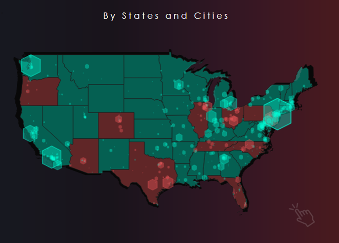
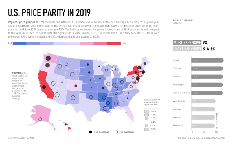
Here are links to these two examples and two additional ones: Profit Analysis, Price Parity, Operation Fistula, and Coronavirus in India.
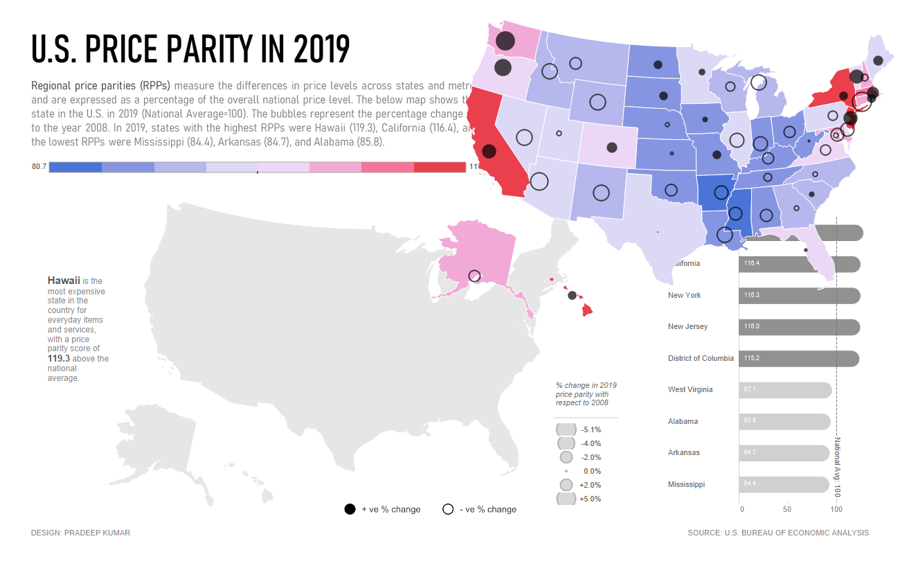
So how might you do this? It's actually pretty simple. Just duplicate the map sheet then remove all filters, colors, etc. Place that new sheet on the dashboard then float your actual map on top of it. When doing this, however, you must make sure that you offset that map just slightly. Below is Pradeep's dashboard in it's final form and with the floating map moved to the top right.

When you use this technique, you can use a variety of colors and sizes for the background map to give it a different shadow effect. Such a great technique that is so simple!
2. Extended Pie Chart
The second technique is from Muhammad Azhar, which I first saw in his Makeover Monday viz about circumcision. Below is a snapshot of it.
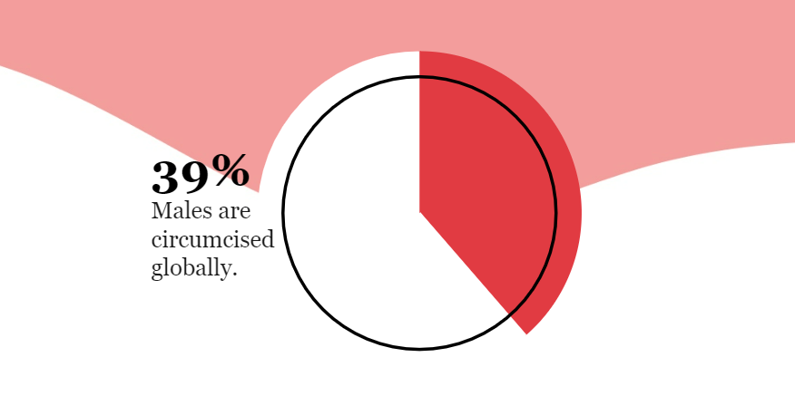
I don't use pie charts very often, but the next time I do, I will design them exactly like this.
3. Highlighting Text
Before using Tableau, if I wanted to highlight text in some way, I would have likely just made it bold and/or underlined it. But in my five years of using the tool, I've seen a ton of cool techniques to highlight text in a visualization. Over time, I've compiled some (and created at least one) methods of doing this. These are shown below. Please note that this phrase and first method were pulled from Jennifer Dawes' wonderful viz she created for the Women in Analytics dataviz competition - thanks, Jen!
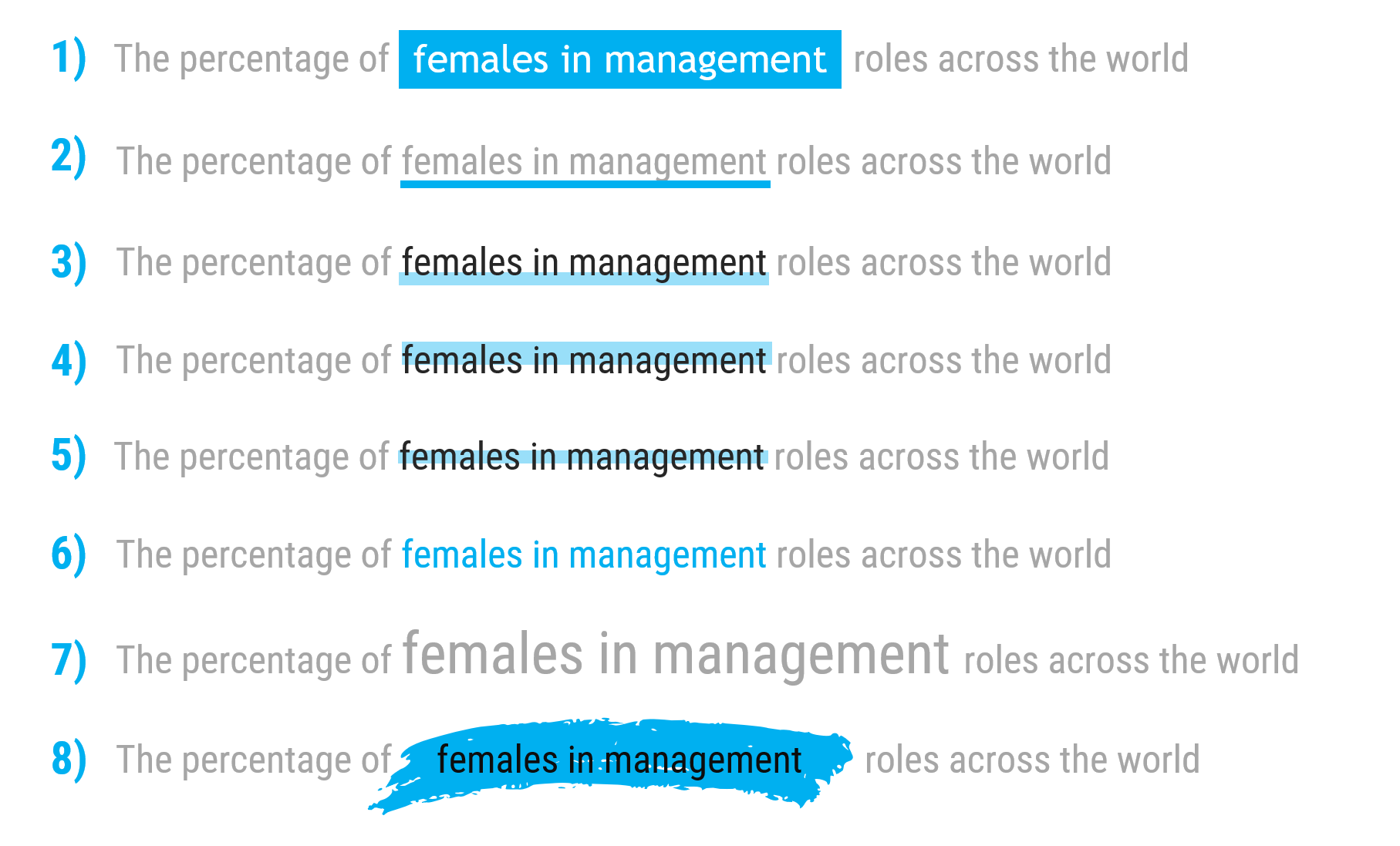
These are all pretty simple and involve changing the size or color of the text and/or adding blocks of color. The blocks of color can be easily created in Tableau by adding a text box or blank object and changing the fill color (or in PowerPoint by going to Insert / Shapes, and then choosing a rectangle).
However, the last one (the paint swipe) is a bit different. I came up with this idea several years back and it happens to be my favorite text-highlighting technique. I used it in my Tableau Visionaries Collector's Edition viz, I used it a half-dozen times in a project I'll release soon, as well as dozens of times in company PowerPoint decks. This does require you to use a tool other than Tableau. In my explanation, I'll use PowerPoint.
First, download the free font called Deadly Finisher; you can get it here. (To install, double-click the ttf file, and click Install). Once it has been installed, open PowerPoint (if it was open before the install, you'll have to close and reopen it). Insert text of a slash (/), change the font size to something large (say 600), and then change the font to Deadly Finisher. From here, rotate it clockwise about 80 degrees and optionally change the font color. The result should look something like this:

From here, select it and save it as an image (you may need to crop it), then bring it in as an image within Tableau and simply float it behind your text. It's so impactful and just adds a nice design element to your viz.
4. Punctuated Bar Chart
The last one today comes from Jared Flores who gives design credit to Dorian Banutoiu. William Brown calls this technique a "punctuated bar chart" (what a great name!) Below is an example from Jared's Prep in your Step dashboard as well as one that Ken built for Tableau Public using the same style. Man, I love this so much!
Like the other 3 techniques, this is super simple. It's just a dual-axis chart with a bar on one axis and a Gantt bar on the other. In both of the above examples, the color of the marks is exactly the same, but the opacity was reduced on the bar. What a great technique!
Alright, there you have it...four design techniques that I am obsessed with! Thanks for reading and I hope to see these designs used all over the place!
Need help with anything related to Tableau? Through Moxy Analytics, Ken and I provide consulting services such as Tableau Lifeline (get us for 1 hour to help solve sticky problem), Fractional Data Here (get us on your team for N number of hours a month for whatever you want us for), Tableau Training, and of course, project work. Click the Icon below if you are interested.
Kevin Flerlage, October 16, 2023
Twitter | LinkedIn | Tableau Public


No comments: