
The Gain & Loss Chart

Recently, a client asked me to build them a visual to show their top 20 most profitable accounts. I created a simple bar chart showing profit and filtered that down to the top 20. However, as I looked at the chart, I wondered to myself...why are they the most profitable? The numbers were all pretty similar (say for example, #1 was $100,000 and #20 was $80,000), but how did they get to be the most profitable. So as a good analyst does, I started exploring that. I ended up adding in additional bars to show Revenue per client as well as Cost per client. What I found was astounding (at least in my opinion).
I found that one account had (as an example) $120,000 in revenue and $30,000 in cost for a total of $90,000 in profit. However, another account had $630,000 in revenue and $540,000 in cost for that same $90,000 in profit. So although they both resulted in $90,000 in profit, they both got there in very very different ways. One had low revenue and lower cost and the other had high costs and just higher revenue. To me, this detail was incredibly important to show my client. It was something that could potentially be really informative to the client and how the client does business. In fact, they might find ways to improve profitability by simply exploring these very different scenarios.
As mentioned, I started out with bar charts, but thought that something similar to a waterfall might work well. I created a chart, shared it with the client, and they loved it! (I'll share what that looked like momentarily).
The very next week, Steve Wexler messaged me asking if I'd want to participate in the Real World Fake Data challenge that he put together with Mark Bradbourne and Jacqui Moore. The data was related to HR Cross Functionality and showed the movement of individuals within departments of a company. Essentially, who joined that department and who left it. I thought to myself that this chart I had recently created for my client would work perfectly for this! Ultimately, I ended up with a chart that looked similar to the following. (Check out my actual RWFD dashboard here).
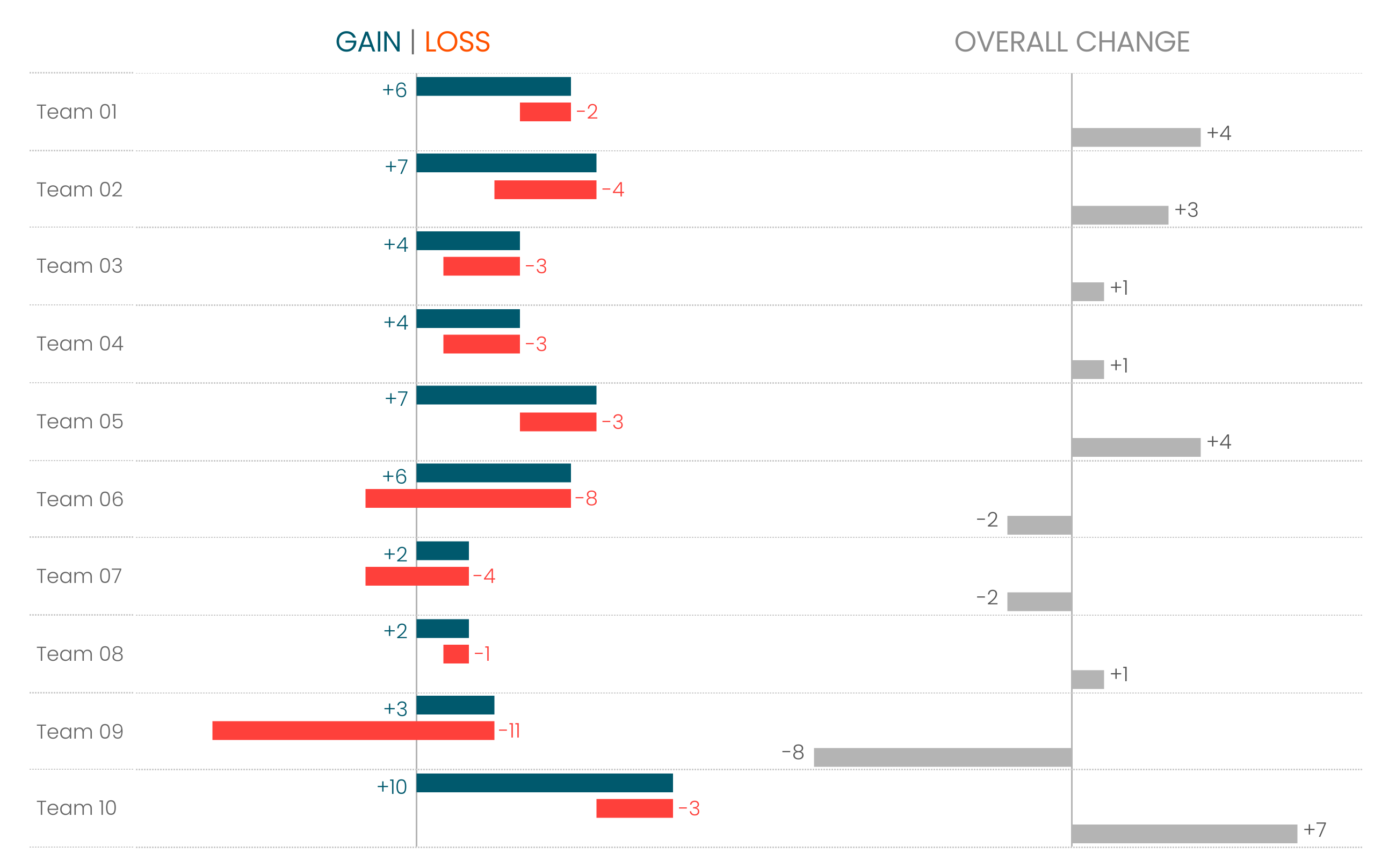
When I shared this with Steve, he was really excited about the chart (and the dashboard as a whole). Since I had used the same exact chart twice in one week, I figured I'd write a tutorial on how to build it.
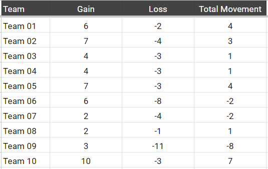
First, let's talk about the data. The RWFD data was quite challenging to work with. I ended up doing some data modeling to get it in a nice format, but for this tutorial, I've simplified the data. You can access it via my google sheet here, and the data looks like the following:
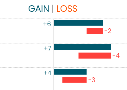
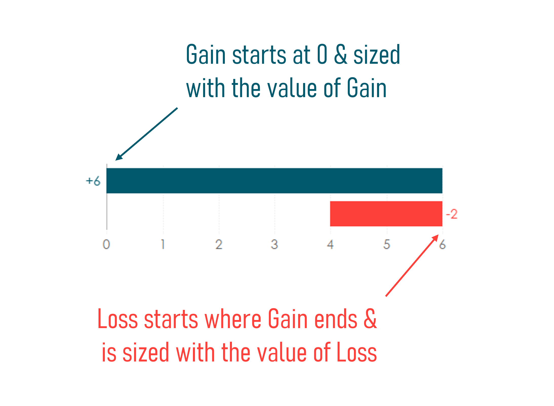
Okay, let's think about how we might build this. (For reference, I've included a portion of the chart below). I'll admit, I've never built a waterfall chart...never. And for this chart, I didn't read any tutorials for waterfall charts, I just thought through how we might create it. First, it looks like a bar chart mark type, but how would we utilize bars to build this? The bars start at different points. The gain bar starts at zero and moves to the right where the loss bar starts where the gain bar ends and moves to the left. I'm not sure how to do that with a bar, so I opted to do it with sized Gantt marks.
If you don't know how Gantts work, if you plot them on their own, it will simply show a thin bar at that mark value similar to plotting a circle or shape mark. However, when you add something to size, then they grow accordingly. Check out this GIF where the Gantt mark is plotted to start at 0 but then sized based on the Gain field (a value of 6 in this case).
So we need to do two things: 1) determine the starting point of each Gantt bar. and 2) determine how to size each Gantt bar. Well, the latter is simple, it will be sized solely based on the measure value. For Gain, we size the bar using the Gain value (in the image above, that is 6). We do the same for Loss, we size it based on the value of Loss (negative values for loss will move toward the left). So let's focus on the starting point. Let's look at the chart I created to see this visually:
Gain - Starting Point
0
Loss - Starting Point
SUM([Gain])
Just like we showed before, the starting point for Gain is 0 and the starting point for Loss is just Gain.
Those are the only calculations we need to build this chart, so let's get into the actual build. I'm going to walk through all the steps, but then I'm going to provide a GIF showing all of these steps in detail.
1) In this case, we are looking at the gain and loss by team, so place Team on Rows.
2) Place Gain - Starting Point on Columns
3) Change the mark type to Gantt Bar
4) Place Gain on the size card for the Gain - Starting Point axis. You should see it size like the GIF above.
5) Add Loss - Starting Point to Columns next to the Gain - Starting Point pill.
6) Make sure the mark type is also set to a Gantt Bar
7) Add Loss to the size card for the Loss - Starting Point axis. Again, you should see it size like the GIF above.
8) Add Total Movement to Columns next to the Loss - Starting Point pill.
9) Change this mark type to a Bar (not a Gantt Bar).
10) Create a dual-axis using the two Starting Point fields and synchronize.
11) Add Measure Names to Rows next to Team.
12) Right-click on the Measure Names pill and uncheck Show Header.
13) I personally like to label the bars with + values and - values. To easily do this, use CTRL to multi-select the Gain, Loss, and Total Movement fields. Right-click, choose Default Properties, then choose Number Format. Choose Number (Custom), set it to 0 decimal places, then choose Custom at the bottom. You'll see #,##0;-#,##0. Add in a '+' before the entire thing: +#,##0;-#,##0. This will set your formatting on these three fields to show a '+' for a positive number and a '-' for a negative. From there, I simply add the appropriate labels.
And that's it! A little cleanup and you have a really intuitive chart that provides a ton of context to your end users. Check out the gif showing each of these steps and how easy it really is to create this chart.


No comments: